
Tell us anything

An idea, a bug, something you love. We read every note.

⌘↵ to send. The page you're on comes along.

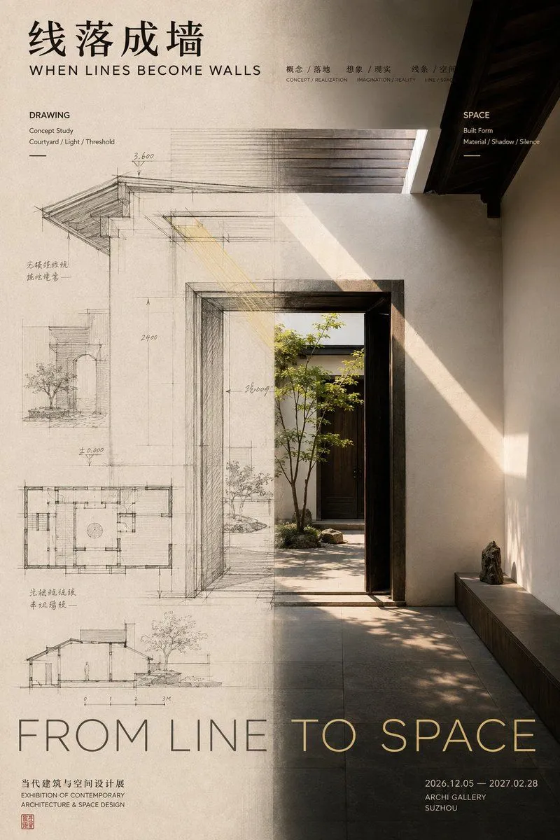
Editorial Design Poster Layout

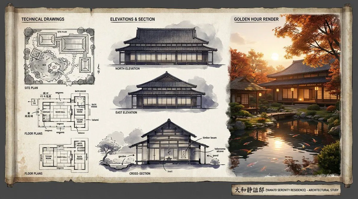
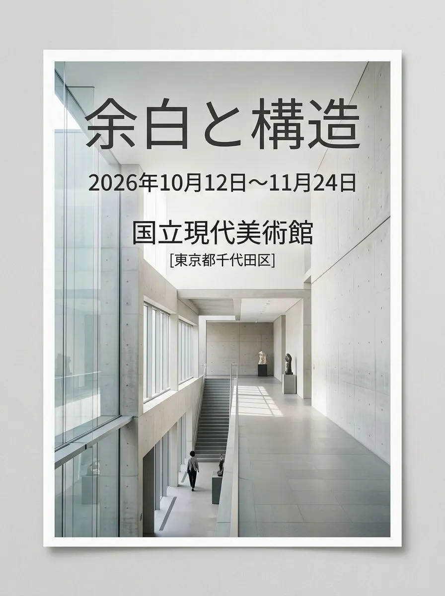
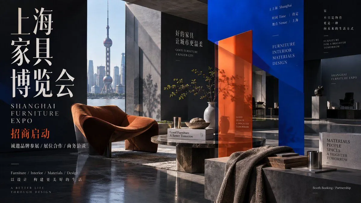
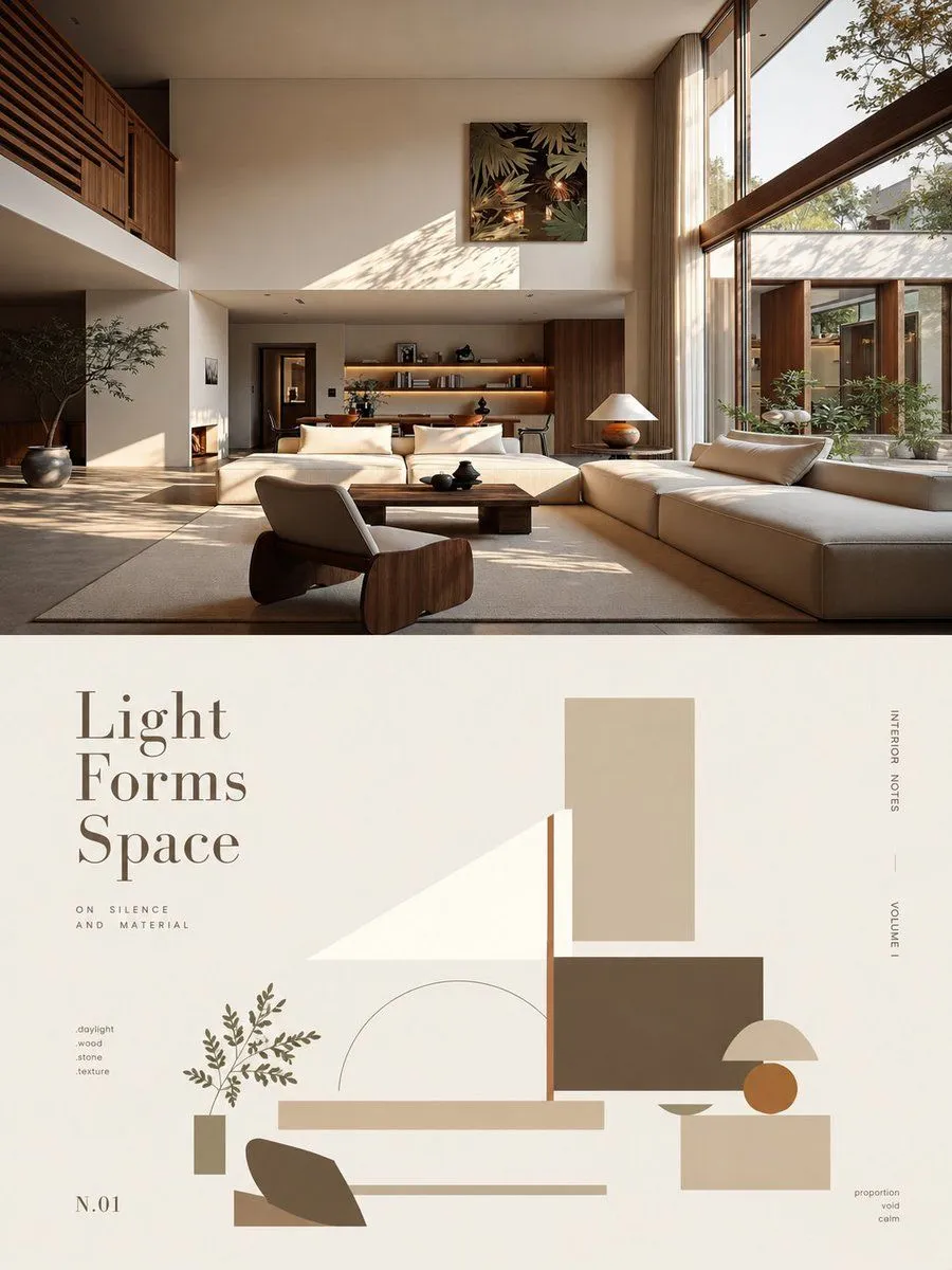
Made with GPT Image 2 in ChatGPT by Library Typography. Promptclay never generates images.

Did it work?

No reports yet. Tell others if it worked for you.

No comments yet. Be the first.

    Editorial Design Poster Layout

    GPT Image 22:3AI-generated

    Prompt

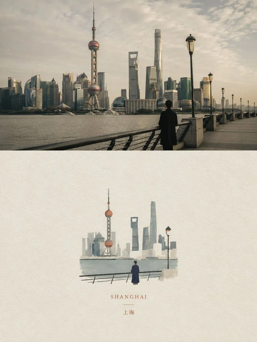
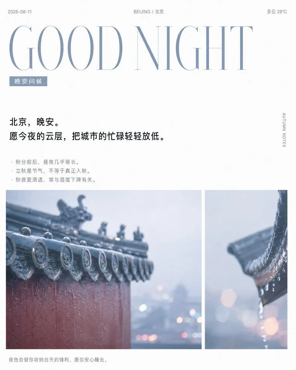
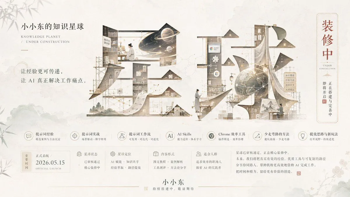
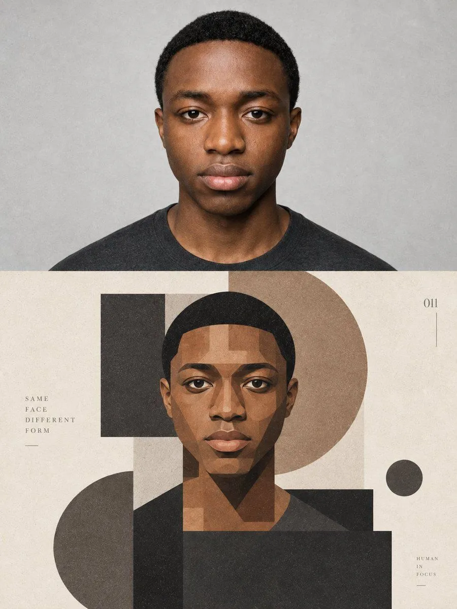
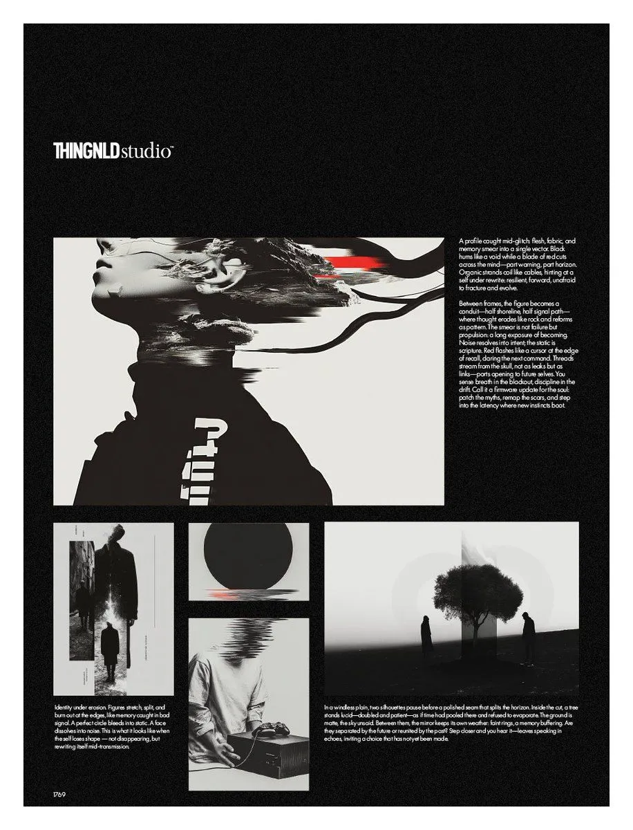
    Generate a bifold poster with mature editorial design and exhibition visual quality. Instead of simply cutting the frame into two columns, let the left and right visual areas express different states of the same theme, and let the "middle boundary" be where the change actually happens. The left and right areas use an unequal layout (40:60, 45:55, 55:45) based on the weight of the subject, rather than a mechanical 50:50. The left side is responsible for establishing the starting point or original state, and the right side is responsible for showing the transformed result, for example: Front of a work → structural and production path behind it; Design sketch → real space after completion; Sound source subject → vibration and sound field diffusing outward; Real entity → rubbings, traces, or images on paper. The most important part is the central axis translation. Do not use an obvious vertical line, but choose a core element to pass through the left and right areas and undergo continuous changes as it crosses the axis. For example: petals gradually turning into stitches and threads; architectural line drawings gradually turning into real walls; object vibrations gradually diffusing into voiceprints; stone carvings gradually flattened into black ink rubbings. This change must be continuous and natural, allowing viewers to immediately understand the causal, process, or translation relationship between the two sides, rather than two unrelated images spliced together. Typography also participates in the left-right relationship, but all text must belong to the work itself. Use real titles, subtitles, short sentences, and exhibition info; avoid template placeholder text like "left-right composition" or "design case." Reduce info on the visually heavier side; the emptier side can carry more titles and text, achieving visual balance through font size, density, and position. Control colors within 2–4 main palettes. The two sides can have distinct brightness, temperature, or material differences, but at least one color, texture, or visual element must cross the axis to ensure unity. Reading order: first see the two visually distinct states; second, discover the connection and change at the axis; third, understand "why the left becomes the right"; finally, read the title and information. Overall requirements: two visual domains with their own roles, a clear translation process in the middle, visually balanced despite being unequal, with both content logic and a sense of a mature work.

    Works in
    ChatGPT, Gemini
    Status
    Free to copy
    0
    DetailsVersions, settings and questions

    Written for

    What's in the prompt

    Subject
    Model
    GPT Image 2

    If your face changes

    keep my face exactly the same

    Questions

    Does this work in the ChatGPT app?
    Yes. Paste the prompt and attach your photo if it uses one.
    It changed my face. What do I do?
    Add "keep my face exactly the same" to the end and run it again.
    Can I use the images I make?
    Check the terms of the app you use. Promptclay never generates images and claims nothing you make.
    Similar prompts

    See more
    • Minimalist Real Estate Sales Poster
    • Travel Observation Archive Poster Design
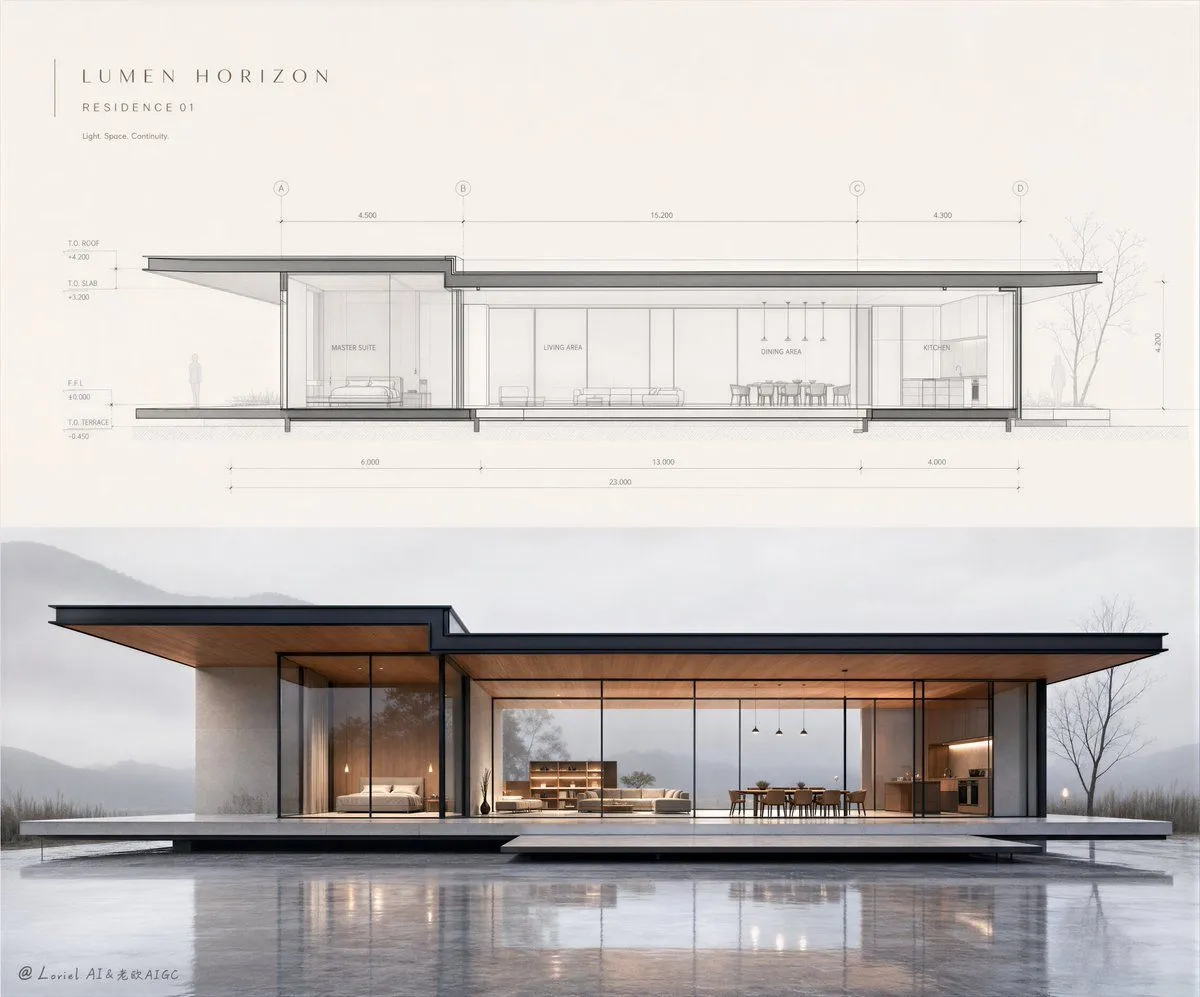
    • Architectural Illustrator Presentation Board Template
    • Minimalist Event Flyer Design
    • Editorial Aesthetic Poster Layout
    • Minimalist Abstract Geometric Deconstruction Poster
    • Editorial Magazine Spread Concept Prompt
    • Photorealistic render from illustration
    • Architectural Blueprint to Miniature Japanese Inn Scene
    • Generating Real Estate Flyers with Nano Banana Pro
    • Dual Editorial Poster Layout
    • Rainy Beijing Good Night Poster
    • Bright Korean Minimalist Typography Graphic
    • Geometric Editorial Portrait Collage
    • Convert Graphic to Pencil Rough Design
    • High-Fashion Typography Poster Template
    • Modern Minimalist Interior Design Presentation Board
    • Wabi-Sabi Japanese Interior
    • Japanese Optical Illusion Museum UI
    • Wide Anime Japanese Room Extension
    • Snow Flower Hashira Diagnosis Poster
    • Cinematic Spring Cherry Blossom Portrait
    • Pop Idol Typography Cover Art
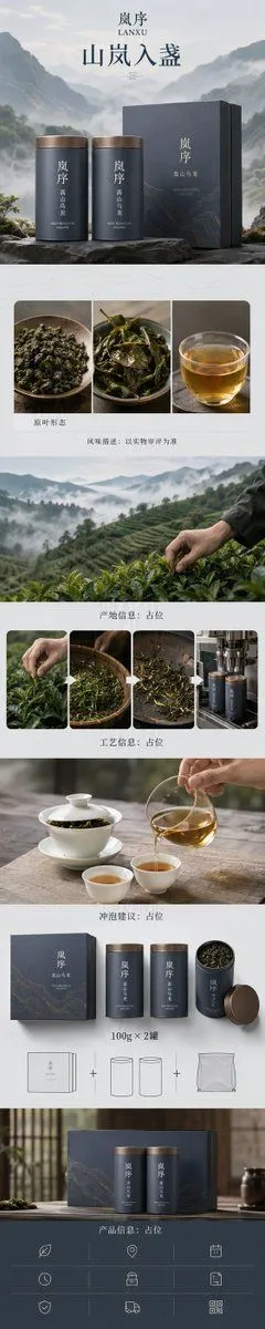
    • Zen-Style Oolong Tea Ecommerce Detail Page

    Show more

    Run it on your phone

    1. Prompt copiedRead it

      Generate a bifold poster with mature editorial design and exhibition visual quality. Instead of simply cutting the frame into two columns, let the left and right visual areas express different states of the same theme, and let the "middle boundary" be where the change actually happens. The left and right areas use an unequal layout (40:60, 45:55, 55:45) based on the weight of the subject, rather than a mechanical 50:50. The left side is responsible for establishing the starting point or original state, and the right side is responsible for showing the transformed result, for example: Front of a work → structural and production path behind it; Design sketch → real space after completion; Sound source subject → vibration and sound field diffusing outward; Real entity → rubbings, traces, or images on paper. The most important part is the central axis translation. Do not use an obvious vertical line, but choose a core element to pass through the left and right areas and undergo continuous changes as it crosses the axis. For example: petals gradually turning into stitches and threads; architectural line drawings gradually turning into real walls; object vibrations gradually diffusing into voiceprints; stone carvings gradually flattened into black ink rubbings. This change must be continuous and natural, allowing viewers to immediately understand the causal, process, or translation relationship between the two sides, rather than two unrelated images spliced together. Typography also participates in the left-right relationship, but all text must belong to the work itself. Use real titles, subtitles, short sentences, and exhibition info; avoid template placeholder text like "left-right composition" or "design case." Reduce info on the visually heavier side; the emptier side can carry more titles and text, achieving visual balance through font size, density, and position. Control colors within 2–4 main palettes. The two sides can have distinct brightness, temperature, or material differences, but at least one color, texture, or visual element must cross the axis to ensure unity. Reading order: first see the two visually distinct states; second, discover the connection and change at the axis; third, understand "why the left becomes the right"; finally, read the title and information. Overall requirements: two visual domains with their own roles, a clear translation process in the middle, visually balanced despite being unequal, with both content logic and a sense of a mature work.

    2. Open your app

      This prompt is long, so it is copied instead of sent in the link. Paste it in the app.

    3. Paste and run

      Press and hold the message box, then tap Paste. Add your photo first if the prompt uses one. You may need to sign in.

    Editorial Design Poster Layout