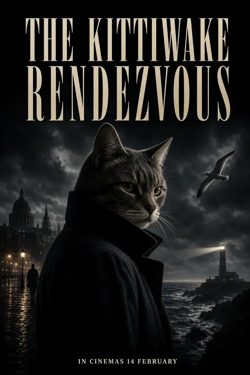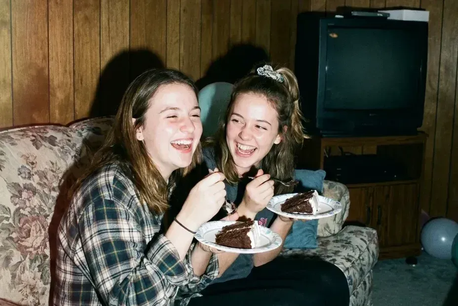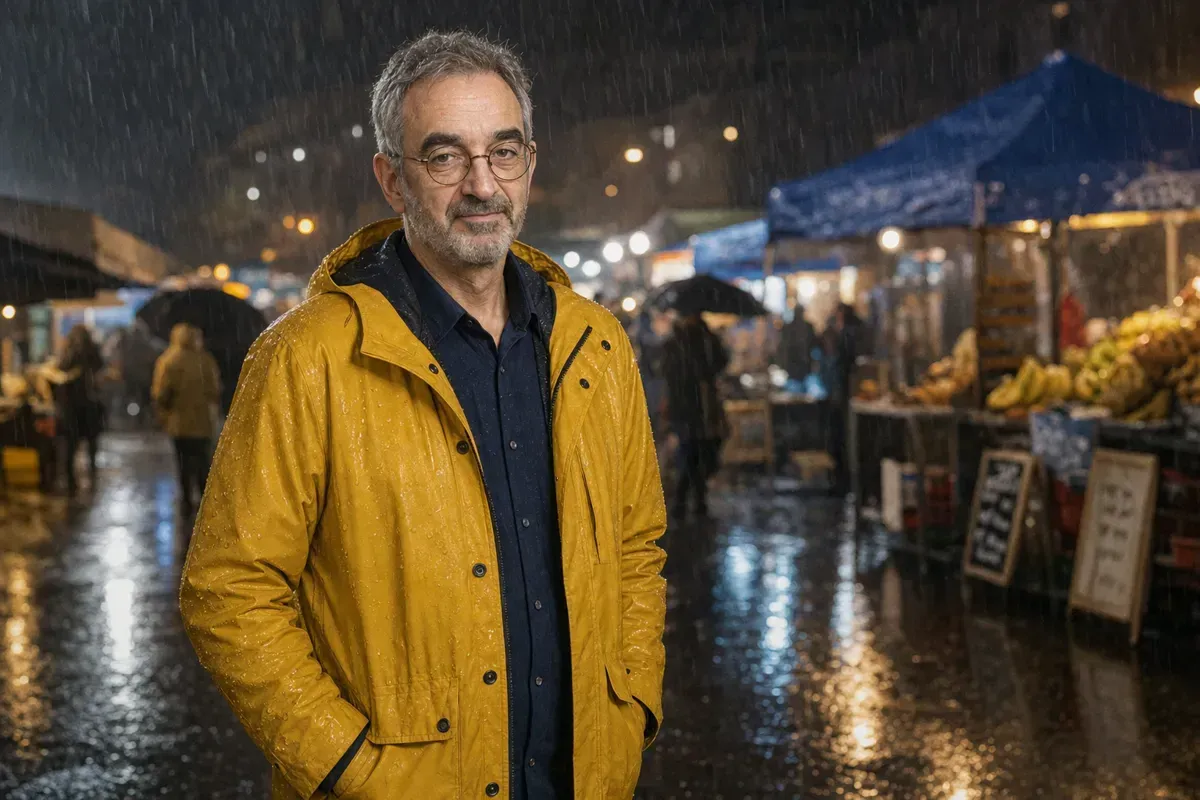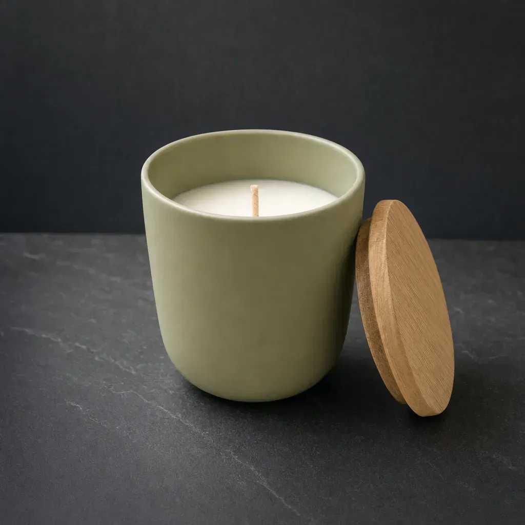


A thumbnail is judged small. We made thumbnails for the same video idea with GPT Image 2, from a short prompt and from one that says how small it will be seen, then shrank both to 168 pixels wide to see what survives.

Say where it will be seen
OpenAI's prompting guide says to include the intended use, because it sets the mode and the polish. This template states it twice: a YouTube thumbnail up front, and ultra readable at small size near the end. We filled its blanks and added one line for the words.
GPT Image 2Viral YouTube Thumbnail Template
Create a highly clickable YouTube thumbnail. SUBJECT: {subject} EXPRESSION / ACTION: [strong emotion, reaction, movement, pose] COMPOSITION: [close-up / medium shot / wide shot] [subject placement] [camera angle] [foreground/background separation] VISUAL HIERARCHY: primary focus should immediately draw attention to [important subject] secondary details should support the story without clutter LIGHTING: {lighting} [rim light / glow / dramatic contrast / soft light] COLOR DISTRIBUTION: dominant colors: [ ] accent colors: [ ] high contrast between subject and background BACKGROUND: [simple readable environment] avoid clutter support the narrative only STYLE: [realistic / anime / cinematic / watercolor / stylized / etc.] THUMBNAIL OPTIMIZATION: ultra readable at small size high contrast silhouette large facial expression clean negative space minimal objects strong emotional clarity high saturation focal points professional YouTube thumbnail composition ASPECT RATIO: {aspect_ratio}
Our subject: a small 3D clay cartoon character sitting on a mountain of opened white paper envelopes and bill letters, no money, no banknotes. Lighting: bright key light with warm rim light. Style: 3D clay render. Aspect ratio: 16:9.
Our added line: TEXT: exactly three words, "100 BILLS OPENED", huge heavy yellow block capitals with a thick black outline, stacked on the left half. No other text.
Check it at phone size
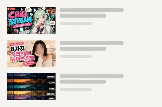
We shrank two results to 168 pixels wide with a few lines of Python and set them on a plain canvas, like one row of a results list. Grey bars stand in for the title. The top one came from the short prompt in step 3: its big 100 survives, the stack labels and the small badge turn to smudge.
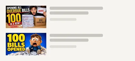
Three words, one face, a plain background
Thumbnail for a YouTube unboxing video, a video of opening all overdue bills, 100 in a row gave 2 crowded frames, each with ten or more bits of text and a desk of stamped envelopes. The step 1 template gave our three words as the only headline in 5 of 5 runs, with one character on plain blue.
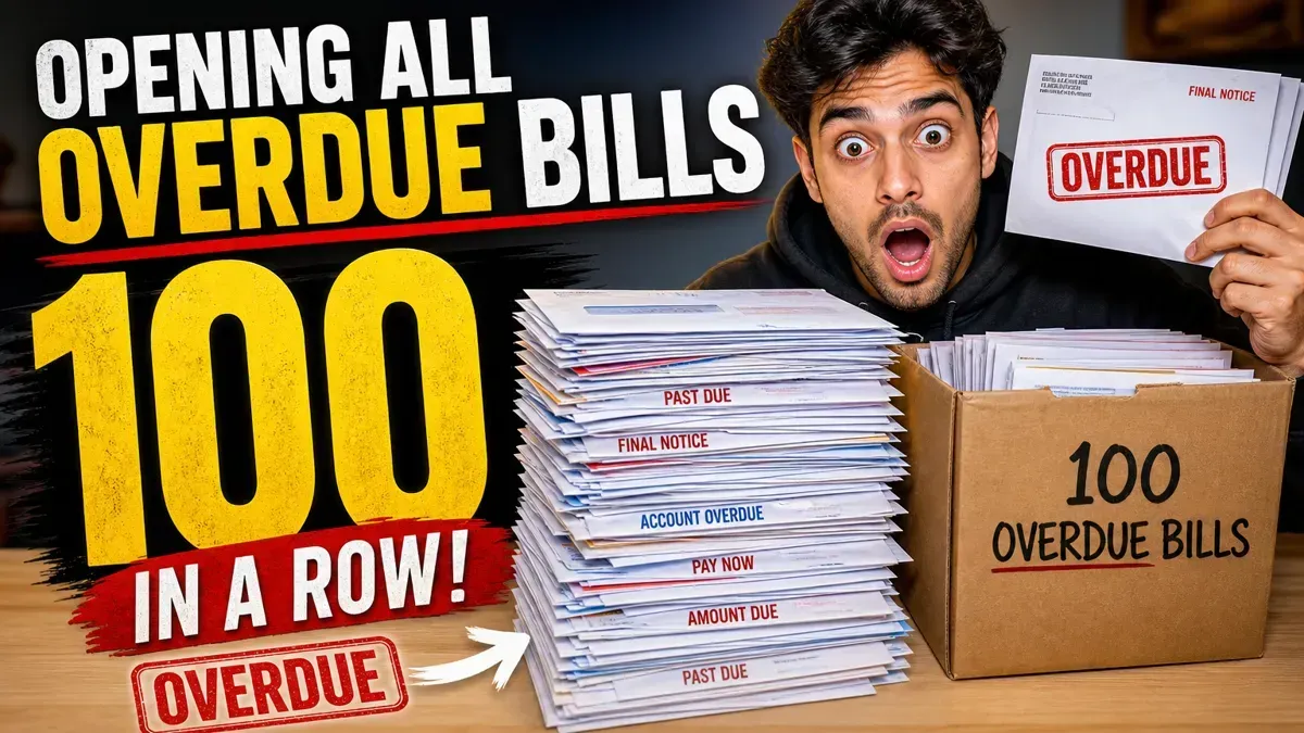 Before
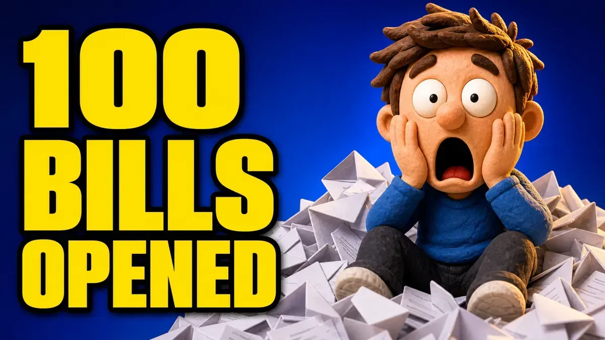 After
GPT Image 2YouTube Unboxing Thumbnail Prompt
Thumbnail for a YouTube unboxing video, a video of {topic}, {quantity}
Filled in with the post's own examples: opening all overdue bills, 100 in a row.
Name the language you are writing in
Many thumbnail prompts on the site were written for Japanese or Korean channels, and they say so in their style words. We kept that wording and quoted English words. This prompt asks for Korean headline typography: both runs turned our headline 8 SLEEP FIXES into Korean and kept the other three lines in English. We changed Korean headline typography and Korean lettering to English, ran it twice more, and both runs kept every word as we wrote it. The blurred square over her face is in the prompt too, for channels that never show the host: delete that line if you want a face.
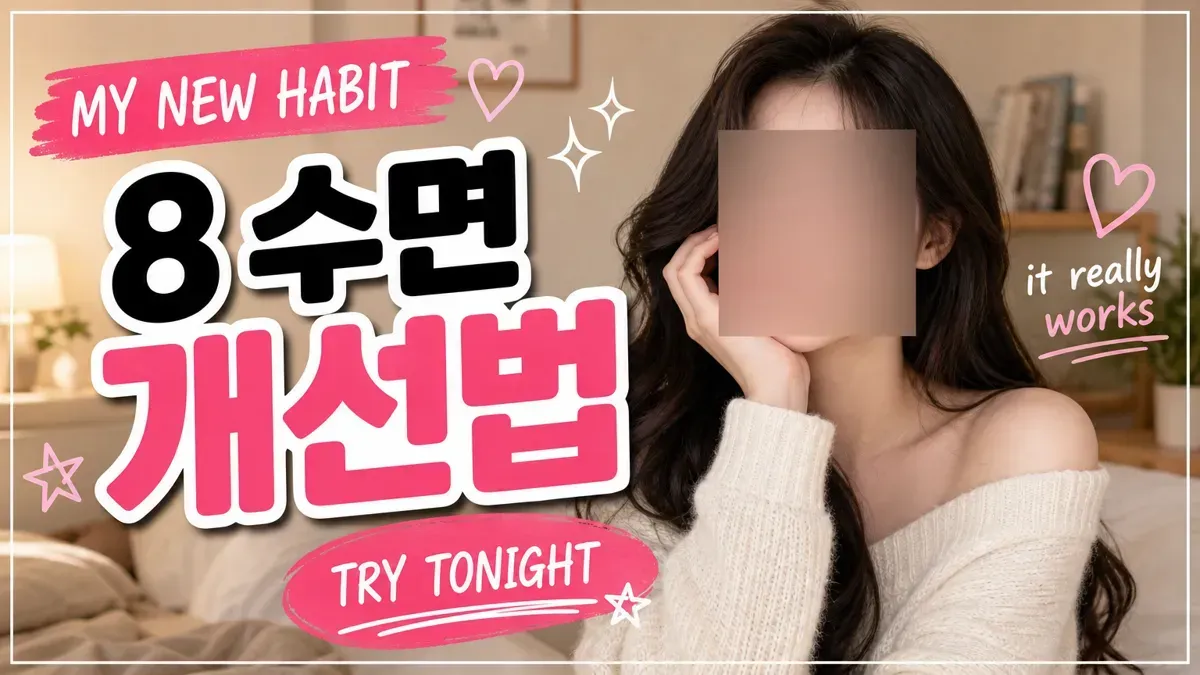 Before
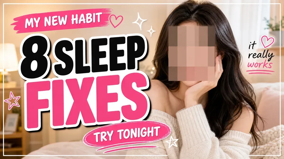 After
GPT Image 2Korean Sleep Tips Thumbnail
Goal: Create a bright Korean YouTube-style thumbnail about improving sleep, combining a lifestyle portrait with bold editorial typography. Canvas: 1200×675 horizontal 16:9 thumbnail, soft warm indoor bedroom/living-room background, thin white rectangular border inset from the edges. Main subject: On the right half, show a young East Asian woman with long dark wavy hair wearing an off-shoulder cream knit sweater, sitting in a cozy room and touching her cheek with one hand. Her face is intentionally covered by a large centered square blur/mosaic block in muted skin-tone colors, obscuring all facial features. Keep the portrait softly lit, feminine, and clean. Layout: Left half is dominated by oversized stacked Korean headline typography with thick white outline and subtle black drop shadow. Use three main headline lines: line 1 black text, line 2 pink text, line 3 pink text. The woman overlaps slightly behind the typography, creating a magazine thumbnail composition. Text content: Include exactly 4 text blocks: 1) a pink brush-stroke banner at upper left reading {top_banner_text}; 2) the main headline reading {headline_text}; 3) a pink oval brush label near the lower center reading {callout_text}; 4) a small handwritten note on the right reading {side_note_text}, with the second phrase in pink and underlined. Decorative elements: Include exactly 2 pink outline hearts, one near the top banner and one near the right handwritten note. Include exactly 4 star/sparkle doodles: two white sparkle marks above the headline near the center, one pink star outline on the left edge, and one small white star near the lower callout label. Add hand-drawn underline strokes under the callout and side note. Visual style: Korean lifestyle content thumbnail, cute and polished, high contrast, bold rounded sans-serif Korean lettering, black and hot-pink palette with white outlines, soft beige background, playful brush strokes, clean social-media design. Constraints: Do not add extra text blocks, extra people, logos, or watermarks. Keep the face fully obscured by the square blur block while preserving the hair, sweater, hand, and shoulders.
Our fill-ins, each in quotes: MY NEW HABIT, 8 SLEEP FIXES, TRY TONIGHT, it really works. For the right-hand picture, the two Korean style words became English.
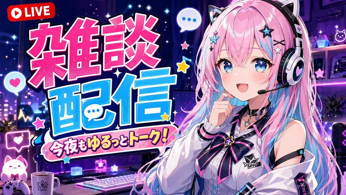
The stream prompt below says pop-art Japanese typography. With CHILL and STREAM quoted, 1 of our 2 runs wrote STREAM in Japanese letters, and both added Japanese speech bubbles we never asked for. The fix is the same: make the style words name the language you quote.
GPT Image 2VTuber Stream Thumbnail
An anime-style YouTube stream thumbnail featuring a cheerful female VTuber. She has long {hair_color} hair, blue eyes, and wears black and white cat-ear headphones with a boom mic. She wears a white collared shirt with a black and pink star ribbon and a black choker, smiling with one hand near her chin. The background is a gaming room with {room_lighting} lighting, showing a desk equipped with 1 white keyboard, 1 mug, 1 glowing cat figure, 1 game controller, and 1 streaming microphone. The left side features large, bold, pop-art Japanese typography: a bright pink top word "{main_text_line_1}" and a bright blue bottom word "{main_text_line_2}". Below is a pink banner reading "{subtitle_text}". A red "LIVE" badge sits in the top left. Floating speech bubbles, stars, and hearts decorate the composition.
Our fill-ins: CHILL, STREAM, late-night talk, mint green hair with white highlights, warm amber and teal lighting.
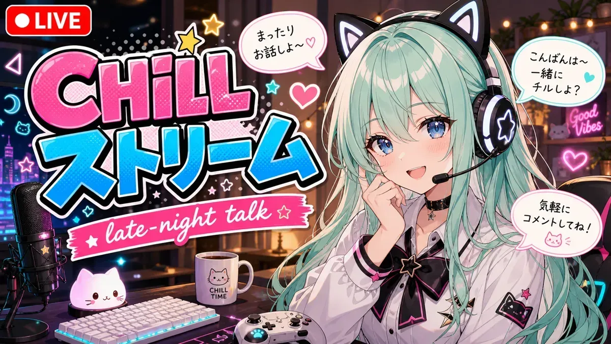
Six more thumbnail prompts, by kind of video
Every prompt below is a real post on the site, and the highlighted words are the ones to change. We ran one of them, the tutorial strip. The other five we read line by line, so we say what they ask for, not what they give.
Food and single objects
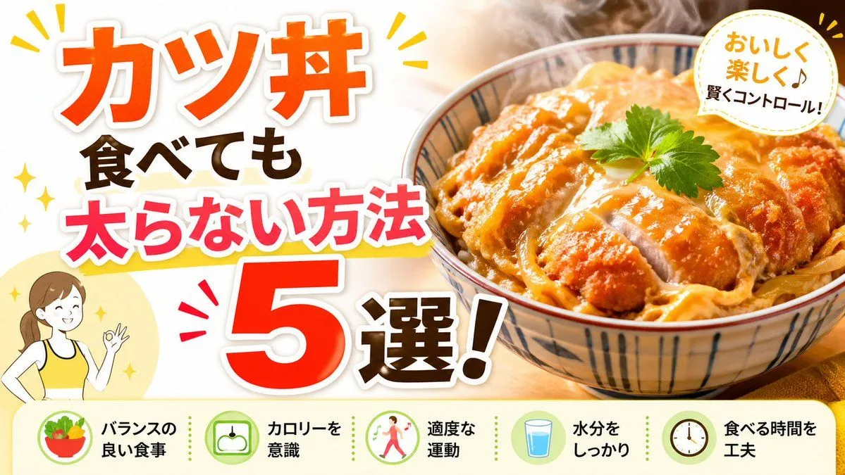
Half the frame is one bowl of food, the other half a stacked headline. Every word is already written into the prompt in Japanese, so to reuse it, replace the four headline lines and the five labels along the bottom. Five labels is a lot for a phone. After step 2, the strip along the bottom is the first thing we would cut.
GPT Image 2Japanese Katsudon Diet Thumbnail
Create a bright, high-impact Japanese YouTube thumbnail about diet-friendly eating, in a clean split composition. The left half is a white background filled with oversized bold Japanese headline text stacked vertically and diagonally for maximum readability: the top line says "カツ丼" in huge vivid orange with a thick white outline and soft drop shadow, below it "食べても" in dark brown, then "太らない方法" in hot pink with a white outline and a yellow underline swoosh, and at the bottom a gigantic red-orange "5" with white outline next to "選!" in dark brown with a white outline. Add small yellow sparkle accents and comic-style emphasis marks around the headline. In the lower left corner, place a simple flat illustration of 1 smiling woman from the waist up wearing a yellow tank top, brown hair tied back in a ponytail, making an OK hand gesture, set over a pale yellow circle. The right half shows a close-up, appetizing katsudon bowl photographed in warm light: 1 ceramic bowl with blue vertical stripe patterns, filled with sliced golden-brown breaded pork cutlet over egg and onion on rice, glossy sauce, visible steam rising, and 1 small green herb leaf garnish on top. In the upper right corner, add 1 white circular badge with a dotted yellow border containing the Japanese text "おいしく楽しく♪ 賢くコントロール!" in a friendly handwritten style, with yellow accent marks around the badge. Along the entire bottom, include a pale cream horizontal information strip with 5 circular icons and 5 labels separated evenly from left to right: 1 salad bowl icon with the text "バランスの良い食事", 1 scale icon with "カロリーを意識", 1 walking person icon with "適度な運動", 1 glass of water icon with "水分をしっかり", and 1 clock icon with "食べる時間を工夫". Use a glossy commercial thumbnail aesthetic, warm food photography, thick outlined typography, cheerful health-themed colors, and strong contrast optimized for social media click-through.
Products
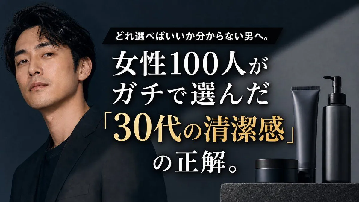
One model, one headline group with a gold phrase, and four unlabelled bottles. Its last paragraph is worth copying into any product thumbnail: do not add extra labels to the products, do not add logos, do not add more than one person. One catch: the Japanese headline is written out in full, and four headline blanks come later. Replace the written lines too, or the model has two sets of words to choose from.
GPT Image 2Premium Men's Skincare Thumbnail
Goal: Create a cinematic Japanese YouTube thumbnail-style advertisement for a men's grooming or skincare product line, aimed at men who do not know what to choose. Canvas: 16:9 horizontal thumbnail, dark premium editorial look, high contrast, no border or watermark. Layout: Place one serious Japanese male model on the left third, cropped from chest upward, wearing a black blazer over a black shirt. He has medium-length wavy black hair, clean-shaven face, slightly tilted head, calm confident expression, and looks directly at the viewer. Put the main headline in the center-right, large and layered over the dark background. Place the product lineup on the far right bottom on a dark stone pedestal. Text content: Use exactly 3 text groups. Top group: a black slanted rectangular banner with small bold white Japanese text: 「どれ選べばいいか分からない男へ。」 Main group: very large white Japanese Mincho-style serif text with subtle drop shadow: 「女性100人が」 on the first line and 「ガチで選んだ」 on the second line. Highlight group: large metallic gold serif text with quotation marks: 「30代の清潔感」, followed below by large white text: 「の正解。」 Make the gold phrase the strongest focal point after the model. Subject details: The man should feel like a polished luxury magazine cover: realistic skin texture, moody studio lighting, sharp cheekbones, mature 30s atmosphere, understated masculinity. Use {model_description}. Product details: Show exactly 4 matte-black grooming containers on the right: 1 tall pump bottle at the far right, 1 tall squeeze tube just left of it, 1 low cylindrical jar in front, and 1 wider low cylindrical container behind the jar. All products are unlabeled, minimal, premium, and softly rim-lit. Visual style: Dark charcoal-blue background with a diagonal spotlight beam from the upper right, subtle smoky haze around the center text, premium black-and-gold color palette, realistic commercial photography, glossy but restrained highlights, crisp typography. Customizable headline parameters: Use {top_banner_text}, {main_white_headline}, {gold_key_phrase}, and {closing_text}. Constraints: Keep the composition uncluttered, ensure all Japanese text is large and legible, do not add extra labels to the products, do not add logos, do not add more than one person, and keep exactly 4 visible product containers.
Prices and comparisons
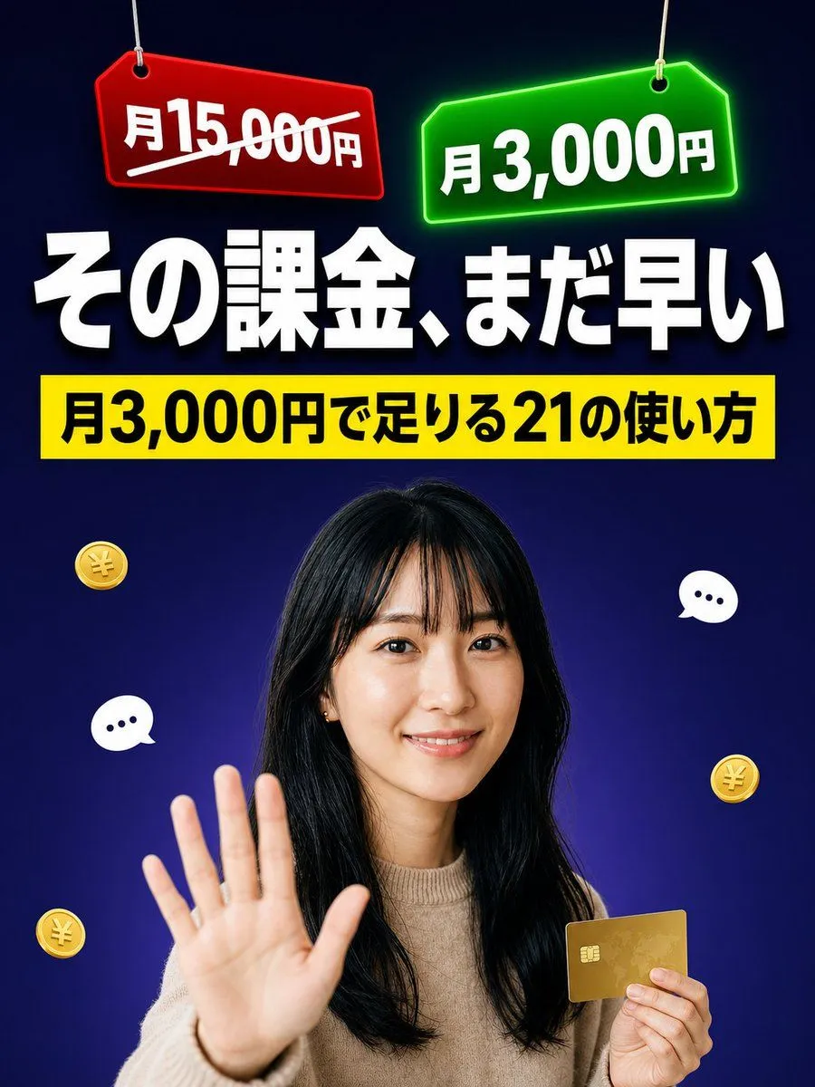
Two price tags, a headline, a yellow banner and one person. It is the only prompt in this list that says optimized for mobile readability and Keep all main text inside safe margins, step 1 in its own words. Mind the canvas: Vertical 3:4, made for social feeds. For a YouTube video, YouTube's help page asks for 16:9.
GPT Image 2Japanese Pricing Comparison Thumbnail
Goal: Create a bold Japanese YouTube/X thumbnail about subscription pricing being too expensive, using a dramatic comparison between a crossed-out high monthly fee and a cheaper monthly fee. Canvas: Vertical 3:4 thumbnail, 768×1024 style, optimized for mobile readability. Use a dark navy-to-deep-purple gradient background with a subtle spotlight glow behind the person. Keep all main text inside safe margins and make it extremely large, high-contrast, and legible. Layout: At the very top, place exactly 2 hanging price tags suspended by thin strings: left tag is red, tilted slightly, with the text {old_price_text} in bold white and a thick white diagonal strike-through line; right tag is neon green, tilted slightly, glowing, with the text {new_price_text} in bold white. Below the tags, center a huge white headline with black shadow: {headline_text}. Under the headline, add one bright yellow rectangular banner spanning nearly the full width, with bold black text: {subheadline_text}. Subject details: In the lower half, show a realistic studio-cutout portrait of a smiling young Japanese woman with long black hair and bangs, wearing a beige knit sweater. She faces the camera, raises her left hand open toward the viewer in a clear “stop/wait” gesture, and holds a gold credit card in her right hand. Use natural skin tones, clean beauty lighting, and a crisp cutout edge. Decorative elements: Add exactly 3 small floating gold yen coins with embossed yen symbols: one on the left upper-middle area, one near the lower-left edge, and one on the right-middle area. Add exactly 2 white speech/chat bubbles with three dark dots: one on the left side near the raised hand and one on the right side near the headline/shoulder area. Do not add extra coins, bubbles, icons, logos, or watermarks. Visual style: High-impact Japanese social media thumbnail, glossy 3D accents, strong drop shadows, neon glow on the green tag, clean compositing, sharp typography, saturated colors, professional viral-cover design. Make the text accurate and not garbled.
Tutorials
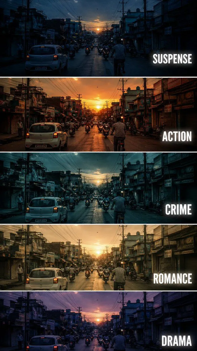
Five strips of the same street, each graded for a film genre and labelled. The aspect blank sits at the top, but the last line still says 9:16 vertical composition. We set the blank to horizontal 16:9, left that line in and asked for a 1536 by 864 canvas. Our one run came out wide, with five strips and five labels spelled right. Delete the 9:16 line anyway, so the prompt asks for one shape.
GPT Image 2Cinematic Film Genre Color Grading Comparison
Create a {aspect} cinematic tutorial comparison poster showing the same {subject} repeated in five horizontal panels, each panel demonstrating a different film genre color grading style. The scene is a busy small city street at sunset, with cars, motorcycles, cyclists, shop buildings, electric poles, tangled overhead wires, and warm evening sky. Keep the camera angle exactly the same in every panel, like a fixed street photography shot. Each horizontal strip should have a different cinematic mood and color tone: Panel 1: SUSPENSE - cool blue shadows, dark contrast, slightly mysterious atmosphere, tense and moody lighting. Panel 2: ACTION - warm orange sunset tone, high contrast, energetic cinematic look, dramatic highlights. Panel 3: CRIME - cold teal blue grading, darker exposure, gritty urban feeling, realistic shadows. Panel 4: ROMANCE - soft golden warm tone, gentle contrast, nostalgic sunset mood, dreamy atmosphere. Panel 5: DRAMA - muted purple blue evening tone, emotional cinematic lighting, soft shadows and serious mood. Add bold white uppercase text on the right side of each panel: SUSPENSE, ACTION, CRIME, ROMANCE, DRAMA. Use clean modern sans serif typography with slight glow or subtle shadow. Separate each panel with thin white horizontal borders. Make it look like a professional filmmaking color grading tutorial thumbnail, cinematic, realistic, high detail, urban street photography, 9:16 vertical composition. Negative Prompt: cartoon, anime, painting, low quality, blurry, distorted buildings, extra text, wrong spelling, messy typography, overexposed, unrealistic colors, duplicated cars, warped street, bad perspective, random objects, low resolution, watermark
Our fill-ins: horizontal 16:9, harbour street scene.
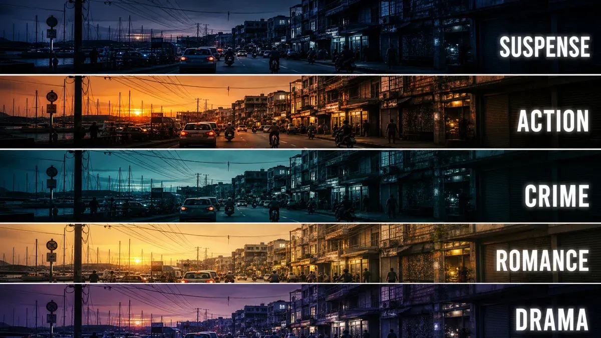
We shrank three of our new runs to 168 pixels, as in step 2. CHILL STREAM and the big Korean headline still read. late-night talk, the speech bubbles and the handwritten note do not. The five genre labels just survive, and the street detail is gone.
Podcasts and stories
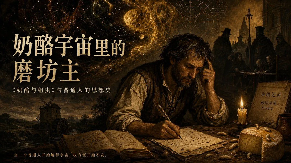
A painted scene, a face lost in shadow, and exactly four text blocks in Chinese. It is drawn 16:9, which suits an episode. YouTube's help page asks for 1:1 on podcast playlists, so make a square version for the playlist. If you write in another language, change the four blanks and the words traditional Chinese typography together.
GPT Image 2Dark Historical Podcast Cover
Create a dark cinematic podcast cover in a 16:9 horizontal format, painted like a dramatic Baroque oil painting with golden-brown chiaroscuro lighting, aged parchment textures, and a historical mystery atmosphere. The scene shows a weary medieval scholar or miller seated at a rough wooden desk in the right-center foreground, face intentionally obscured by a dark square shadow, one hand pressed to his temple while the other writes with a feather quill on handwritten papers. On the desk include 5 main foreground objects: an open occult notebook filled with diagrams, loose manuscript pages, a burning wax candle, a wedge of hole-filled cheese, and scattered larvae; include exactly 9 clearly visible larvae around the cheese and papers. Behind him, blend a surreal cosmic sky with stars, astrological circles, a cratered moon, golden nebula dust, and faint mathematical manuscript marks, merging into a late-medieval village with a windmill on the lower left and shadowy church officials or inquisitors on the upper right. Add exactly 4 visible text blocks: a large cream-colored Chinese main title on the left reading {main_title}, a smaller subtitle beneath it reading {subtitle}, a tiny bottom-left tagline reading {tagline}, and a parchment note on the right reading {document_note}. Use elegant traditional Chinese typography, off-white ink for the title, muted gold for the small tagline, high contrast but weathered edges, museum-poster composition, no modern objects, no clean digital gloss, richly detailed, ominous, intellectual, and suitable as a historical philosophy podcast episode cover.
Vlogs
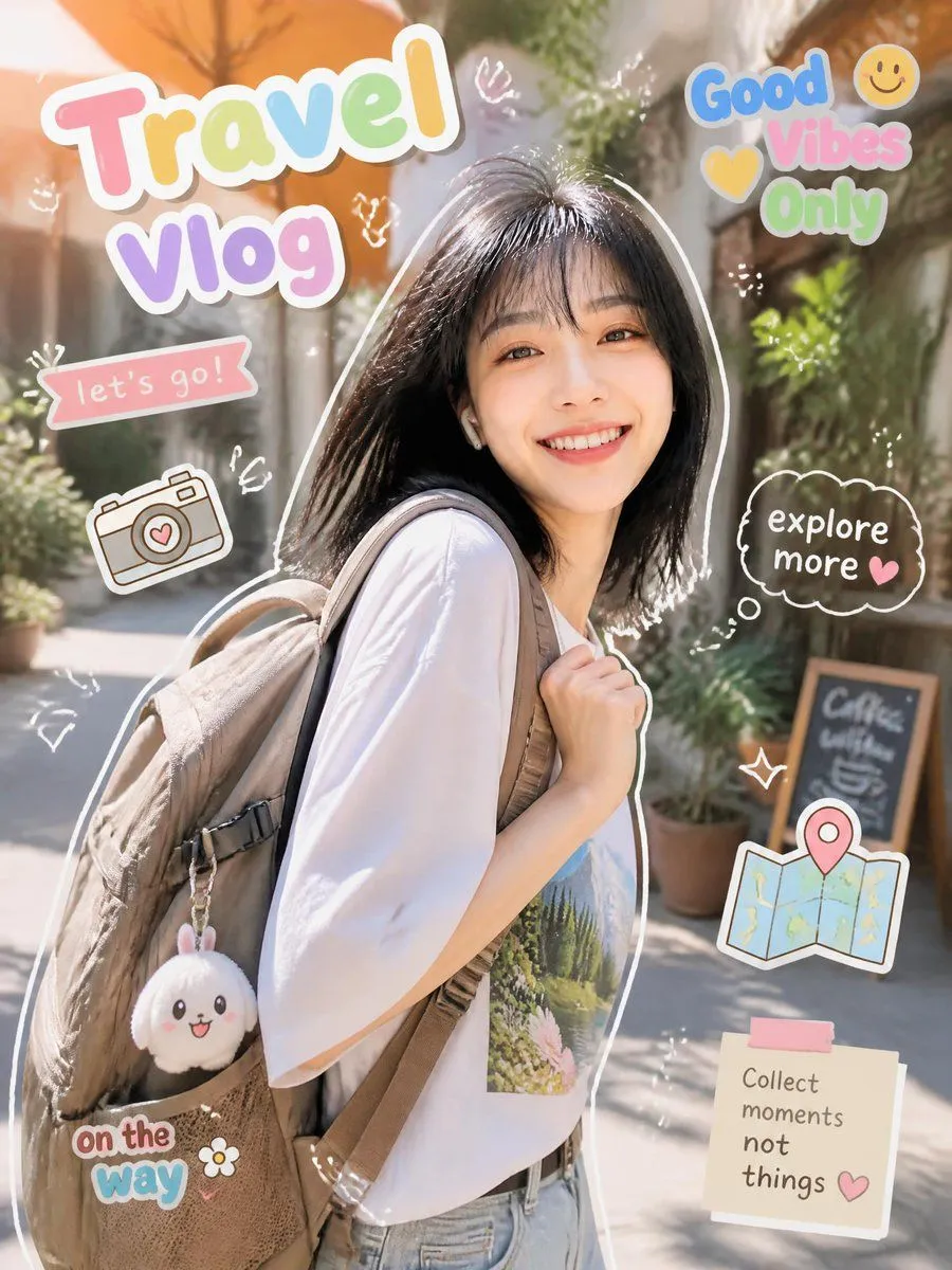
A traveller cut out like a sticker, with six text stickers around her. Its constraint Keep all text legible and in English is the step 4 fix, already written in. The canvas is Vertical 3:4, and going by our step 2 test, six stickers are unlikely to survive 168 pixels. For a YouTube video, switch to 16:9 and keep the big title.
GPT Image 2Cute Travel Vlog Thumbnail
Goal: Create a bright vertical travel vlog thumbnail/collage featuring a smiling young woman traveler in a sunny outdoor alley, surrounded by cute scrapbook stickers and hand-drawn doodles. Canvas: Vertical 3:4 social media image, high-resolution, warm daylight, shallow depth of field. Background is a charming pedestrian street or café alley with plants, terracotta umbrellas, soft bokeh, and a small chalkboard sign in the distance. Main subject: A cheerful {character_description} stands slightly right of center, turned three-quarters toward the camera, smiling warmly. She wears a loose white T-shirt with a small nature print on the chest, light blue jeans, and a large beige backpack over one shoulder. Add a cute plush keychain hanging from the backpack. Put a thick white cutout outline around the subject, like a sticker. Layout and text stickers: Use exactly 6 main text stickers: 1) large top-left title reading {main_title} in oversized rounded pastel bubble letters with a thick white border; 2) top-right stacked sticker reading {top_right_phrase} with a yellow heart and yellow smiley face; 3) small pink ribbon banner on the left reading {banner_text}; 4) dark cloud speech bubble on the right reading "explore more" with a small pink heart; 5) bottom-left sticker reading "on the way" in playful blue and pink bubble letters with a small white flower; 6) bottom-right sticky note reading {note_text} with a pink tape strip and a small heart. Decorative elements: Include exactly 3 illustrated travel icons: a cute line-art camera with a heart on the lens on the left, a folded map with a pink location pin on the lower right, and the backpack plush charm. Add multiple small white hand-drawn sparkles, arrows, hearts, squiggles, and doodle marks scattered around the subject, keeping them light and airy. Visual style: Photorealistic lifestyle portrait blended with kawaii sticker graphics, pastel colors, glossy scrapbook aesthetic, soft white outlines, playful vlog thumbnail design, warm golden sunlight, cheerful vacation mood. Constraints: Keep all text legible and in English, preserve the exact 6 main text stickers and 3 illustrated travel icons, avoid extra large words, avoid watermarks or logos, and make the subject the clear focal point.
More looks to try
Three more thumbnail prompts from the YouTube thumbnails collection, each built around one big subject.
Questions
What size should I make it?
Ask for 16:9. YouTube's help page recommends 3840 by 2160 pixels for videos, at least 640 wide, as JPG or PNG, with 9:16 for Shorts and 1:1 for podcast playlists. We made ours at 1536 by 864 pixels and they still read when scaled down.
Can I put my own face in it?
GPT Image 2 can work from a photo you upload, but we did not test that here. Keep the same rule: one face, large, with three words beside it.
Why does my thumbnail have extra words?
Short prompts leave the model to fill the frame with words it thinks fit. Quote the exact words and end with No other text.
Can the words be in another language?
Yes, and GPT Image 2 wrote Korean and Japanese for us without being asked. That is the catch: the language named in the style words won over our quoted English in 2 of 2 sleep runs. Name the language you are quoting, as in step 4.
How do I know which thumbnail works better?
Test it on real viewers. YouTube Studio can test up to 3 titles and thumbnails on one video and keeps the one with the most watch time. It runs on a computer only, and not on Shorts.
How many words can a thumbnail hold?
In our phone-size checks, three big words read at 168 pixels, and so did a two-word headline. Small lines, speech bubbles and labels did not, so we treat anything past one short headline as decoration.
The 13 prompts in this guide
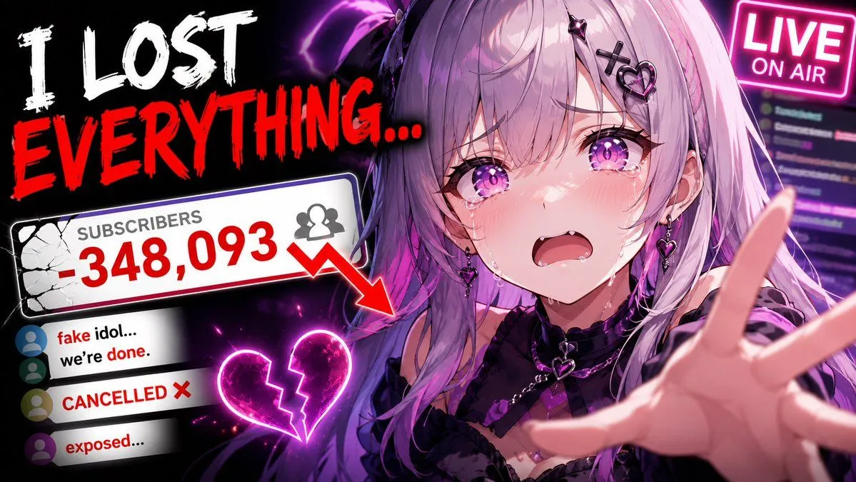 Viral YouTube Thumbnail TemplateGPT Image 2
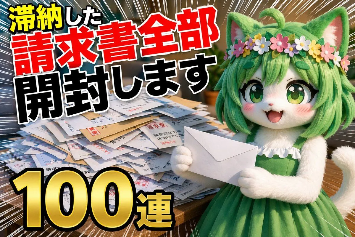 YouTube Unboxing Thumbnail PromptGPT Image 2
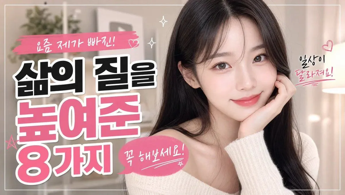 Korean Sleep Tips ThumbnailGPT Image 2
 VTuber Stream ThumbnailGPT Image 2
 Japanese Katsudon Diet ThumbnailGPT Image 2
 Premium Men's Skincare ThumbnailGPT Image 2
 Japanese Pricing Comparison ThumbnailGPT Image 2
 Cinematic Film Genre Color Grading ComparisonGPT Image 2
 Dark Historical Podcast CoverGPT Image 2
 Cute Travel Vlog ThumbnailGPT Image 2
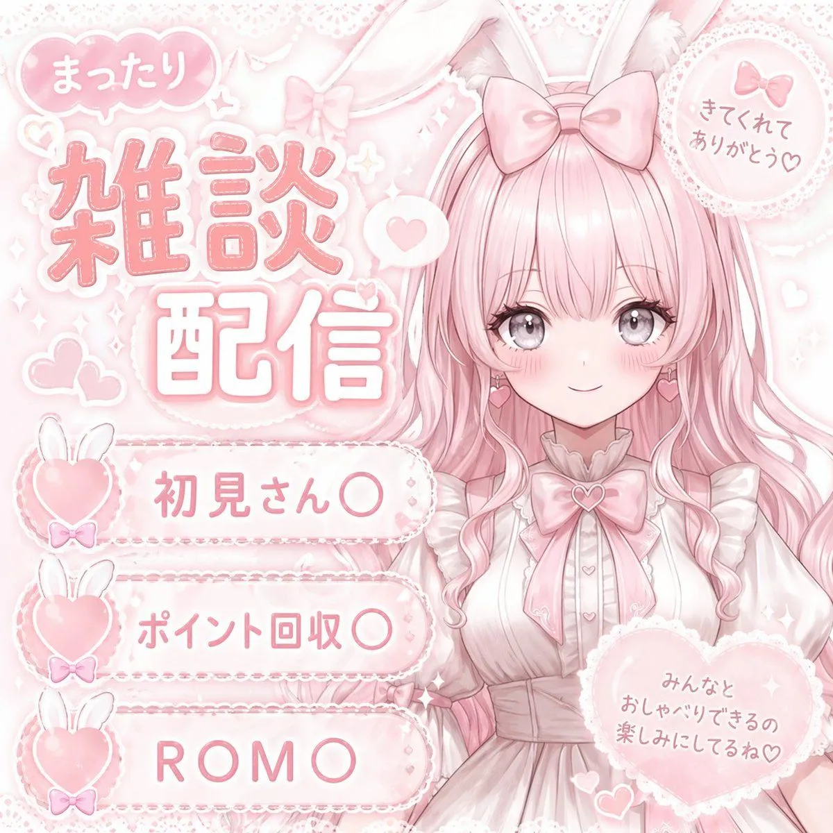 Pastel Pink VTuber Stream ThumbnailGPT Image 2
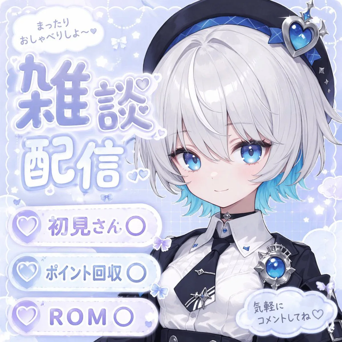 Anime VTuber Livestream ThumbnailGPT Image 2
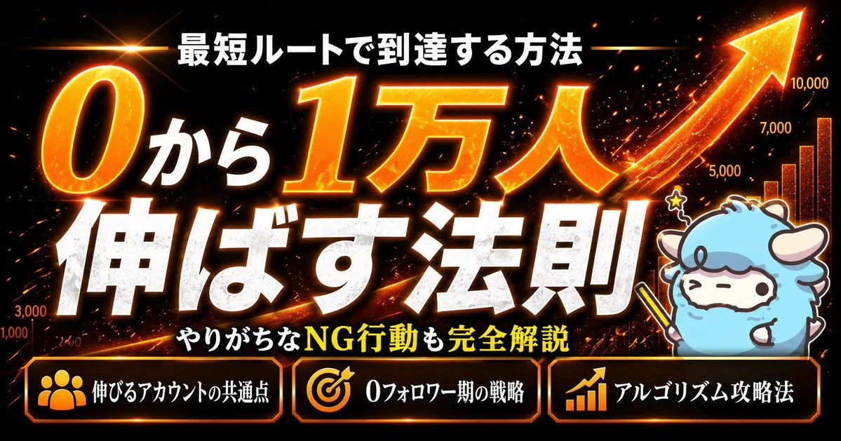 Fiery Japanese Growth ThumbnailGPT Image 2

That is the whole guide.
Did it work for you?
Get promptclay's new guides by email
Check your inbox: tap the link we sent to confirm.