

We made 12 posters with GPT Image 2 to test the text rules in OpenAI's prompting guide. It spelled our title right every time. What went wrong was everything we had not written down.
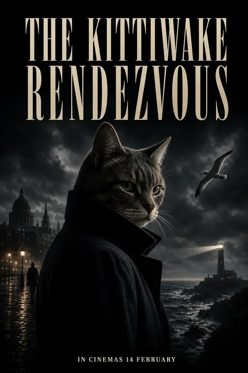
Quote every word, then say no other text
Without quotes, all 3 runs spelled the title right and all 3 added at least eight lines we never wrote: taglines, made-up press quotes, a credits block of letter-shaped noise. With every word in quotes and No other text, 3 of 3 showed only our two lines.
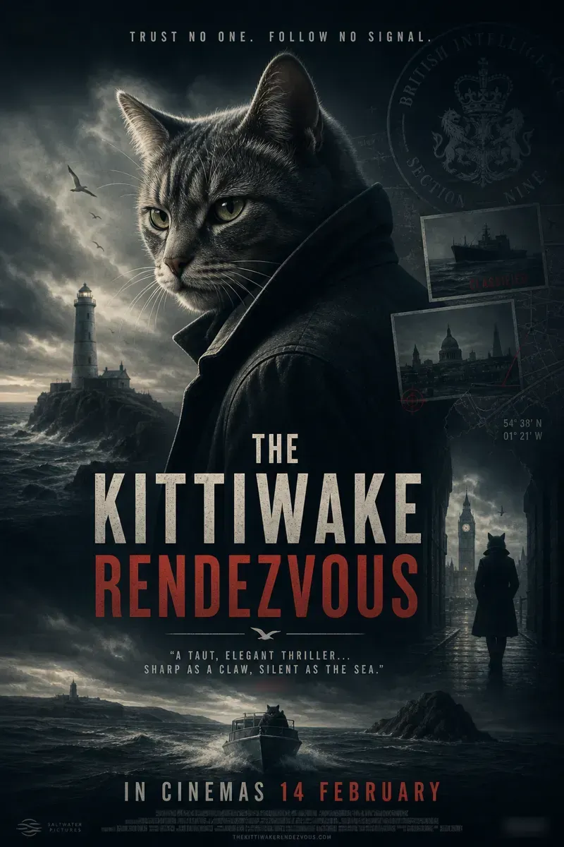 Before
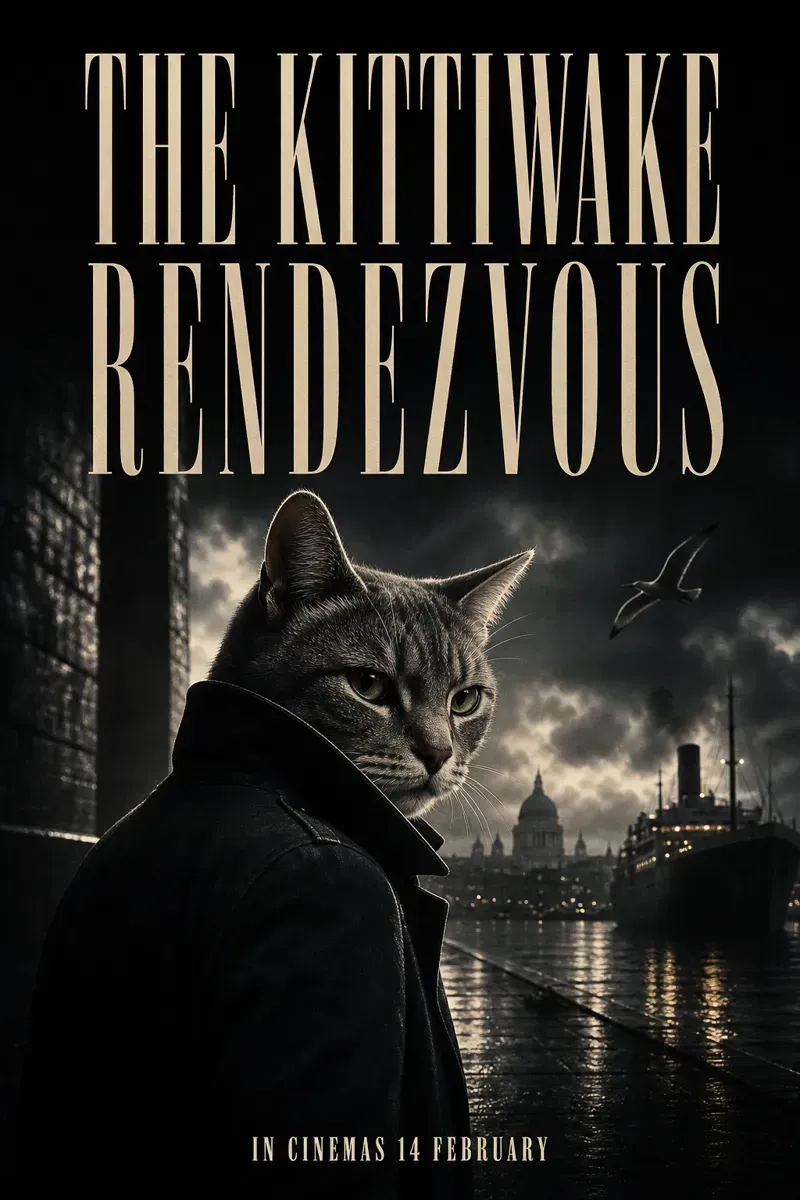 After
Left: Generate a movie poster. The theme of the movie is a spy thriller, the movie title is The Kittiwake Rendezvous, the lead actor is a cat, with an extreme sense of atmosphere. Put the release date at the bottom: in cinemas 14 February. We blurred a real magazine's name and a sound logo it added. Right: the prompt below, plus Title text (EXACT, verbatim, no extra characters): "THE KITTIWAKE RENDEZVOUS". and Bottom line, small, centred: "IN CINEMAS 14 FEBRUARY". No other text, no credits block, no logos.
GPT Image 2Spy Movie Poster with Cat
Generate a movie poster. The theme of the movie is a {theme}, the movie title is "{title}", the lead actor is "{star}", with an extreme sense of atmosphere.
Filled in: spy thriller, THE KITTIWAKE RENDEZVOUS, a cat. Then add the two lines above.
Write the type like a brief
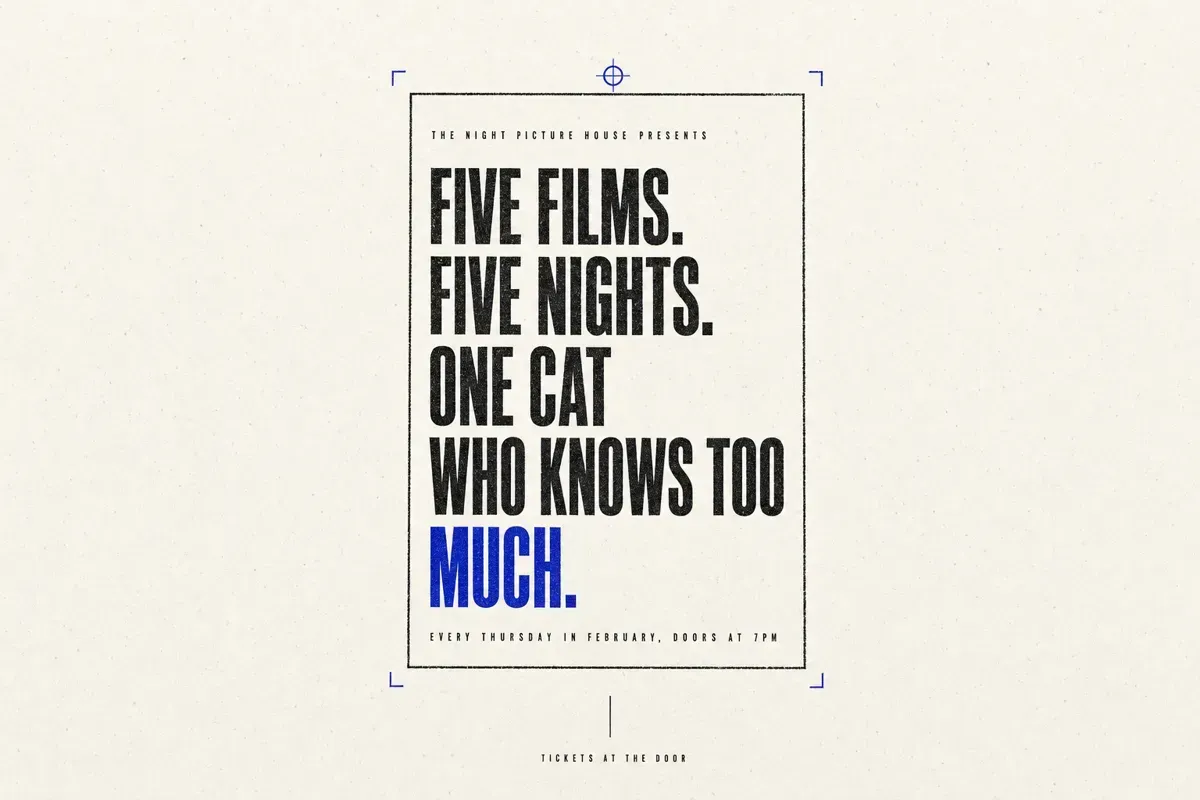
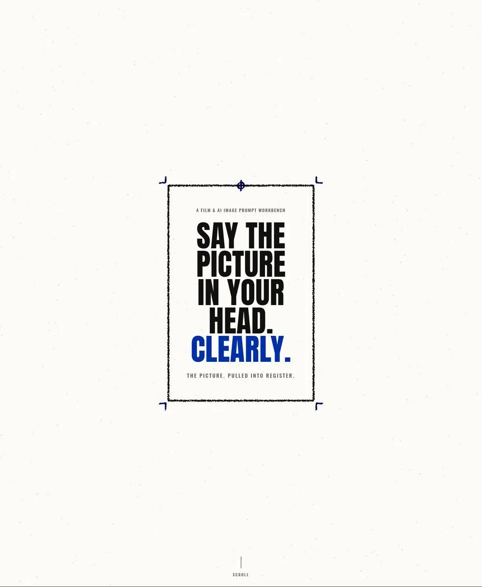
OpenAI's guide asks for font style, size, colour and placement as constraints. This post sets each line: a tiny spaced eyebrow, a five-line condensed headline, one word in blue, a tiny caption, no extra text. We put quoted words in its blanks. Every line landed in place, spelled right, in 2 runs of 2.
GPT Image 2Minimalist Klein Blue Typography Poster
Create a minimalist editorial landing-page hero poster on an off-white coated-paper background with subtle dust speckles and scanned paper grain. Center a single vertical rectangular print sheet slightly above the middle of a wide landscape canvas, leaving large empty margins. The sheet has a thin imperfect black ink border with a slightly rough printed texture, plus four small Klein-blue crop/corner registration marks just outside the rectangle, and one small blue circular registration target centered on the top border. Inside the sheet, use stark condensed bold uppercase typography like a printed production document: a tiny tracking-spaced eyebrow at the top reading {eyebrow_text}, then a large stacked headline in black reading {main_headline} across five tight lines, followed by the final word in vivid Klein blue reading {accent_word}. Add a tiny tracking-spaced caption beneath the headline reading {caption_text}. At the very bottom center of the canvas, far below the poster, add a thin vertical black line and tiny uppercase text reading {bottom_label}. Use only three colors: warm paper white, black ink, and intense Klein blue. Keep all corners square, no rounded UI elements, no shadows, no gradients, no illustrations, no photos, no extra text.
Each blank got its words in quotes, such as "FIVE FILMS. FIVE NIGHTS. ONE CAT WHO KNOWS TOO" and "MUCH."
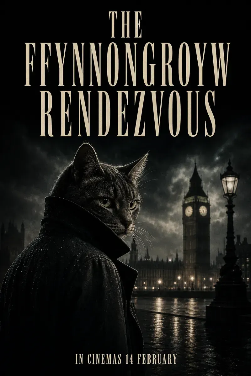
Spell hard names letter by letter
OpenAI suggests spelling uncommon words out. We tried a Welsh village: THE FFYNNONGROYW RENDEZVOUS. In quotes alone it came out right 2 of 2 times. With Spell it letter by letter: F-F-Y-N-N-O-N-G-R-O-Y-W added, also 2 of 2. It changed nothing for us, but it costs one line, so we keep it for names nobody has seen.
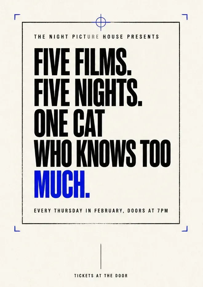
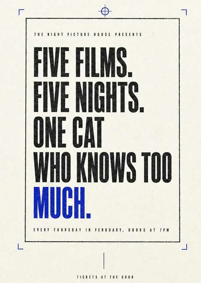
Use medium or high quality for small text
OpenAI recommends medium or high quality for small text. We ran the step 2 poster once at low and once at high. Both spelled every word right. At low, three letters of the smallest line came out grey and the paper went flat. At high, the small lines look printed.
 Before
 After
Eight more poster prompts, sorted by job
The four steps hold for any poster. Below are eight more real prompts from the site, grouped by what the poster is for. The highlighted words are the ones you change. We ran three of them with our own words and say what came back; the other five we read line by line, and we only say what they ask for.
Shop openings and sales
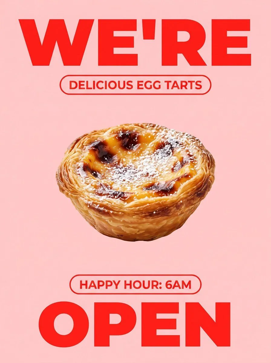
This one is built for a shop window: a huge word at the top, a pill, one photographed pastry, a second pill and a huge word at the bottom. Its blanks take words without quotes, yet both of our runs with FRESH, BUTTER EGG TARTS, FIRST TRAY AT 7AM and DAILY came back with exactly those four lines and nothing else. The reason is its last paragraph, which counts the text and bans prices, addresses and small print.
GPT Image 2Bold Egg Tart Opening Poster
Goal: Create a bold minimalist food advertisement poster for a bakery opening, centered on one photorealistic Portuguese-style egg tart. Canvas: Vertical poster in 3:4 aspect ratio, soft pale pink background with subtle smooth gradient, no borders or watermark. Layout: At the very top, place an enormous uppercase red headline reading {top_headline}, using a heavy geometric sans-serif font, spanning nearly the full width. Directly underneath, centered, add one rounded pill outline in red containing the uppercase text {product_label}. In the middle of the poster, place exactly 1 large egg tart floating on the pink background, photographed realistically with no plate or hands. Below the tart, centered, add one smaller rounded red outline pill containing the uppercase text {happy_hour_text}. At the bottom, place an enormous uppercase red word reading {bottom_headline}, using the same heavy sans-serif font, spanning almost the full width. Subject details: The egg tart should be golden brown with a flaky layered puff-pastry crust, glossy yellow custard filling, dark caramelized blister spots, and a light dusting of powdered sugar across the top. Make it appetizing, sharply detailed, and studio-lit, with a subtle natural shadow only if needed. Visual style: Modern pop-art bakery poster, high contrast red typography on pastel pink, clean negative space, centered alignment, crisp commercial food photography, bright but soft lighting. Text constraints: Use exactly 4 visible text elements: 1 top headline, 1 product-label pill, 1 happy-hour pill, and 1 bottom headline. Keep all typography bright red, uppercase, bold, and clean. Do not add any extra logos, icons, prices, addresses, small print, or decorative objects.
Our fill-ins: FRESH, BUTTER EGG TARTS, FIRST TRAY AT 7AM, DAILY. To sell something else, change the egg tart in the first and fourth paragraphs too.
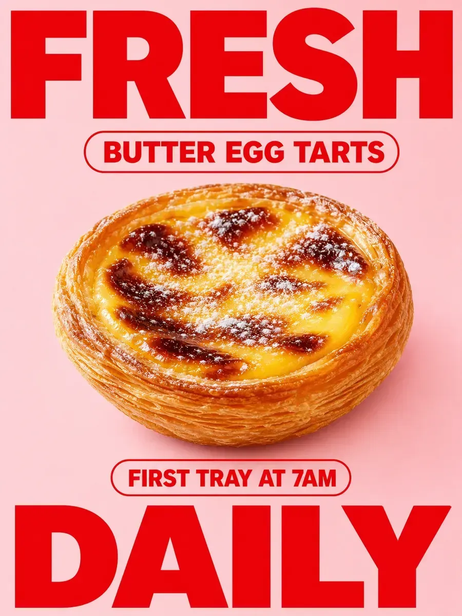
Counting works like quoting. When a prompt says how many pieces of text there are and what each one says, there is no room left for a tagline the model makes up.
Exhibitions and talks
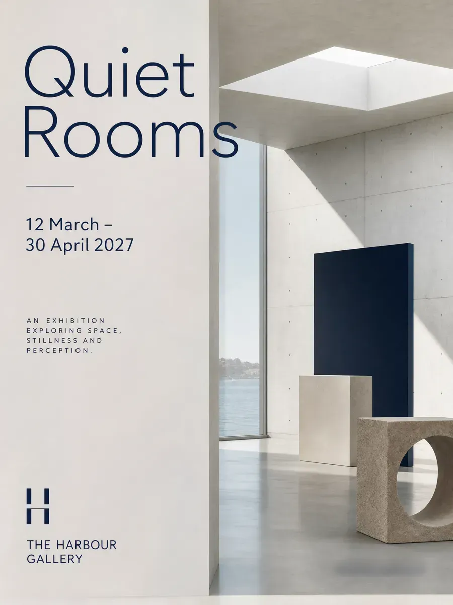
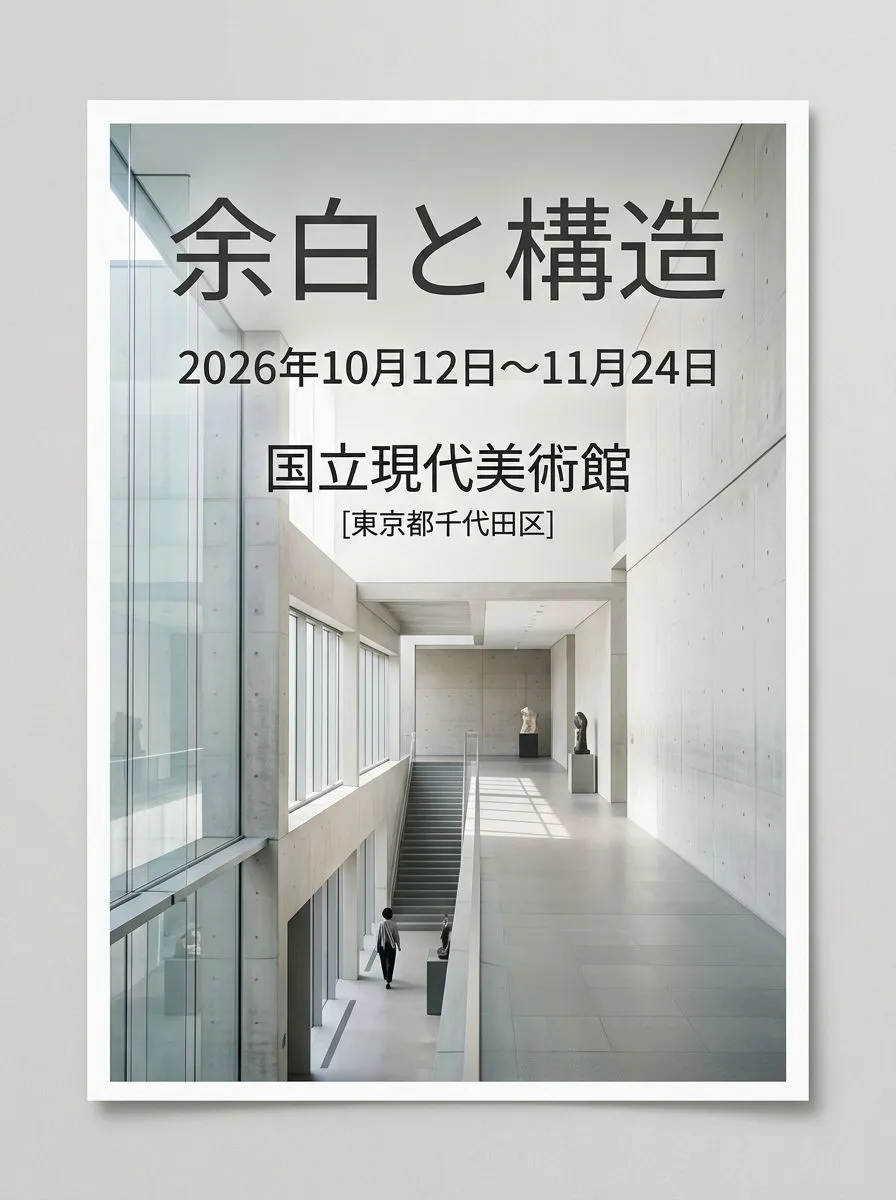
A gallery poster with three blanks: name, dates, venue. Each one appears twice, once in a list and once inside single quotes where the type should sit. Most of the prompt is a ban on one common failure, a photo of a framed poster on a wall instead of the poster itself. Our one run with Quiet Rooms, 12 March – 30 April 2027 and The Harbour Gallery came back flat and frameless, every word right. It also added a line about the show and a web address we never gave. We blurred the address: an invented one can belong to someone.
GPT Image 2Minimalist Event Flyer Design
[Event Information] - Event Name: {event_name} - Date & Time: {date} - Venue: {venue} [Quality, Direction, and Composition Specifications] - Style: A poster for a contemporary art exhibition or modern design event, clean and minimalist editorial layout. - Visual Elements: A beautiful live-action composition conveying silence and intelligence, set against geometric abstract art objects or concrete and glass architectural spaces. - Typography Placement (For GPT-image / Nano Banana Pro): In the empty margins of the screen, the event name '{event_name}', the date '{date}', and venue information '{venue}' are beautifully laid out in a sophisticated, modern sans-serif font. The typography harmonizes without detracting from the beauty of the overall image. - Lighting & Color: A clean space based on white, cool natural light with soft gradients of light, neutral tones with accent colors (e.g., navy or dark gray). [Strict Layout and Output Constraints (Required)] - Output the completed design itself, filling the entire canvas. Scene descriptions inside the design (walls, spaces, shadows) may follow the text instructions. - Prohibited items: Photographs of the finished poster inside a frame, stuck to a wall, mockup photos placed on tables or paper, perspective distortion of paper edges, or drop shadows. - Output the finished flat 2D design itself, filling the entire canvas. Scene elements inside the design (walls, rooms, shadows) described above are allowed. Absolutely NO photo-of-a-poster mockups: no picture frames, no poster-on-wall or poster-on-desk shots, no perspective warp or drop shadow around the artwork's edges. - Aspect Ratio: --ar 3:4
Our fill-ins: Quiet Rooms, 12 March – 30 April 2027, The Harbour Gallery. Add No other text at the end if you want only these three lines.
Festivals and concerts
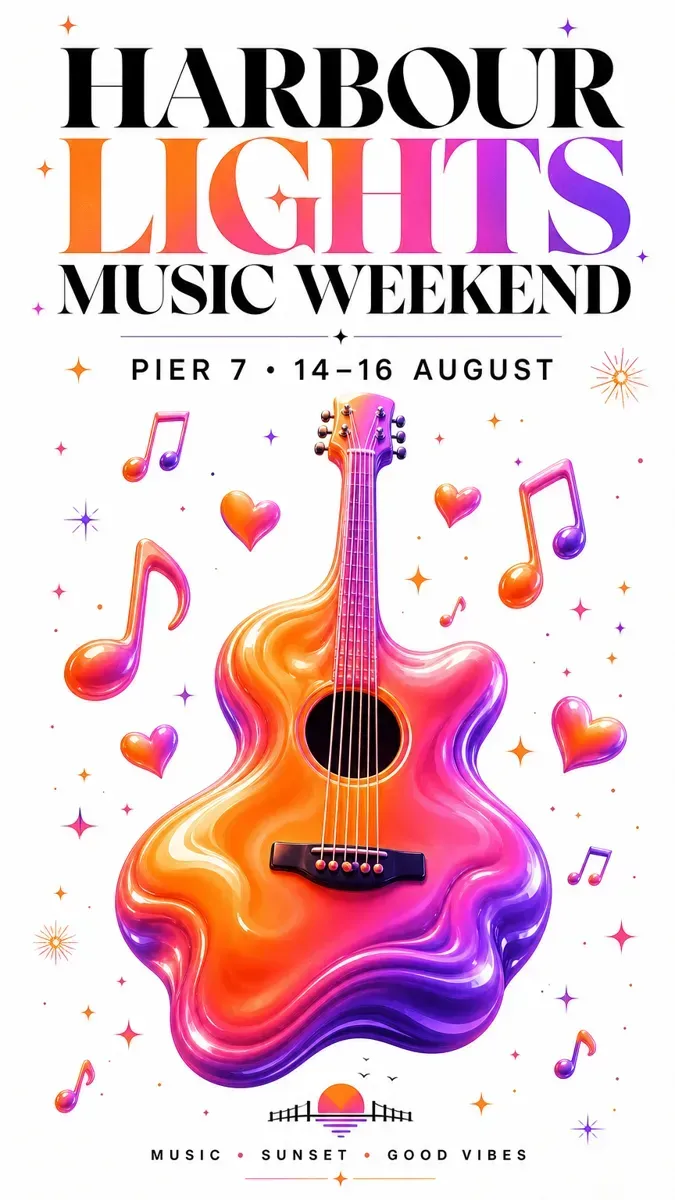
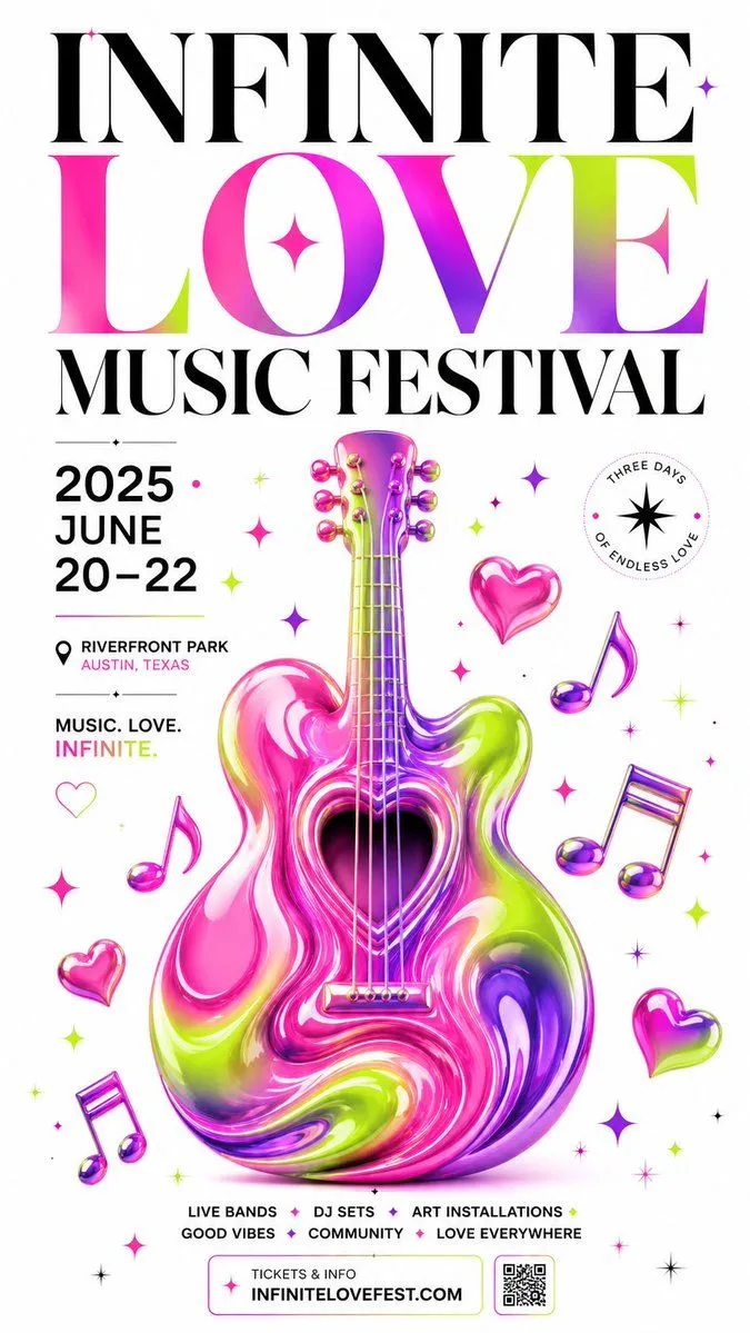
One long sentence with two quoted blanks, the festival name and a date-and-place line, plus three colours for a liquid guitar. In our run HARBOUR LIGHTS MUSIC WEEKEND and PIER 7 · 14–16 AUGUST came out right, and a third line we never wrote appeared at the bottom. The prompt has no no other text, so the model filled the space. Add those words if the poster is going to print.
GPT Image 2Gradient Music Festival Poster
A stunning music festival vertical social media poster with a clean white background, at the center a large beautifully rendered 3D acoustic guitar shape filled with a flowing liquid gradient in {colors}, the guitar form slightly abstracted and organic with a glossy smooth inflated aesthetic, surrounded by floating gradient music notes hearts and sparkle diamond symbols in matching fluorescent colors, bold large serif display typography at the top reading "{festival_name}" mixing oversized black and gradient-colored letters, date and location info "{event_details}" in clean minimal sans-serif below, tiny decorative star and spark motifs scattered across the white background, overall composition elegant yet high-energy, premium event poster quality, 9:16 vertical ratio
Our fill-ins: HARBOUR LIGHTS MUSIC WEEKEND, PIER 7 · 14–16 AUGUST, and sunset orange, coral pink and violet.
Film posters
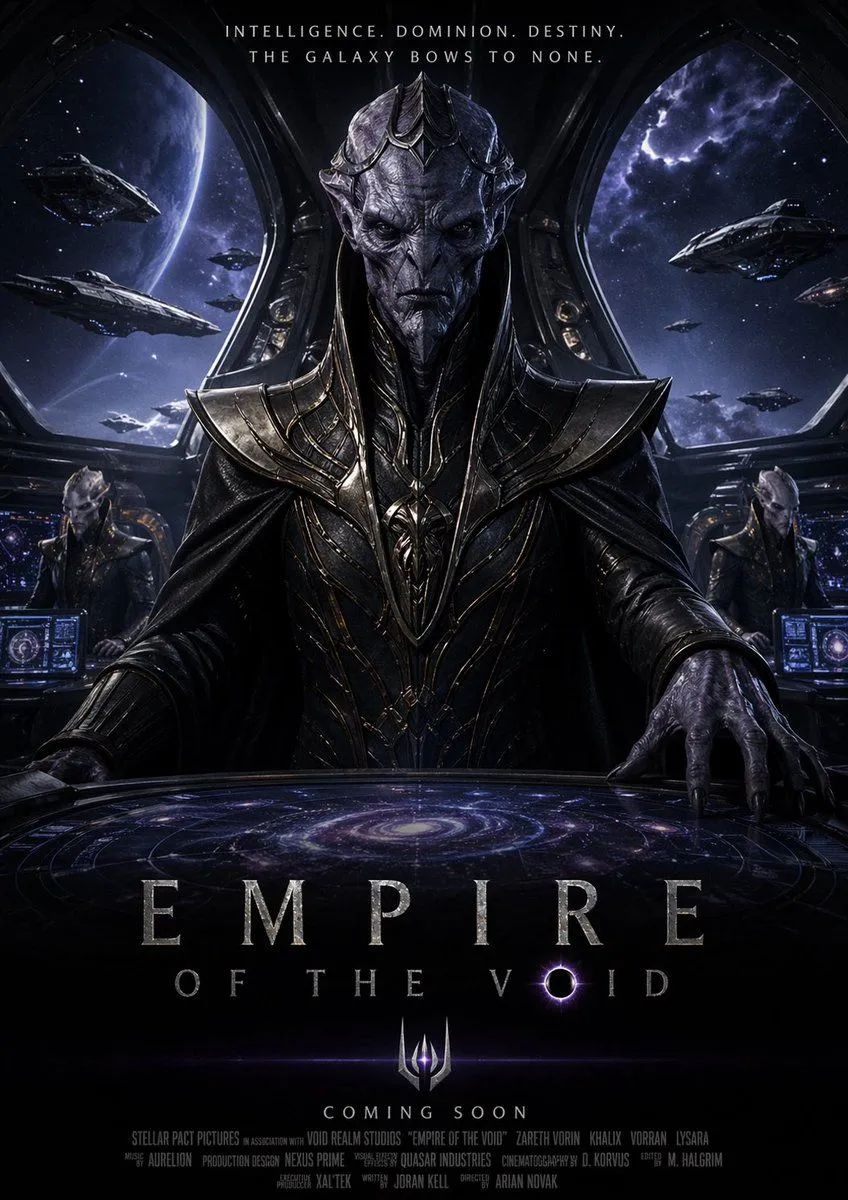
For a made-up film, this one-sheet splits the title into two blanks, so a long name can sit on two lines, and adds a tagline and a release line. Read the end before you run it. It asks for a dense strip of tiny production credits, the same block of letter-shaped noise our step 1 runs made without being asked. Delete that line, or write the credits out yourself in quotes.
GPT Image 2Dark Space Emperor Movie Poster
A dark epic sci-fi movie poster for {film_title}, in a highly cinematic photorealistic space-opera style. Centered composition with a tall alien emperor standing behind a massive circular command table, viewed from slightly below to make the figure feel imposing and godlike. The emperor wears ornate black and gunmetal biomechanical armor with sharp layered pauldrons, engraved metallic filigree, a long dark cloak, and a regal elongated helmet-crown. The face is mostly obscured in shadow, giving a mysterious, intimidating presence. One large clawed hand rests prominently on the glowing table in the foreground. The command table displays a luminous spiral galaxy hologram in blue-violet tones, with concentric interface rings and subtle cosmic light. The setting is the bridge of a colossal starship or throne room, with two curved panoramic windows framing outer space. Outside the windows are 8 visible spacecraft total: 4 on the left side and 4 on the right side, including several large battleships and smaller escort vessels. A huge planet fills much of the left background, while the right background shows a purple-blue nebula and starfield. Two secondary alien officers are seated in the mid-background, 1 on the left and 1 on the right, each at glowing futuristic control consoles. The color palette is deep black, steel gray, indigo, violet, and cold blue, with dramatic rim lighting, glossy metallic reflections, and dense atmospheric shadows. The layout should feel like a premium blockbuster poster: a centered top tagline in small uppercase text reading {tagline}, the giant title near the bottom in elegant spaced serif capitals with the words {main_title} on the first line and {subtitle} below it, with the letter O stylized as a glowing black-hole eclipse. Beneath that, add a glowing imperial trident-like emblem centered above the release line {release_text}. At the very bottom, include a dense strip of tiny production credits in authentic movie-poster typography. Ultra-detailed, symmetrical, ominous, imperial, galactic conquest mood, vertical one-sheet poster, premium VFX key art, sharp focus, high contrast, dramatic sci-fi lighting.
Quotes and wall prints
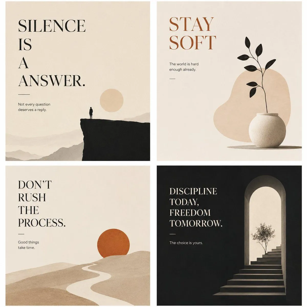
Four small posters share one square here, each with its own headline blank and a fixed line of small print under it. Proof-read what you type. The post's own example headline is SILENCE IS A ANSWER., and the picture on its page prints that mistake exactly as written. The model copies your words, typos included.
GPT Image 2Minimalist Philosophical Poster Grid
Goal: Create a refined 2x2 grid of four minimalist philosophical wall-art posters with restrained illustration, spacious typography, and a quiet editorial mood. Canvas: Square format, four equal poster panels separated by clean white gutters. Use warm off-white paper texture for three panels and deep charcoal black for the bottom-right panel. Overall style is calm, premium, minimalist, suitable for interior prints and poster collections. Layout: Exactly 4 posters in a 2-by-2 arrangement. Each poster uses large high-contrast serif typography, generous negative space, a tiny subtitle line, a short horizontal rule, and one simple symbolic illustration. Poster 1, top-left: Cream background. Large black serif headline in the upper-left reads “{top_left_headline}” with stacked line breaks. Below it, a thin horizontal rule and small text: “Not every question deserves a reply.” Illustration: distant beige mountain layers across the bottom, a dark black cliff occupying the lower right, a tiny lone human silhouette standing on the cliff edge, and a pale beige sun disk near the right side. Poster 2, top-right: Cream background. Large warm rust-brown serif headline in the upper-left reads “{top_right_headline}”. Small text beneath: “The world is hard enough already.” Add a short horizontal rule. Illustration: a rounded beige abstract blob in the center-right background, a matte white round ceramic vase at the lower right, and one thin black plant stem with exactly 8 black leaves emerging upward. Poster 3, bottom-left: Cream background. Large black serif headline in the upper-left reads “{bottom_left_headline}” arranged on multiple lines. Below it, a thin horizontal rule and small text: “Good things take time.” Illustration: soft rolling beige sand-like hills filling the lower half, a winding pale path leading toward the horizon, and one burnt-orange sun circle partly sitting behind a hill on the right. Poster 4, bottom-right: Deep charcoal black background. Large cream serif headline in the upper-left reads “{bottom_right_headline}” stacked on four lines. Below it, a thin cream rule and small text: “The choice is yours.” Illustration: on the right side, a tall arched doorway glowing with warm cream light, stone steps rising into the arch, and a small delicate tree silhouette near the top of the stairs. Visual style: Elegant serif typography similar to classic editorial poster design, muted earth palette of cream, beige, black, rust orange, and charcoal. Soft grain, subtle paper texture, flat minimal forms, balanced asymmetry, quiet contemplative atmosphere. Keep all four posters consistent as a cohesive collection. Constraints: Use exactly 4 poster panels. Keep typography crisp and legible. Do not add extra quotes, logos, signatures, frames, mockup walls, people beyond the single tiny silhouette in the first poster, or decorative clutter.
The small line under each headline is written into the prompt. Change those too, or they stay as they are.
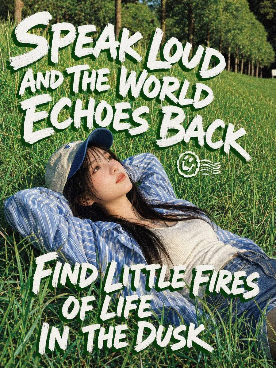
The next one is a photo with two lines of rough hand-painted lettering over it. It closes with no additional text, which does the job No other text did in step 1. The post's example quotes are seven words each and already fill the top half and the bottom third, so a longer quote has less room and will shrink.
GPT Image 2Meadow Lifestyle Quote Poster
Create a vertical 4:5 editorial poster combining outdoor lifestyle photography with bold hand-painted typography. Show a young woman relaxing in a lush green meadow at dusk, lying diagonally across tall grass with both arms folded behind her head, looking calmly upward and slightly away from camera. She has long dark hair, a natural contemplative expression, and wears a blue baseball cap, an oversized blue-and-white striped button-up shirt, a white ribbed tank top, and blue jeans. Use warm late-afternoon sunlight, deep green grass texture, a tree-lined background fading into soft focus, candid film-photography grain, high contrast, and a relaxed summer mood. Overlay large rough white brush-lettering across the image: top text reads “{top_quote}”; bottom text reads “{bottom_quote}”. Add exactly 1 small white doodle icon near the center-right between the text blocks: a hand-drawn smiley face with three wavy motion lines. Typography should be all caps, irregular, thick, energetic, slightly distressed, and integrated over the grass and subject without looking digitally perfect. Keep the subject visible beneath the text, with the upper quote occupying the top half and the lower quote occupying the lower third. No borders, no watermark, no extra logos, no additional text.
Chinese, Japanese and other scripts
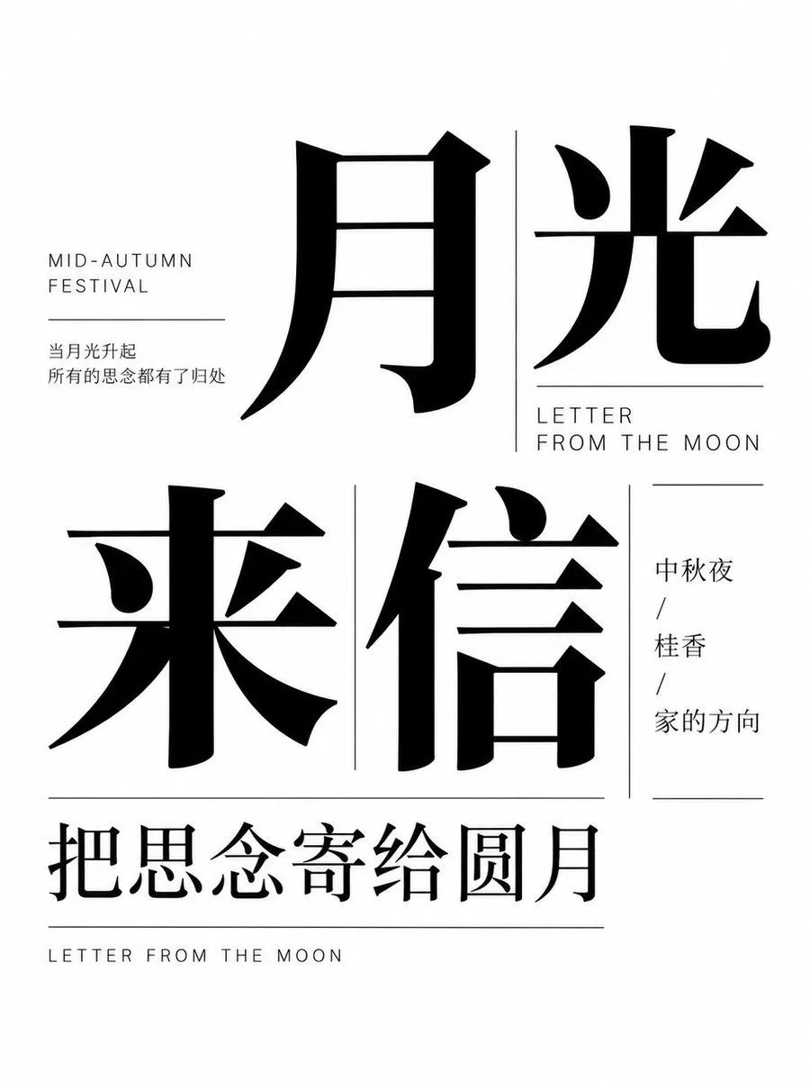
Here every word is written into the prompt in single quotes, Chinese and English, each with its place: two big characters at the top, a small English label, a column of three short phrases. There are no blanks. To make your own, replace the quoted words and keep the same number of lines, so the layout still fits.
GPT Image 2Mid-Autumn Typography Poster
Create a minimalist, high-contrast typography poster for the Mid-Autumn Festival. The design should be monochromatic (black text on a white background) and feature a sophisticated layout of Chinese characters and English labels. Layout & Text Content: 1. Top Section: Feature two massive, bold serif-style Chinese characters '月光' (Moonlight). To their left, include small uppercase sans-serif text 'MID-AUTUMN FESTIVAL' above a thin horizontal line, followed by two lines of smaller Chinese text: '当月光升起' and '所有的思念都有了归处'. 2. Middle Section: Display two large Chinese characters '来信' (Letter/Incoming Mail). To the right of these, place the English text 'LETTER FROM THE MOON' in uppercase sans-serif, separated by a vertical line from a column of three short Chinese phrases: '中秋夜', '桂香', and '家的方向'. 3. Bottom Section: A horizontal line separates the main body from a final row of medium-sized Chinese text '把思念寄给圆月'. Below this, at the very bottom edge, is the text 'LETTER FROM THE MOON' in small uppercase letters. Visual Style: Use a clean, modern editorial aesthetic. The primary Chinese font should be a heavy, elegant serif (Songti style), while secondary text uses a light sans-serif. Ensure ample negative space to maintain a balanced composition.
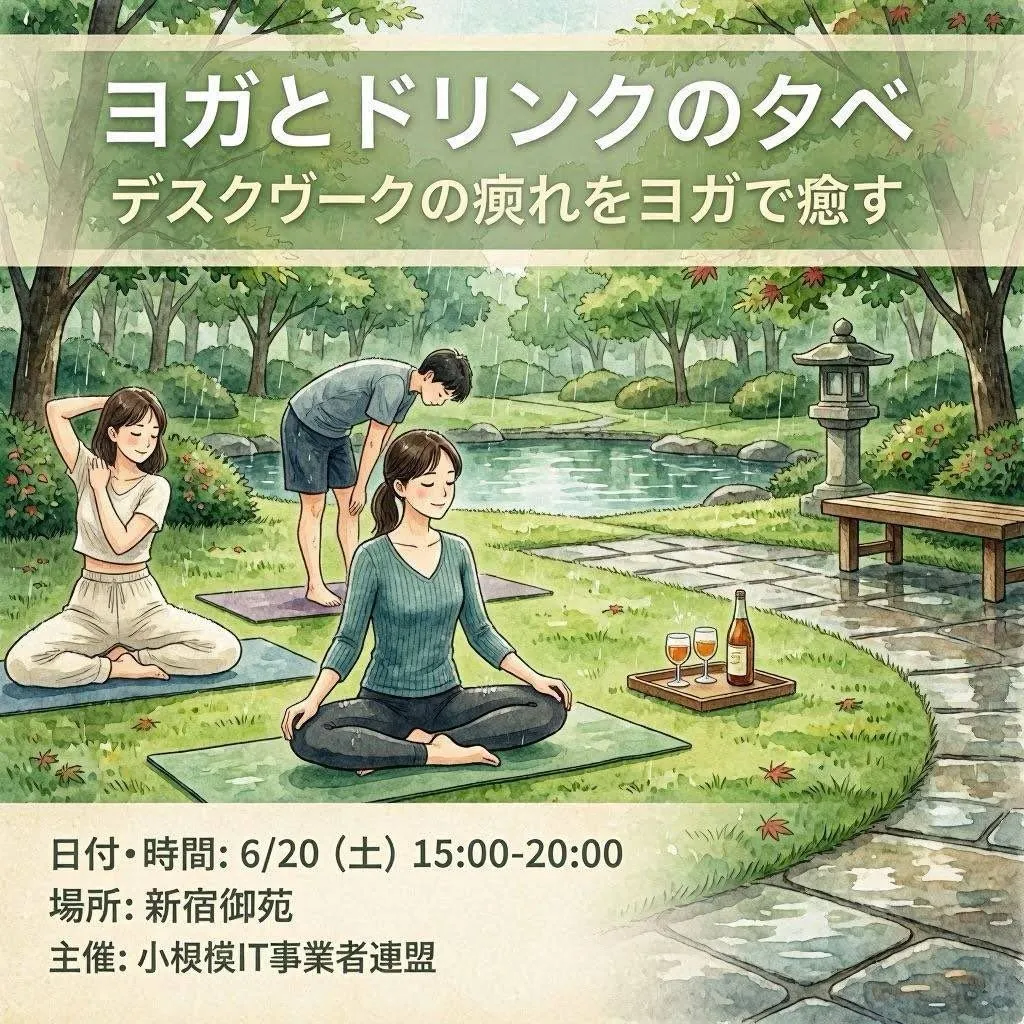
Last, a watercolour event flyer whose blanks take Japanese text, and whose final paragraph says to keep the Japanese exactly as written. If you type English into the blanks, change Large Japanese headline and that last line as well. In our thumbnail tests, a prompt that named one language and quoted another translated some of our words.
GPT Image 2Japanese Yoga and Drinks Event Flyer
Goal: Create a square illustrated Japanese event flyer for {event_title}, promoting an outdoor yoga-and-drinks evening for desk workers. Canvas: 1:1 square flyer, soft watercolor illustration, calm natural palette, hand-painted texture, gentle ink outlines, inviting wellness-event atmosphere. Layout: Use three horizontal zones: a translucent pale green title banner across the top, a large central garden illustration, and a cream information panel along the bottom. Keep all typography bold, clean, white or dark charcoal, with subtle drop shadows on the headline for readability. Top text: Large Japanese headline: {event_title}. Beneath it, smaller Japanese subtitle: {subtitle_text}. Central illustration: A peaceful Japanese-style park beside a pond, with leafy trees, shrubs, stepping-stone path, a stone lantern on the right, a simple wooden bench, rocks, grass, and a few scattered red leaves. Show exactly 3 yoga participants on mats: 1 seated woman in the foreground wearing a teal ribbed long-sleeve top and dark pants, sitting cross-legged with relaxed hands on knees; 1 woman on the left wearing a white sleeveless top and loose white pants, seated cross-legged and stretching one arm behind her head; 1 man in the rear wearing a light gray T-shirt and navy shorts, barefoot on a mat, bending forward with hands near knees. Add exactly 1 wooden drink tray on the grass to the right of the foreground mat, containing exactly 3 drink items: 2 stemmed glasses filled with amber/orange drinks and 1 tall bottle with a warm-colored label. Bottom information panel: Cream rectangle with three bold Japanese lines, aligned left: {date_and_time}, {location}, and {organizer}. Constraints: Preserve the Japanese text exactly as written in the parameter defaults, make the flyer look like a finished event poster rather than a photo, avoid logos or watermarks, keep the faces simple and unobtrusive, and do not add extra people, extra drinks, or extra text.
More looks to try
Four more posters with their words written into the prompt.
Questions
Do I need quotes if the model spells well anyway?
Yes. Quotes mattered less for spelling than for stopping extra words. Every unquoted run added lines, and every quoted run with No other text added none.
Which quality should I pick?
Medium was enough for big titles: 10 of 10 medium runs spelled the title right. Use high when the poster has captions, dates or other small lines.
Why did my poster get a fake credits block?
Film posters usually carry one, so the model adds it. Write no credits block and No other text at the end of the prompt.
Can GPT Image 2 write Chinese, Japanese or Korean?
Yes. OpenAI's guide even has a use case for translating the text inside an image while keeping the layout. Quote the exact characters, and make sure the style words name the same language as the words you quote.
How do I fix one wrong letter without starting over?
OpenAI's guide says to keep the prompt strict and make small wording or layout changes, and for edits to name the one change and list what must stay the same. We did not test edits for this guide, so take that as their advice, not our result.
Why did the model add a website or a logo?
It fills the gaps a real poster would have. Our gallery poster got a web address and a monogram, and the festival poster an extra line. In step 1, No other text, no credits block, no logos stopped it in 3 runs of 3.
The 14 prompts in this guide
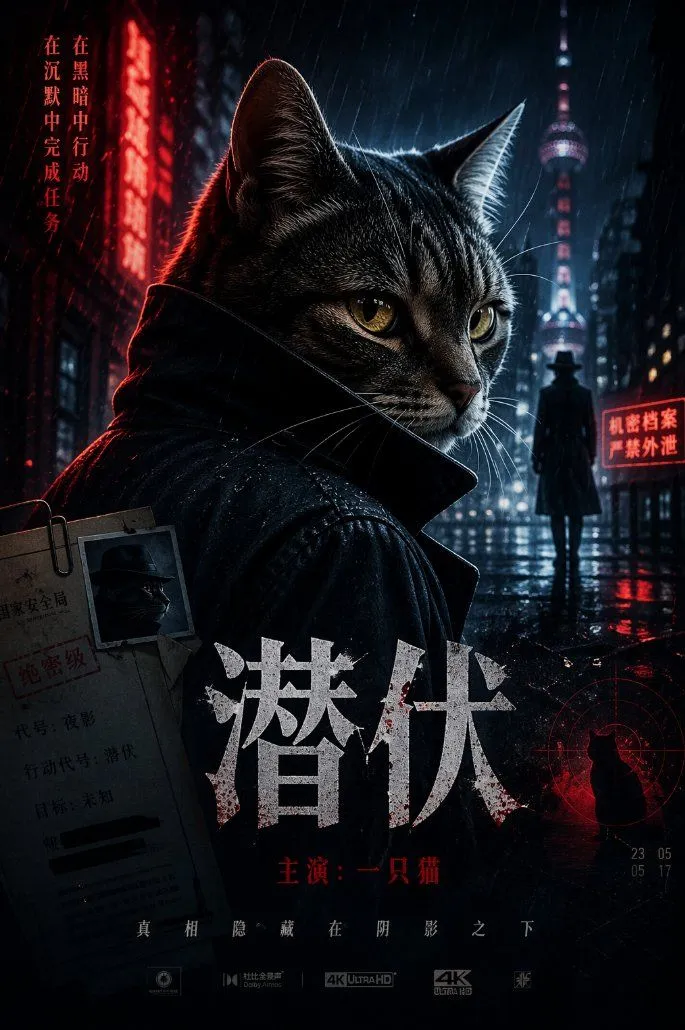 Spy Movie Poster with CatGPT Image 2
 Minimalist Klein Blue Typography PosterGPT Image 2
 Bold Egg Tart Opening PosterGPT Image 2
 Minimalist Event Flyer DesignGPT Image 2
 Gradient Music Festival PosterGPT Image 2
 Dark Space Emperor Movie PosterGPT Image 2
 Minimalist Philosophical Poster GridGPT Image 2
 Meadow Lifestyle Quote PosterGPT Image 2
 Mid-Autumn Typography PosterGPT Image 2
 Japanese Yoga and Drinks Event FlyerGPT Image 2
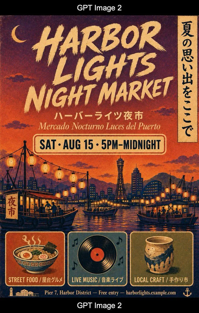 Retro Harbor Lights Night Market PosterGPT Image 2
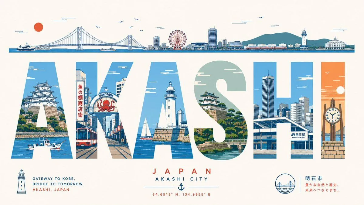 Akashi Typographic Travel PosterGPT Image 2
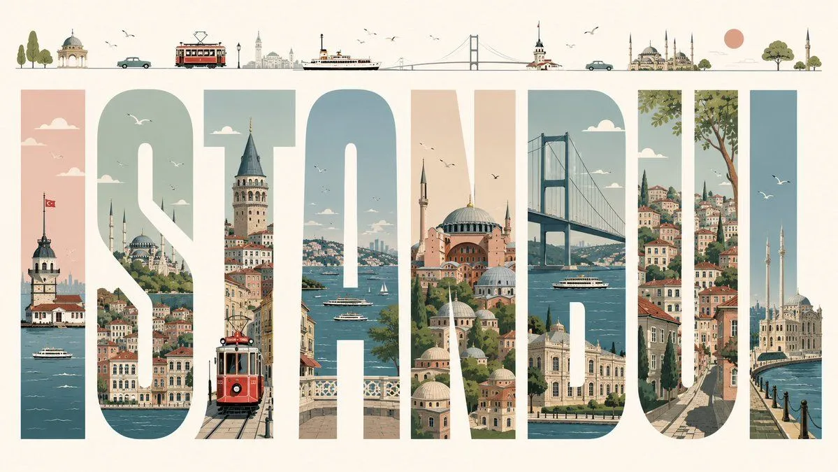 Istanbul Typographic Travel PosterGPT Image 2
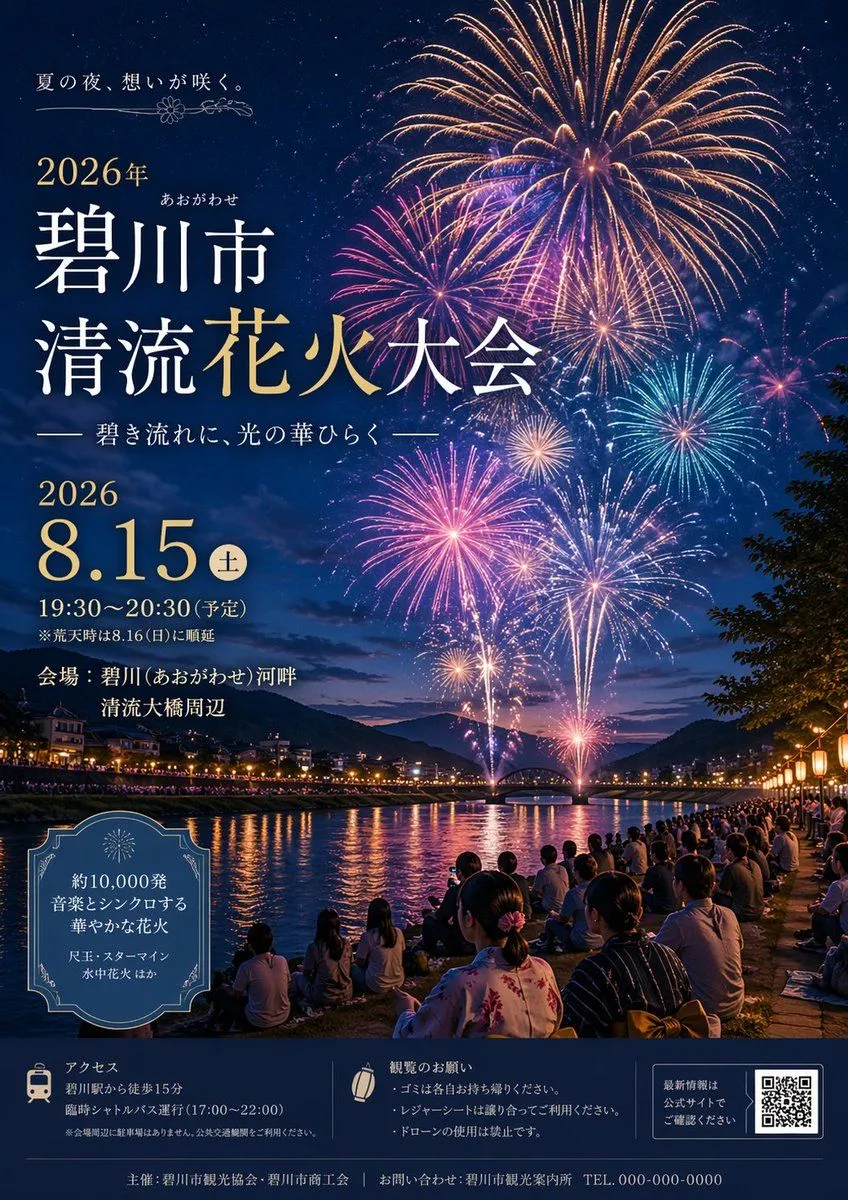 Japanese Fireworks Festival PosterGPT Image 2

That is the whole guide.
Did it work for you?
Get promptclay's new guides by email
Check your inbox: tap the link we sent to confirm.