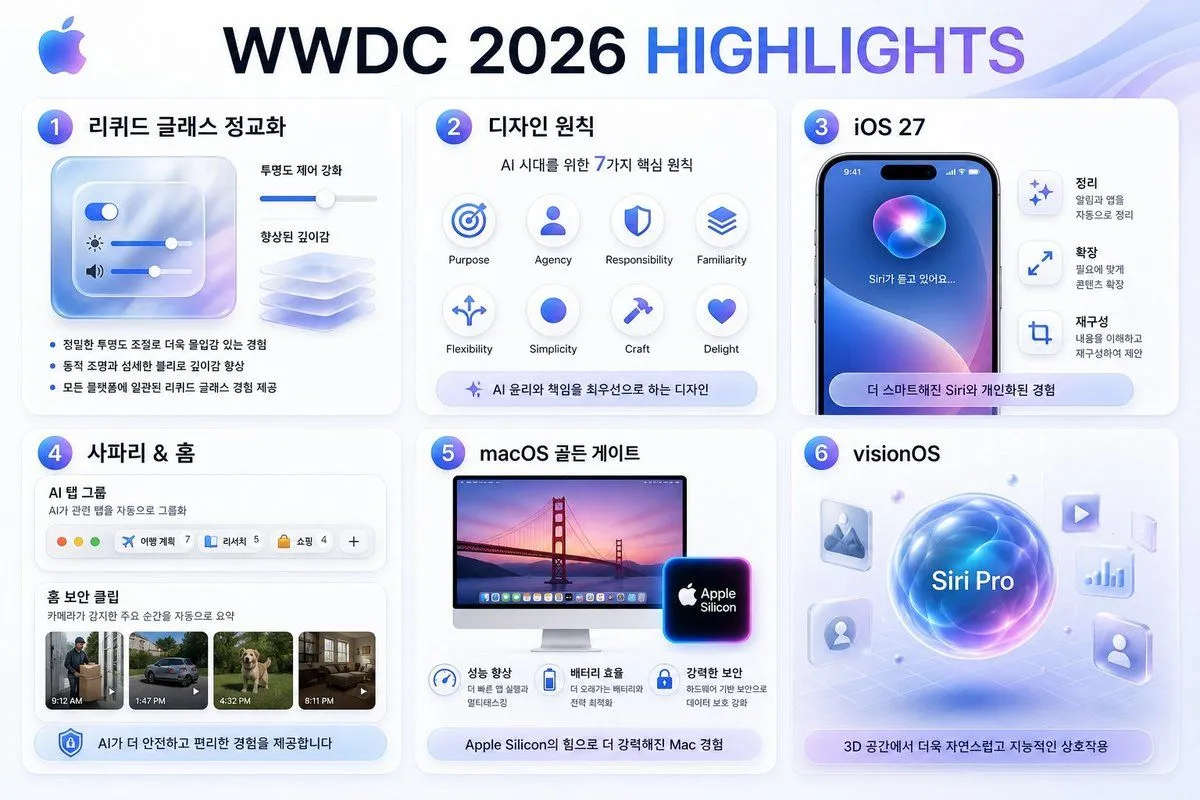
WWDC 2026 Highlights Infographic
Goal: Create a polished Apple-style Korean infographic slide summarizing headline_text from a designer perspective. Canvas: 16:9 horizontal presentation graphic, 1152×768 feel, white-to-pale-blue gradient background with soft translucent wave ribbons in the top-right corner. Use Apple-inspired glassmorphism, rounded cards, subtle shadows, blue/purple gradients, clean SF Pro-like typography, and a small multicolor Apple logo at the top-left. Layout: Large centered headline at the top, with “WWDC 2026” in dark navy and “HIGHLIGHTS” in blue-to-purple gradient. Under it, arrange exactly 6 rounded white cards in a 3-column by 2-row grid, each card numbered with a glossy blue-purple circular badge from 1 to 6. Card 1: Title liquid_glass_title. Show a translucent frosted-glass control panel with exactly 3 horizontal sliders: a toggle slider, a brightness slider with sun icon, and a volume slider with speaker icon. To the right, show a depth-enhancement slider and a stack of translucent glass sheets. Include exactly 3 Korean bullet points: “정밀한 투명도 조절로 더욱 몰입감 있는 경험”, “동적 조명과 섬세한 블러로 깊이감 향상”, “모든 플랫폼에 일관된 리퀴드 글래스 경험 제공”. Card 2: Title design_principles_title. Subtitle “AI 시대를 위한 7가지 핵심 원칙”. Show exactly 7 circular principle icons in a neat grid, labeled in English: Purpose, Agency, Responsibility, Familiarity, Flexibility, Simplicity, Craft, Delight. Even though 8 label positions are visible, emphasize the subtitle says 7 principles while the visual grid contains these 8 labeled icon circles. Bottom pill caption: “AI 윤리와 책임을 최우선으로 하는 디자인”. Card 3: Title ios_title. Show a realistic iPhone mockup with dynamic island, blue-purple Siri orb wallpaper, and Korean text on screen “Siri가 듣고 있어요...”. To the right, include exactly 3 vertical feature rows with icons and Korean headings: “정리” with smaller text “알림과 앱을 자동으로 정리”, “확장” with smaller text “필요에 맞게 콘텐츠 확장”, and “재구성” with smaller text “내용을 이해하고 재구성하여 제안”. Bottom rounded pill: “더 스마트해진 Siri와 개인화된 경험”. Card 4: Title safari_home_title. Show a Safari-like AI tab group module labeled “AI 탭 그룹” with subtitle “AI가 관련 탭을 자동으로 그룹화”. Include exactly 4 visible tab chips plus one plus button: “여행 계획 7”, “리서치 5”, “쇼핑 4”, and a final add button “+”. Below, show a Home security clipping section titled “홈 보안 클립” with subtitle “카메라가 감지한 주요 순간을 자동으로 요약”. Include exactly 4 video thumbnails with time labels: 9:12 AM delivery person, 1:47 PM car, 4:32 PM dog, 8:11 PM living room. Bottom pill: “AI가 더 안전하고 편리한 경험을 제공합니다”. Card 5: Title macos_title. Show an iMac display with Golden Gate Bridge sunset wallpaper and a glowing Apple Silicon chip badge. Under it, include exactly 3 benefit icons with Korean headings and short subtext: “성능 향상”, “배터리 효율”, “강력한 보안”. Bottom pill: “Apple Silicon의 힘으로 더 강력해진 Mac 경험”. Card 6: Title “visionOS”. Create a futuristic spatial-computing scene: a glowing central blue-purple orb labeled “Siri Pro” hovering over a faint perspective grid. Around it place exactly 6 floating translucent app tiles/icons: image/photo icon, play icon, chart icon, person icon, profile silhouette icon, and one small glass panel. Bottom pill: “3D 공간에서 더욱 자연스럽고 지능적인 상호작용”. Visual style: High-end Apple keynote recap aesthetic, crisp vector UI mixed with soft 3D glass elements, blue/purple glow accents, consistent spacing, rounded 24px cards, light shadows, premium minimalism. Keep all Korean text legible and correctly spelled. Avoid extra logos, watermarks, signatures, or additional cards.