Vintage Kyoto Travel Poster
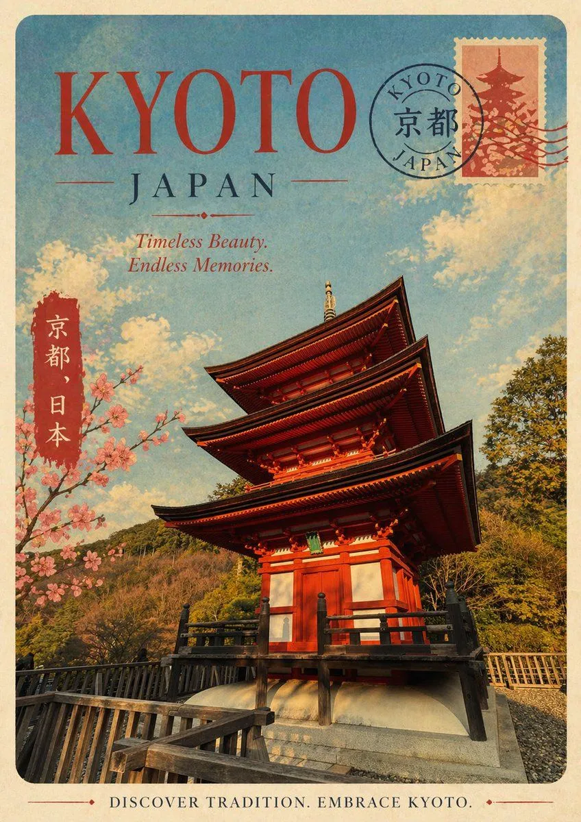
A vintage travel poster for destination_name, Japan, designed in a nostalgic mid-century tourism style with a faded paper texture, softly worn edges, and warm sun-aged colors. Use a vertical poster layout with rounded corners and a cream border. At the top, place the large headline headline_text in oversized elegant red serif letters, with “JAPAN” centered below in dark blue serif type and thin decorative divider lines. Add an italic tagline beneath it reading tagline_text. The main image should show a dramatic low-angle view of a traditional five-story Japanese pagoda in vivid vermilion red with dark wooden eaves and black railings, standing on a stone base with a wooden walkway in the foreground. Surround the pagoda with green wooded hills, a bright blue sky, and soft cream-colored clouds. On the left side, include a vertical red label with white Japanese characters reading “京都、日本”. Also add a blooming cherry blossom branch entering from the left, with clusters of pale pink flowers. In the upper right corner, include a postage stamp featuring a pagoda silhouette in muted red tones, partially overlapped by a circular postal cancellation mark reading “KYOTO JAPAN” with the kanji “京都” in the center and a few wavy postmark lines extending rightward. At the bottom, add a centered vintage footer slogan in serif capitals reading footer_text. The overall look should feel romantic, collectible, slightly distressed, and like a classic Japanese tourism print from the 1950s or 1960s.