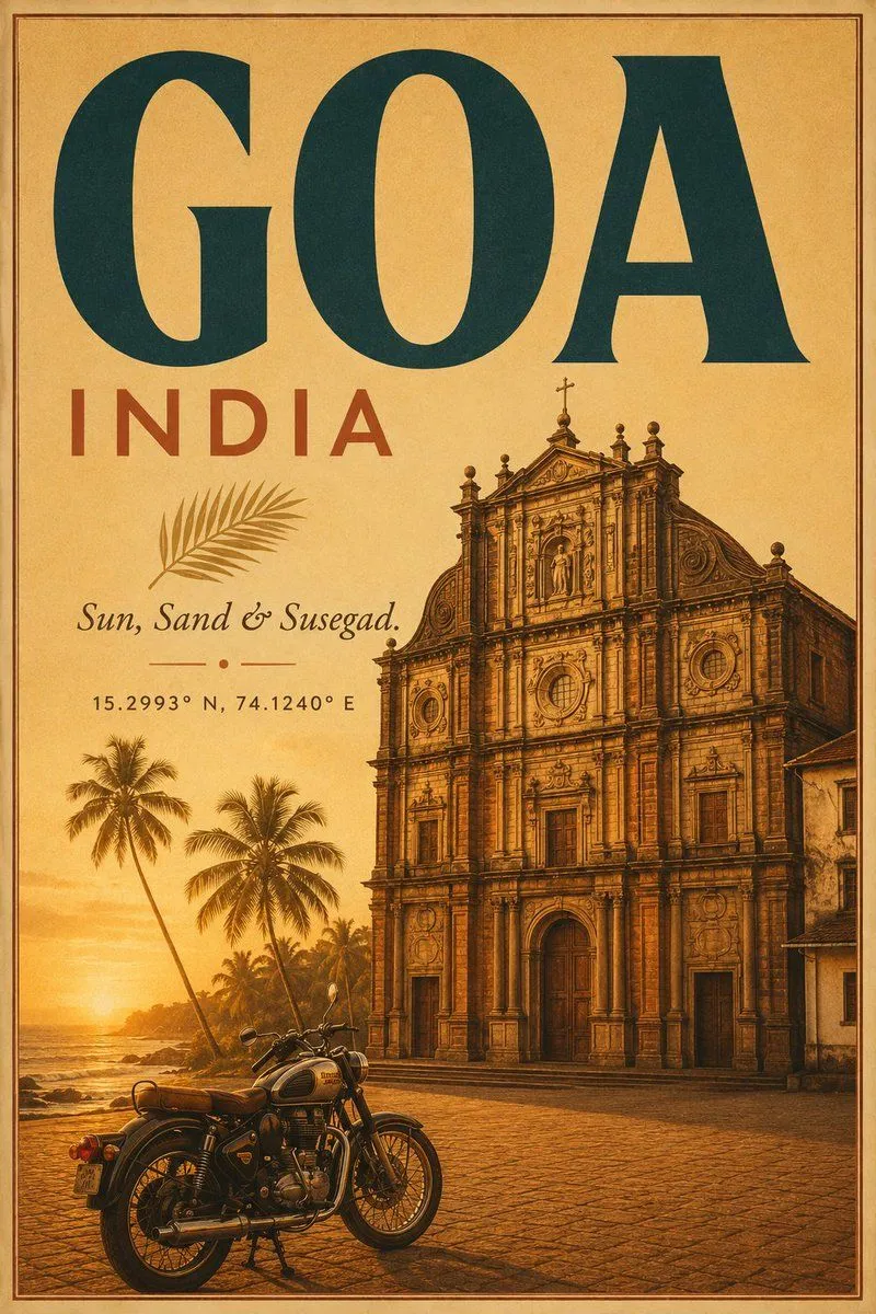
Vintage Goa Travel Poster
Goal: Create a vintage travel poster for destination, country, with a warm colonial coastal atmosphere and dramatic typography. Canvas: Vertical poster format, roughly 2:3 aspect ratio, aged tan parchment background with subtle paper grain, sepia-gold sunset color grading, and a thin double-line dark brown border inset from the edge. Layout: The top half is dominated by huge serif headline text reading “GOA” in dark teal, spanning nearly the full width. Directly beneath it on the left is spaced uppercase text reading “INDIA” in muted brick red. Below that, place a small illustrated palm frond, then an italic script tagline reading “tagline”, a small ornamental divider made of a short line, dot, and short line, and a coordinate line reading “coordinates”. Main scene: On the right side and lower half, show a highly detailed baroque Portuguese-style Goan church facade, golden-brown stone, ornate columns, arched doorway, circular windows, statues, finials, and a small cross at the top. The church occupies the right two-thirds of the poster and rises into the middle, partly under the headline. A partial adjacent old building appears along the far right edge. Foreground and background: In the lower left foreground, place exactly 1 classic motorcycle, vehicle, parked on a cobblestone plaza, angled slightly to the right, with chrome details, black tires, brown leather seat, and warm reflections. Behind it, show a tropical coastline at sunset with the sun low near the horizon, ocean waves, rocks, and exactly 5 visible palm trees: 2 tall prominent palms on the left, 1 medium palm behind them, and 2 smaller palms farther back near the shoreline. Visual style: Retro lithographic travel advertising, painterly realism mixed with engraved detail, warm amber and burnt orange lighting, deep shadows, nostalgic Indian coastal tourism aesthetic, crisp readable typography, slightly weathered ink texture, no modern logos, no people, no extra text beyond the specified poster lettering.