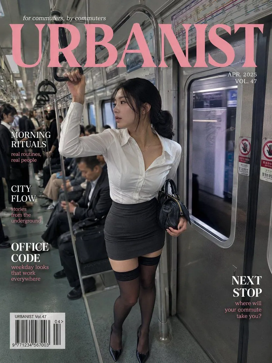
Urbanist Subway Magazine Cover
Goal: Create a realistic editorial magazine cover for an urban commuter lifestyle publication titled magazine_title, shot inside a crowded subway train during rush hour. Canvas: Vertical magazine cover, 3:4 aspect ratio, full-bleed documentary street-photography background with overlaid magazine typography. Main image: A candid full-body photo of a stylish office commuter standing in the subway aisle near the train doors. She wears a crisp white button-up blouse, a dark fitted mini skirt, sheer black thigh-high stockings, and glossy black pointed heels. She holds an overhead subway hand strap with one raised arm and carries a small black handbag in the other hand. Her face is intentionally pixelated/blurred for anonymity. Around her are seated and standing commuters in business attire, also with some blurred faces. The subway interior has metal poles, hanging hand straps, windowed sliding doors, route maps above the doors, warning stickers, fluorescent lighting, and a muted gray-green floor. The overall feeling is candid, metropolitan, slightly gritty, and fashion-editorial. Layout: Large masthead across the top in oversized pink high-contrast serif capitals reading magazine_title. Above it, a small italic tagline reads “for commuters, by commuters.” On the upper right, small white issue text reads issue_date on one line and volume_number beneath it. Place cover lines along the left side and one on the lower right, using a mix of white serif headlines and smaller pink subtext. Add a barcode block at the bottom left. Cover lines: Use exactly 4 editorial cover-line groups: 1) “MORNING RITUALS” with subtext “real routines, real people”; 2) “CITY FLOW” with subtext “stories from the underground”; 3) “OFFICE CODE” with subtext “weekday looks that work everywhere”; 4) “NEXT STOP” with subtext “where will your commute take you?”. Barcode details: Bottom-left white barcode label with black bars, small text “URBANIST Vol.47,” issue marker “04>,” and digits resembling “9 771234 567003.” Visual style: Photorealistic smartphone candid photo blended with polished magazine-cover design, natural subway lighting, slight motion blur outside the train window, muted cool gray environment contrasted with the soft pink masthead. Typography should feel like a modern fashion/lifestyle magazine: elegant serif display type, clean alignment, strong hierarchy. Constraints: Keep exactly 4 cover-line groups, 1 barcode block, 1 main standing commuter subject, and 1 large masthead. Do not add extra logos, watermarks, QR codes, or unrelated text. Maintain anonymous blurred faces for visible commuters.