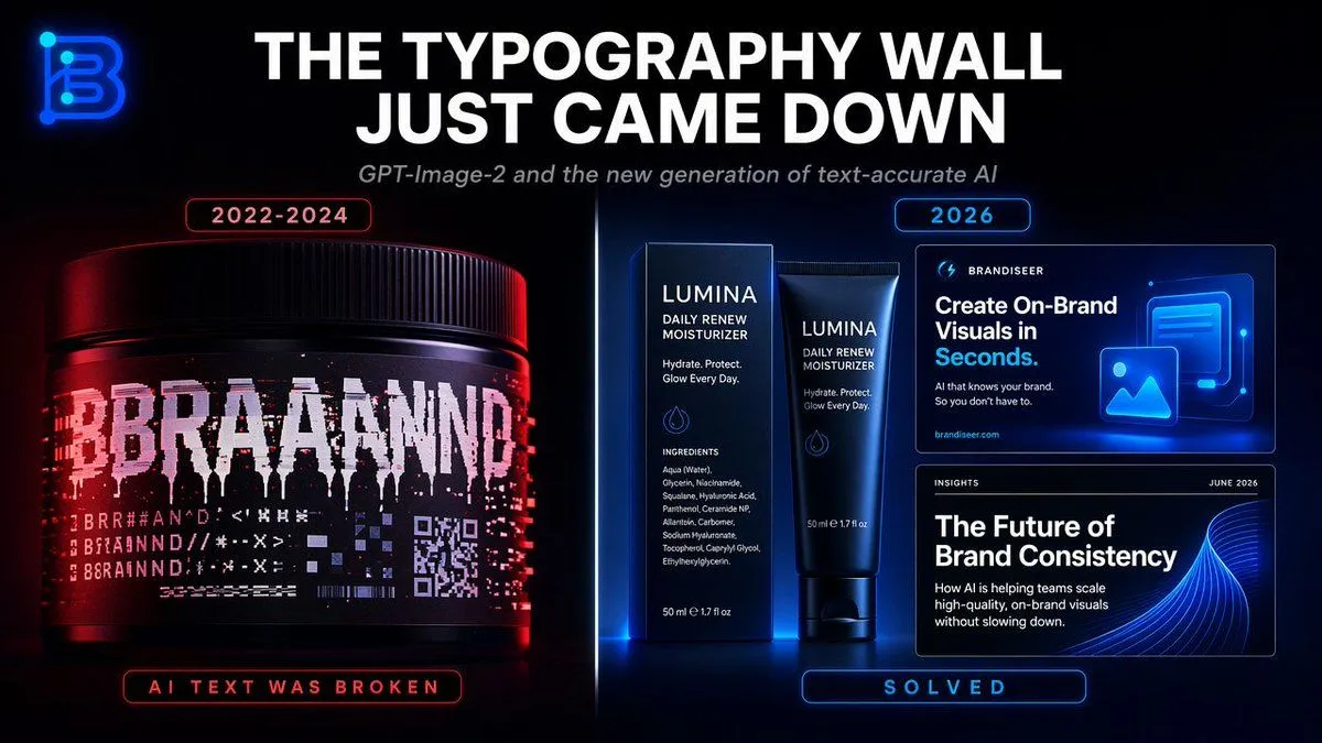
Typography Wall Comparison Infographic
Goal: Create a sleek dark tech infographic about the breakthrough in AI-generated typography accuracy, contrasting broken text generation from 2022–2024 with solved, brand-ready text generation in 2026. Canvas: Wide 16:9 social media graphic, black background with subtle blue/red glow, cinematic product-ad lighting, high contrast, crisp typography, futuristic SaaS/brand design aesthetic. Top area: Place a glowing neon monogram logo in the upper-left corner, shaped like a stylized letter B in electric blue. Center a huge bold all-caps white headline: headline_text. Beneath it, add a smaller italic gray subtitle: subtitle_text. Main layout: Split the image vertically into two comparison halves with a thin glowing divider line down the center. Use red lighting on the left side and blue lighting on the right side. Left panel, broken era: At the top, add a small rounded red outlined label reading left_year_label. Show exactly 1 large black cosmetic jar/product tub, lit with red highlights, occupying the lower-left half. Its label should look corrupted and glitchy: a huge fragmented white word resembling “BRAND” but broken into unreadable duplicated letters, plus multiple rows of hallucinated symbols, pseudo-letters, distorted barcode-like lines, and a small corrupted QR-code block. At the bottom of the left panel, add a rounded red outlined status label reading “AI TEXT WAS BROKEN”. Right panel, solved era: At the top, add a small rounded blue outlined label reading right_year_label. Show exactly 3 clean brand-design examples with sharp readable text: 1 skincare box and matching tube in the center-right, plus 2 rectangular digital brand cards stacked on the far right. The skincare packaging brand name should be brand_name, with readable supporting copy such as “DAILY RENEW MOISTURIZER”, “Hydrate. Protect. Glow Every Day.”, an ingredients list, and “50 ml e 1.7 fl oz”. The upper digital card should read “BRANDISEER”, “Create On-Brand Visuals in Seconds.”, smaller text “AI that knows your brand. So you don’t have to.”, and “brandiseer.com”, with a glowing blue image/icon illustration. The lower digital card should read “INSIGHTS”, “JUNE 2026”, “The Future of Brand Consistency”, and smaller body copy about AI helping teams scale high-quality on-brand visuals without slowing down, with an abstract blue wave graphic. At the bottom of the right panel, add a rounded blue outlined status label reading “SOLVED”. Element count: The composition must contain exactly 2 comparison panels, 1 neon logo, 1 main headline, 1 subtitle, 2 year labels, 1 corrupted product jar on the left, 3 clean brand examples on the right, and 2 bottom status labels. Visual style: Photorealistic product rendering mixed with polished UI mockup design, glossy black surfaces, neon rim light, red/blue cyberpunk color contrast, ultra-sharp readable text, premium brand-design presentation, no extra objects, no watermark.