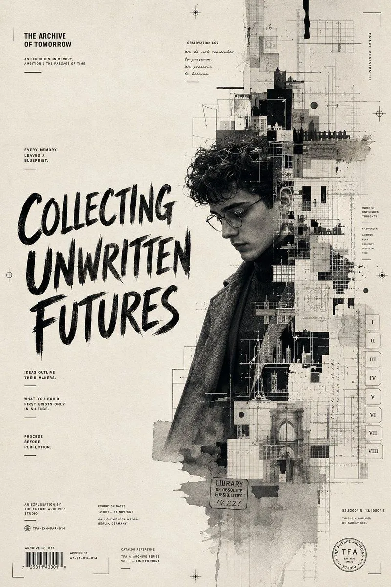
The Archive of Tomorrow Editorial Poster
Create an ultra-premium monochromatic editorial art poster titled: THE ARCHIVE OF TOMORROW. Design a sophisticated gallery-quality poster that feels like the visual identity for an experimental design exhibition exploring memory, ambition, and the passage of time. The central subject is a thoughtful young creative captured in a three-quarter profile rather than a frontal pose. They wear a structured wool overcoat layered over a minimalist high-neck knit, conveying timeless elegance rather than contemporary fashion trends. Instead of a clean portrait, the subject gradually dissolves into an intricate architectural blueprint made from fragmented geometric forms, technical drafting marks, grid systems, abstract city silhouettes, paper textures, ink washes, and fragmented handwritten notes. It should feel as though their thoughts are becoming architecture. The composition is intentionally asymmetrical. The left side remains spacious with generous negative space, while the right side becomes increasingly dense with layered design elements, archival markings, registration symbols, film perforations, measurement scales, index tabs, editorial dividers, and abstract printing artifacts. No colorful graphics. No neon. No futuristic holograms. Everything should feel tactile, printed, and handcrafted. TYPOGRAPHY AS DESIGN. Typography should function as part of the artwork itself rather than simply labeling it. The dominant headline occupies nearly half the poster: COLLECTING UNWRITTEN FUTURES. The lettering should appear hand-painted with expressive dry-brush strokes layered over distressed paper textures. Surrounding the composition are dozens of smaller editorial fragments such as: EVERY MEMORY LEAVES A BLUEPRINT. IDEAS OUTLIVE THEIR MAKERS. WHAT YOU BUILD FIRST EXISTS ONLY IN SILENCE. PROCESS BEFORE PERFECTION. ARCHIVE NO. 014 OBSERVATION LOG DRAFT REVISION III INDEX OF UNFINISHED THOUGHTS. Tiny catalog details, coordinates, exhibition references, barcode elements, print registration marks, library stamps, archival accession numbers, and minimalist symbols should reward viewers who zoom in. ART DIRECTION: Blend influences from contemporary editorial graphic design, fine-art exhibition catalogues, brutalist layouts, Japanese poster minimalism, Swiss International Style, vintage printmaking, expressive ink illustration, museum branding, luxury independent publishing. The final composition should resemble something displayed in a prestigious contemporary art museum rather than a commercial poster. COLOR PALETTE: Only use warm ivory paper, rich carbon black, charcoal gray, soft graphite, subtle weathered paper tones. No additional colors. The beauty should come entirely from contrast, texture, composition, and typography. VISUAL STYLE: Museum-grade editorial design, Luxury graphic branding, Photorealistic portraiture blended with expressive ink textures, Mixed-media collage without appearing chaotic, Elegant asymmetrical composition.