Retro Japanese Release Poster Edit
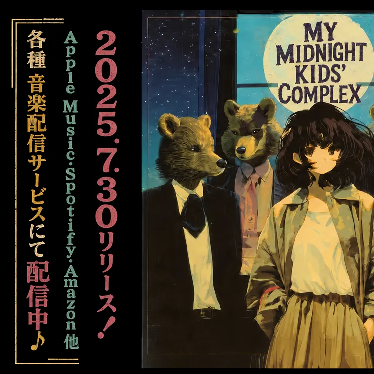
Using the provided reference image, redesign it as a polished retro Japanese music-release poster while preserving the same split layout, the same illustrated band artwork on the right, and the same overall composition. Upgrade the typography from plain placeholder text into authentic vintage poster styling: add distressed print texture, uneven ink, and a slightly worn screen-printed look. Keep the 3 vertical text columns on the left, but restyle them with stronger hierarchy and color separation: the Japanese service-announcement column in warm gold, the platform list in muted teal, and the date/release column in dusty pink. Change the bottom of the left Japanese column from the original release-start message to 「配信中♪」 and emphasize it in larger pink type with a musical note. Add thin gold decorative border lines and corner ornaments framing the left text block. On the right panel, keep the title text in the moon area but restyle it into bold distressed retro lettering that reads “MY MIDNIGHT KIDS’ COMPLEX.” Apply a cohesive nostalgic poster finish across the whole image: subtle paper grain, faded edges, light scratches, slightly darkened borders, and richer vintage teal/gold/pink color grading.