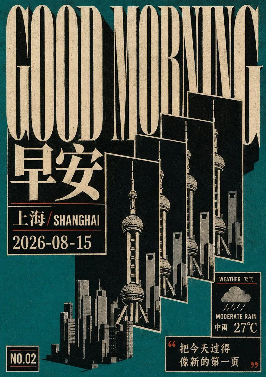
Retro Geometric Future Culture Poster
Construct any theme into a retro cultural poster with a background_color and strong flattening: at first glance, you see a large-scale high-contrast title and a group of thematic graphics repeated along depth and misplaced layer by layer. Text and images together form an oppressive black-and-white geometric composition rather than independent information areas. Use a nearly pure black background to carry heavy warm white text, with small amounts of accent_color used only for fine horizontal lines, explanatory text, and weak emphasis; let the big title occupy the main visual weight at the top, and the information is divided into several nested cards with black backgrounds and white borders, interspersed with thematic objects along diagonal or stepped paths, creating a spatial rhythm like printed layouts being continuously copied, ghosted, and misplaced. The subject of the future theme should be dismantled into repeatable outlines, borders, or stacked slices, sharing the same hard-edged ink logic with cards, titles, and thin lines, forming a relationship where text and images block, intersperse, and nest within each other. The typeface adopts a high-contrast, narrow, and sculpted structure: heavy stems, obvious thickness contrast between horizontal and vertical strokes, sharp or slightly irregular corners at the endpoints, hard turns, and narrow internal cavities while maintaining long-distance recognition; no matter how the text system changes, it maintains tight character spacing, strong line spacing contrast, and a reading beat from large titles to small notes, making punctuation, accents, or other text marks obey the overall geometric axis. The image retains only a small amount of form that can support theme recognition, using layers of black, gray, and warm white and tough outlines, without adding soft gradients, commercial-grade polishing, or decorative details. Retain restrained traces of low-definition copying, slight misalignment, rough edges, local uneven inking, and old printing, but do not create serious damage out of thin air; the overall piece must look like a flat system completed by limited ink, repeating screens, and manual typesetting.