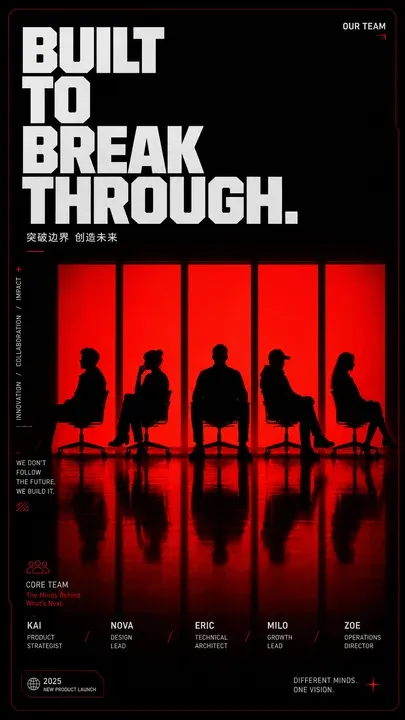
Red Silhouette Team Event Poster
Goal: Create a bold vertical event/team poster with a dark cinematic stage atmosphere and red backlit window silhouettes, designed for a multi-guest activity poster or social media cover. Canvas: Tall portrait poster, approximately 9:16 ratio, black background with a very thin dark-red border and subtle rounded/cut-corner tech styling. Use a glossy black floor with strong red reflections in the lower half. Layout: Huge stacked headline in the upper-left, set in an ultra-bold condensed block sans-serif font, white/light gray with tight spacing. The headline text is headline_text arranged across four lines: “BUILT”, “TO”, “BREAK”, “THROUGH.” Add a small top-right label reading “OUR TEAM” with a tiny red arrow. Under the headline, add a small Chinese subtitle: subtitle_text with a small red underline. Main visual: Center the composition around exactly five tall vertical glowing red panels/windows, evenly spaced across the middle. In front of the panels place exactly five black human silhouettes seated on simple office chairs, each with a distinct pose: 1) leftmost person sitting sideways leaning back, 2) second person with legs crossed and one hand near the face, 3) center person facing forward with broad shoulders, 4) fourth person wearing a cap or brimmed silhouette leaning back, 5) rightmost person in side profile with long hair. Their bodies and chairs should be pure black silhouettes against the intense red light. Mirror their silhouettes and the five red panels as elongated reflections on the glossy floor. Side details: Along the left side, add thin vertical microtext reading “INNOVATION / COLLABORATION / IMPACT” with a small red plus symbol above it. Add a small paragraph block in the lower-left reading “WE DON’T FOLLOW THE FUTURE. WE BUILD IT.” Add small red decorative hatch marks beneath it. Bottom information band: Include a lower section labeled “CORE TEAM” with a small red outline people icon and the subtitle “The Minds Behind What’s Next.” Display exactly five team member entries across the bottom, aligned below the five silhouettes: 1) member_one, 2) member_two, 3) member_three, 4) member_four, 5) member_five. Separate entries with small red slash marks. Add a small bottom-left badge containing “2025” and “NEW PRODUCT LAUNCH.” Add bottom-right text reading “DIFFERENT MINDS. ONE VISION.” with a red starburst/cross accent. Visual style: High-contrast editorial poster design, black and red duotone lighting, dramatic silhouettes, minimal futuristic UI accents, crisp Swiss/grid typography, cinematic shadows, glossy reflections, premium tech-event aesthetic. Keep the design clean, poster-like, and text legible. Avoid adding extra people, extra panels, logos, watermarks, or unrelated decorative elements.