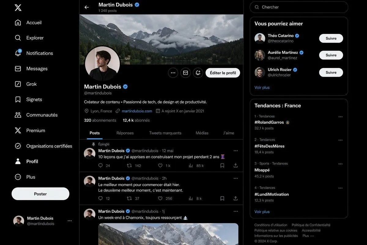
Realistic X Profile Page Mockup
Create a highly realistic dark-mode social media interface mockup that closely resembles the desktop X/Twitter layout in French, shown as a full-browser screenshot with three vertical columns on a black background and subtle dark gray separators. The left sidebar contains exactly 11 navigation items stacked vertically with white icons and labels: “Accueil”, “Explorer”, “Notifications” with a small blue badge showing 3, “Messages”, “Grok”, “Signets”, “Communautés”, “Premium”, “Organisations certifiées”, “Profil”, and “Plus”. At the top of this sidebar place the white X logo, near the lower-middle add a large rounded white button labeled “Poster”, and at the bottom show a compact logged-in account block for Martin Dubois with handle @martindubois and a small circular avatar. The center column is the main profile page for profile_name, with a top bar showing a back arrow, the name “Martin Dubois” and a blue verification badge, and underneath the text “1 248 posts”. Below that, include a wide panoramic cover photo of dramatic cloudy alpine mountains above a forest lake. Overlapping the bottom-left of the banner, place a circular profile picture of a young man in dark clothing, face slightly obscured or blurred, with a pale background and a thin border. On the right side of the profile header place three small circular action buttons and one prominent rounded light button labeled “Éditer le profil”. Under the avatar show the display name Martin Dubois with a blue verification badge, the handle @martindubois, and a one-line bio in French: “Créateur de contenu • Passionné de tech, de design et de productivité.” Then add a metadata row with exactly 4 items: location “Lyon, France”, website “martindubois.com”, and “A rejoint X en janvier 2021”, followed by a follower row reading “320 abonnements” and “12,4 k abonnés”. Add a horizontal tab bar with exactly 5 tabs: “Posts”, “Réponses”, “Tweets marquants”, “Médias”, and “J’aime”, with “Posts” active and underlined in blue. Beneath the tabs, show a feed containing exactly 3 visible posts by Martin Dubois. Post 1 is pinned, indicated by “Épinglé”, dated “12 mai”, with the French text “10 leçons que j’ai apprises en construisant mon projet pendant 2 ans” followed by an emoji, and an engagement row with 5 values: 24 replies, 142 reposts, 1 k likes, 85 k views, and a bookmark/share area. Post 2 is dated “2h” with the French text “Le meilleur moment pour commencer était hier. Le deuxième meilleur moment, c’est maintenant.” and engagement values 12 replies, 37 reposts, 256 likes, and 8 k views. Post 3 is dated “1j” with the French text “Un week-end à Chamonix, toujours ressourçant” followed by a mountain emoji, and includes a large embedded image of snowy mountain peaks under soft daylight. Use circular avatars at the left of each post and thin separators between posts. The right sidebar starts with a rounded search field containing the placeholder “Chercher”. Below it, include a card titled “Vous pourriez aimer” with exactly 3 suggested profiles, each with avatar, display name, handle, blue verification badge, and a white rounded “Suivre” button: “Théo Catarino” @theocatarino, “Aurélie Martinez” @aurel_martinez, and “Ulrich Rozier” @ulrichrozier. Add a “Voir plus” link at the bottom of that card. Under it, create a trends card titled “Tendances : France” listing exactly 4 trends in ranked order with category and post counts: 1. “#RolandGarros” with “32,1 k posts”, 2. “#FêteDesMères” with “18,4 k posts”, 3. “Mbappé” with “45,2 k posts”, 4. “#LundiMotivation” with “12,3 k posts”. Add a “Voir plus” link below the trend list. At the very bottom place a compact footer with multiple small gray legal links and “© 2024 X Corp.”. The entire image should look almost indistinguishable from a real desktop screenshot: crisp typography, authentic spacing, realistic UI proportions, subtle rounded cards, white and gray text on near-black surfaces, blue accent color, polished anti-aliased icons, and a clean modern product-design aesthetic.