Premium Men's Skincare Thumbnail
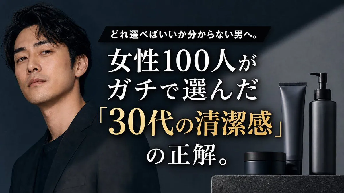
Goal: Create a cinematic Japanese YouTube thumbnail-style advertisement for a men's grooming or skincare product line, aimed at men who do not know what to choose. Canvas: 16:9 horizontal thumbnail, dark premium editorial look, high contrast, no border or watermark. Layout: Place one serious Japanese male model on the left third, cropped from chest upward, wearing a black blazer over a black shirt. He has medium-length wavy black hair, clean-shaven face, slightly tilted head, calm confident expression, and looks directly at the viewer. Put the main headline in the center-right, large and layered over the dark background. Place the product lineup on the far right bottom on a dark stone pedestal. Text content: Use exactly 3 text groups. Top group: a black slanted rectangular banner with small bold white Japanese text: 「どれ選べばいいか分からない男へ。」 Main group: very large white Japanese Mincho-style serif text with subtle drop shadow: 「女性100人が」 on the first line and 「ガチで選んだ」 on the second line. Highlight group: large metallic gold serif text with quotation marks: 「30代の清潔感」, followed below by large white text: 「の正解。」 Make the gold phrase the strongest focal point after the model. Subject details: The man should feel like a polished luxury magazine cover: realistic skin texture, moody studio lighting, sharp cheekbones, mature 30s atmosphere, understated masculinity. Use model_description. Product details: Show exactly 4 matte-black grooming containers on the right: 1 tall pump bottle at the far right, 1 tall squeeze tube just left of it, 1 low cylindrical jar in front, and 1 wider low cylindrical container behind the jar. All products are unlabeled, minimal, premium, and softly rim-lit. Visual style: Dark charcoal-blue background with a diagonal spotlight beam from the upper right, subtle smoky haze around the center text, premium black-and-gold color palette, realistic commercial photography, glossy but restrained highlights, crisp typography. Customizable headline parameters: Use top_banner_text, main_white_headline, gold_key_phrase, and closing_text. Constraints: Keep the composition uncluttered, ensure all Japanese text is large and legible, do not add extra labels to the products, do not add logos, do not add more than one person, and keep exactly 4 visible product containers.