Pastel Japanese Mobile Game Ad
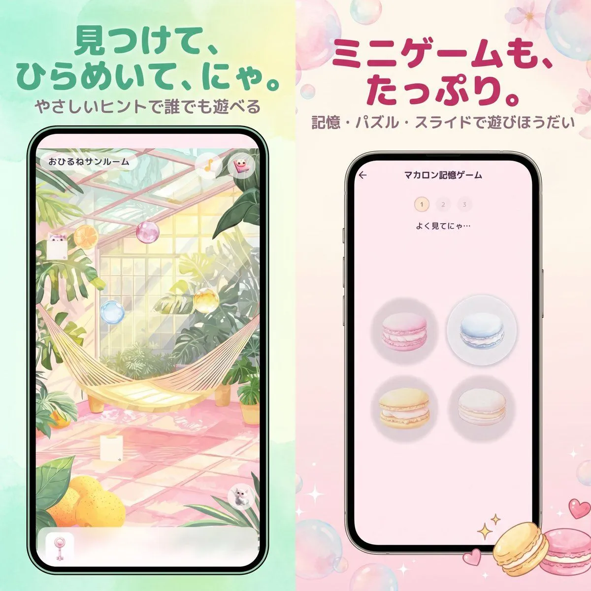
Create a cute Japanese mobile game advertisement poster split vertically into 2 equal halves, with a soft pastel watercolor background and glossy translucent bubbles scattered around the canvas. The left half has a mint green to pale yellow wash, and the right half has a cream to blush pink wash. At the top left, place a large rounded Japanese headline in bold teal green: left_headline_text, with a smaller subtitle beneath it in muted brown-gray: left_subtitle_text. At the top right, place a large rounded Japanese headline in bold raspberry pink: right_headline_text, with a smaller subtitle beneath it in muted mauve-gray: right_subtitle_text. Centered in each half is a black-bezel smartphone mockup shown straight-on. The left phone displays a hidden-object style game screen inside a bright greenhouse sunroom with lush tropical plants, a cream hammock stretched diagonally across the middle, pink tiled floor, warm sunlight through glass panels, hanging pastel glass orbs, lemons in the lower left foreground, and tiny cute character accents hidden in the scene; a Japanese room title appears at the top inside the phone UI: left_game_screen_title. The right phone displays a memory minigame screen on a pale pink interface with a back arrow, a centered Japanese title at the top reading "マカロン記憶ゲーム", a 3-step indicator showing 1 highlighted and 2 and 3 faded, small instruction text "よく見てにゃ…", and exactly 4 macarons arranged in a 2 by 2 grid: pink top left, blue top right, yellow bottom left, white bottom right, each on a soft circular shadow. Add small sparkling star icons and two decorative macarons at the bottom right outside the phone, plus tiny heart doodles nearby. The overall style is polished app-promo key art, kawaii, airy, elegant, soft-focus, with rounded typography, gentle gradients, subtle floral details, and a premium casual game advertisement look.