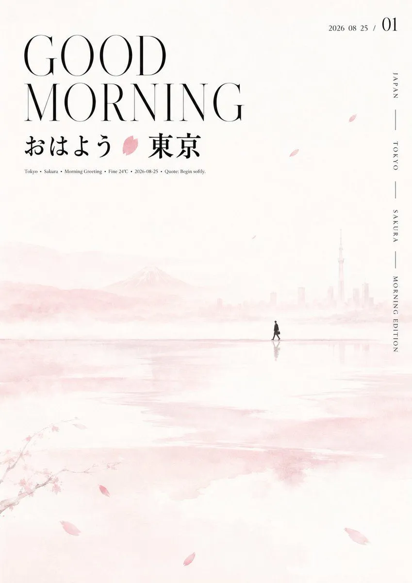
Oriental Aesthetic Typography Layout
Construct a clear, quiet visual with an Oriental seasonal feel based on the theme: theme. Use large areas of high-brightness white space as the main environment, with several horizontal, flowing semi-transparent soft color bands extending from the middle to the bottom. The edges are feathered like water vapor or out-of-focus light, with uneven widths and density, creating layers and reflections. Place a small silhouette symbol derived from the theme deep within the white space, maintaining a restrained scale near a thin color band to create a strong contrast between the tiny narrative and the vast white void. Scatter a few long, narrow fragments or leaf-like strokes to guide the eye. Information is concentrated on one side at the top: the English title uses oversized, tall, high-contrast modern serif characters in short lines with wide spacing; the Chinese title below uses a more condensed and bold font with calligraphic sharpness. A simple color block from the core symbol is embedded between the words. Small explanatory text is at the bottom, and a small date or number combo is on the other side. Use extremely light, low-saturation tones for most of the space, with slightly deeper monochromatic colors for the mist bands and a few medium-saturation accent colors for symbols and text nodes. Maintain high brightness, low contrast, and an airy, clean emotional state throughout.