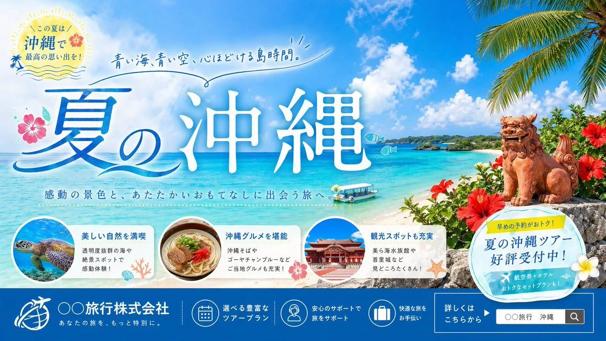
Okinawa Summer Travel Banner
Create a polished Japanese travel agency summer banner ad for Okinawa in a bright, inviting commercial style. Use a wide horizontal layout with a vivid tropical beach scene as the full background: crystal-clear turquoise ocean, white sand shoreline, small green island in the mid distance, deep blue sky with large fluffy white clouds, and palm leaves hanging in from the upper right corner. On the right foreground, place 1 traditional Okinawan shisa lion-dog statue sitting on a stone wall, surrounded by red hibiscus flowers and lush tropical greenery. Near the water, include 1 small glass-bottom sightseeing boat floating close to shore. Add 2 small simple fish doodle icons over the sea. Make the typography the hero element. Across the left-center to center, place very large Japanese calligraphic headline text reading headline_text, with a blue gradient and white glow or soft outline, highly legible and elegant. Above it, add a handwritten-style Japanese catchphrase in blue reading catchphrase with a loose underline flourish. Under the main headline, add a smaller Japanese subheading reading subheading. In the upper left, add a circular summer badge with a sunburst feel, soft cream background, tiny wave lines, a small hibiscus accent, and Japanese text reading "この夏は 沖縄で 最高の思い出を!". Decorate the headline area with 1 pink hibiscus flower on the left and subtle ocean-wave graphic strokes. Along the lower middle, place 3 rounded white feature cards in a row, partially overlapping the beach scene. Count and depict all 3 cards clearly: the first card shows a sea turtle swimming underwater in a circular photo, with Japanese heading "美しい自然を満喫" and smaller body text about transparent waters and scenic spots; the second card shows a bowl of Okinawa soba in a circular photo, with heading "沖縄グルメを堪能" and smaller body text mentioning 沖縄そば and ゴーヤチャンプルー; the third card shows Shuri Castle in a circular photo, with heading "観光スポットも充実" and smaller body text mentioning 美ら海水族館 and 首里城. Add small coral, shell, hibiscus, and starfish decorations around these cards. On the right lower-middle, overlap the beach with 1 tilted circular promotional sticker in pale blue and cream, with a small yellow tab on top. The yellow tab says "早めの予約がおトク!" and the main circle says "夏の沖縄ツアー 好評受付中!". Add a white plumeria flower accent near the sticker. Create a full-width dark blue footer bar across the bottom. On the left side of the footer, place a white travel company logo icon and company name text company_name, with a smaller Japanese tagline below. Across the center of the footer, place exactly 3 circular line-icons with short Japanese captions: 1 calendar icon for tour plans, 1 support staff icon for travel assistance, and 1 suitcase icon for comfortable travel help. On the right side of the footer, add a boxed CTA area with Japanese text "詳しくはこちらから" and a mock search field containing search_text plus a search icon. Overall design should feel premium, cheerful, summery, and highly marketable, like a professional Japanese web banner or travel campaign visual.