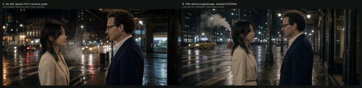
NYC Romance Grade Comparison
Goal: Create a cinematic side-by-side comparison frame showing how different grading constraints affect the same nighttime romance scene in New York City. Canvas: Very wide horizontal comparison image, approximately 4:1 aspect ratio, with a thin black outer border and a black divider between two equal panoramic panels. Layout: Use exactly 2 side-by-side panels. The left panel is labeled at the top-left: “A No skill: generic NYC romance grade” with a smaller subtitle beneath it: “normal saturation / brighter sky volume / modern night polish”. The right panel is labeled at the top-left: “B With eterna-image2image: standard ETERNA” with a smaller subtitle beneath it: “muted night color / soft highlights / deeper readable shadows”. Keep the labels small, clean, white, and unobtrusive, like a film test contact sheet. Scene content: Both panels show the same setup: exactly 2 human subjects, a woman on the left and a man on the right, standing face-to-face on a rainy New York street at night. The woman has woman_appearance. The man has man_appearance. They stand in profile, emotionally restrained, as if in a quiet romantic conversation. The street is wet and reflective, with blurred traffic, storefronts, streetlights, building windows, and a yellow taxi in the distance. Include visible steam or mist rising from the street in the background. Left panel look: A generic modern NYC romance grade, with brighter lifted shadows, slightly exaggerated cool moonlit highlights on faces and coats, higher saturation, glossy wet-road reflections, visible bokeh lights, and a more polished digital night look. The woman and man are placed closer to the foreground, cropped at mid torso, with the woman near the left third and the man near the right third. Right panel look: A more restrained Fuji ETERNA-inspired cinematic grade, using muted colors, soft highlights, deeper but still readable shadows, lower saturation, natural practical streetlight warmth, less artificial blue spill, smoother tonal rolloff, and a more grounded filmic night atmosphere. The composition is slightly wider than the left panel, with more negative space and more visible sidewalk, columns, taxi, steam, and wet street environment. The woman and man remain facing each other in profile, centered in the panel. Visual style: Photorealistic cinematic still, anamorphic-feeling wide frame, natural rain-slick pavement, shallow depth of field, realistic skin tones, soft practical lighting, subtle film grain, restrained contrast, no fantasy elements. Constraints: Use exactly 2 panels, exactly 2 people per panel, exactly the 2 panel labels and 2 subtitles listed above, no extra captions, no logos, no watermark, no UI controls, no additional characters in the foreground.