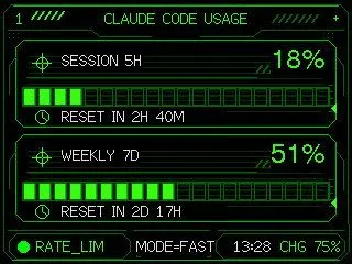
Neon M5Stack Usage Gauge
Using the provided reference image as the functional UI base, redesign it into a polished neon-green cyberpunk terminal interface suitable for an M5Stack-style 320×240 display. Keep the same two usage meters and overall information hierarchy, but replace the plain black layout with thin glowing vector line art, angular framed panels, pixel/monospace typography, and sci-fi HUD decorations. Convert the two meters into 2 stacked framed cards: 1) “SESSION 5H” with a crosshair icon, large percentage “session_percent”, a segmented horizontal progress bar, and a clock/reset row reading “session_reset_text”; 2) “WEEKLY 7D” with a crosshair icon, large percentage “weekly_percent”, a segmented horizontal progress bar, and a clock/reset row reading “weekly_reset_text”. Add a top header reading “header_text” centered, with decorative diagonal tick marks on both sides and a small plus sign at the top right. Add a bottom status bar with exactly 5 visible items: a green status dot, “RATE_LIM”, “MODE=FAST”, “13:28”, and “CHG 75%”. Use only black background, bright green strokes, darker green grid/bar outlines, and crisp pixel-perfect rendering; make the final image look like a refined embedded-device dashboard rather than a flat mockup.