Neon Japanese AI Canvas Ad
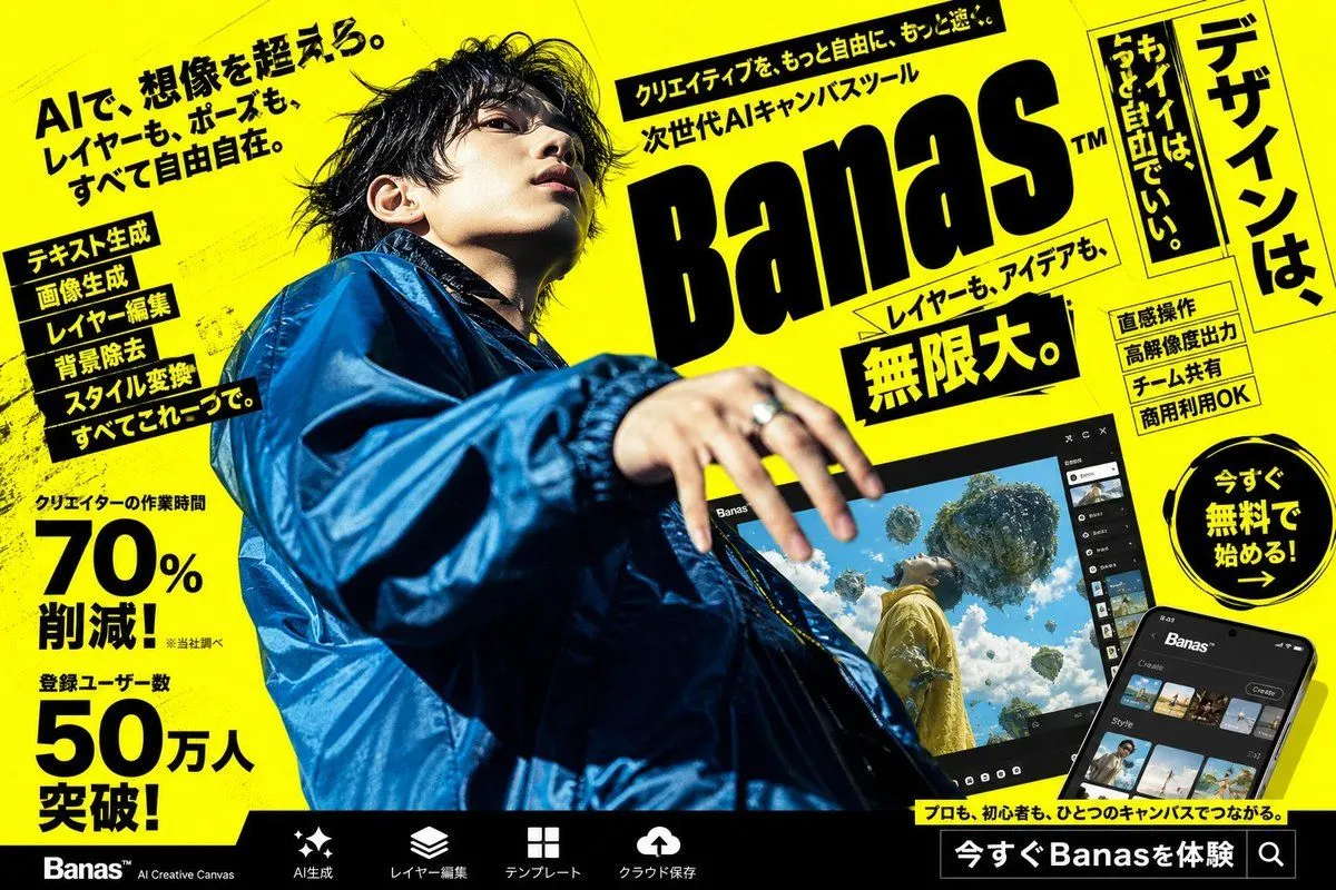
Goal: Create a high-impact Japanese cyberpunk-style advertising poster for an AI creative canvas tool called product_name, with a loud yellow-and-black street magazine layout and a dramatic fashion photo centerpiece. Canvas: Landscape 16:9 poster, bright fluorescent yellow background with black ink texture, diagonal perspective, gritty halftone scratches, skewed panels, thick black borders, and dense promotional typography. Overall look should feel like a Japanese web banner or transit ad for a next-generation AI design app. Main subject: One young male creator photographed from an extreme low angle, occupying the left and center of the poster. He wears an oversized glossy cobalt-blue windbreaker jacket, messy black hair, and reaches one hand toward the camera with motion blur and shallow depth of field. His face is intentionally obscured by a soft square blur/mosaic censor block. Lighting is harsh and editorial, with strong contrast against the yellow background. Layout: Place a huge slanted black logo wordmark reading product_name on the upper right-center, with a small trademark mark. Above it, add a narrow black headline strip with energetic Japanese marketing copy. Around the logo, use multiple tilted yellow and black text boxes. On the far right, add one tall vertical framed headline panel. At bottom, add a black navigation bar with product feature icons and labels. Text content: The largest Japanese headline should be main_japanese_headline. The main logo area should include the supporting phrase supporting_japanese_tagline. Add a bold central callout reading big_benefit_text. Add one circular call-to-action badge on the right reading call_to_action. Keep all visible copy in bold Japanese display typography, mixing horizontal and vertical writing. Discrete visible elements to include: exactly 1 censored human model; exactly 1 giant product logo; exactly 1 laptop/tablet-like app preview screen near the lower center-right; exactly 1 smartphone app mockup in the bottom-right corner; exactly 1 circular call-to-action badge; exactly 1 tall vertical headline panel on the far right; exactly 2 large numeric statistic blocks on the left, one showing 70% and one showing 50万人; exactly 6 stacked feature labels on the left side; exactly 4 small rectangular feature badges on the right side; exactly 5 bottom navigation items with simple white icons: sparkle/AI generation, layers, grid/template, cloud upload, and search/experience button. App mockups: The larger tilted screen should show a dark UI labeled with the product name and a surreal generated image of a person in yellow clothing looking up at floating islands and vegetation in a bright blue sky. The smartphone mockup should show a dark mobile interface with thumbnail rows and a create button. Visual style: Ultra-bold Japanese commercial graphic design, black typography on neon yellow, skewed perspective, energetic composition, dramatic lens distortion, glossy fashion photography mixed with UI mockups, high contrast, crisp print-ad finish, no clean minimalism, no white background, no watermark.