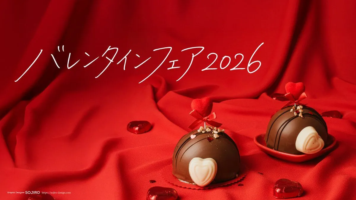
Nano Banana Pro Handwriting Generation Prompt
Use the attached reference images as the handwriting style guide (especially the second image with handwriting samples). Create a single line of Japanese handwritten text on clean white paper. Written with a fine gel pen / fineliner (0.3–0.4mm look), thin and light strokes, mostly monoline (no brush or marker look). Match a stylish, airy, feminine handwriting feel: soft curves, light touch, and a slightly right-leaning slant.Add clear personality through noticeable character size variation (some characters 10–25% larger/smaller), irregular spacing, and a gentle upward baseline from left to right. Add elongated entry and exit strokes (long, tapered starts/tails) on a few characters—especially the first character, any elongated/extended marks in the text, and the final character—while keeping everything readable.Write exactly this text: "text_to_write" No extra text, no borders, no logos, no underline, no decorative swoosh lines. High resolution, sharp thin ink lines, minimal paper texture. Negative: brush pen, calligraphy, shodo, marker, thick strokes, bold ink, heavy pressure, paintbrush, blocky lettering, uniform character size, perfect spacing, perfectly straight baseline, printed font, typeset, outline font, extra words, watermark, frame, stamps, underline, swoosh line, doodles Extra: Keep strokes thin; create expressiveness mainly with size/spacing/baseline and tapered stroke ends, not thickness.Increase character size contrast and spacing irregularity, but keep legibility.