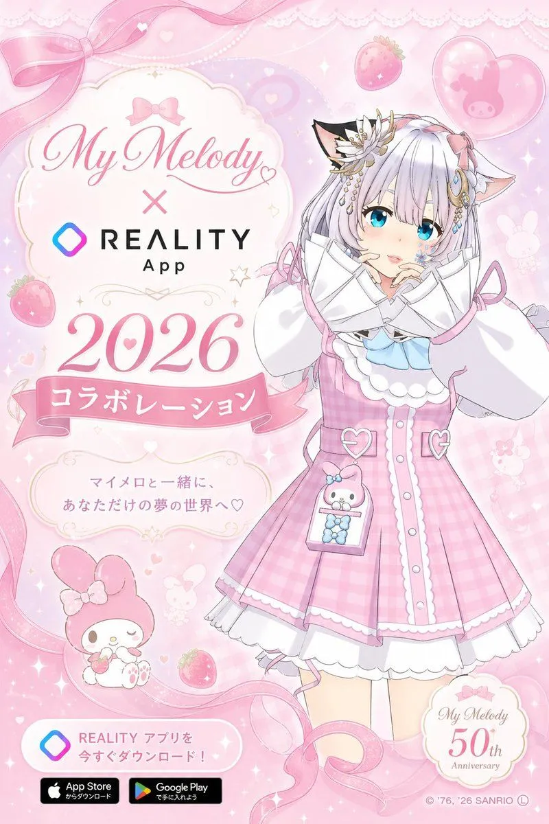
My Melody REALITY Collaboration Poster
Goal: Create a vertical kawaii collaboration poster for collaboration_title, styled like an official Sanrio mobile app campaign announcement. Canvas: Vertical 2:3 poster, soft pastel pink background, high-resolution anime promotional key visual. Use a dreamy lace-and-ribbon frame with a glossy, sparkly finish. Layout: Left side is the announcement text panel and branding; right side is a full-body anime avatar. Top left contains an ornate cream plaque with a pink bow above elegant script text reading “My Melody”, a large pink “×”, and the REALITY App logo below. Under it place a very large pink serif year, year. Beneath the year, add a pink ribbon banner with white Japanese text main_banner_text. Below the banner, add a small ornate cream message plaque containing tagline_text. Bottom left has a rounded white download callout with the REALITY gradient diamond icon and the Japanese CTA download_text, followed by exactly 2 black store badges: Apple App Store and Google Play. Bottom right has a round cream badge reading “My Melody 50th Anniversary”. Add small copyright text along the bottom edge. Subject details: On the right, draw one cute anime girl avatar in a My Melody-inspired outfit. She has very pale silver-white hair with long bangs, bright turquoise-blue eyes, soft blush, small catlike animal ears, and a shy pose with both oversized sleeves lifted near her face. Her hair accessories include exactly 4 visible decorative pieces: a large white flower with gold accents on the left side of her head, gold dangling chains, blue jewel ornaments, and pink ribbon bows. Outfit: a pink gingham pinafore dress with white scalloped trim, white blouse with enormous puffy sleeves, pale blue bow at the collar, heart-shaped strap buckles, white underskirt, and a tiny clear hanging pouch containing a My Melody plush and blue beads. Keep the character sweet, polished, and idol-like. Decorative elements: Include exactly 10 prominent background motifs: 1 large translucent pink bow ribbon across the top left, 1 flowing pink ribbon curling around the border, 2 strawberries, 1 heart-shaped balloon with a My Melody silhouette, 1 small My Melody mascot sitting near the bottom left holding a strawberry, 1 faint bunny silhouette on the mid-right, 1 small star outline near the text, 1 pale lace trim along the top edge, and 1 scattering layer of tiny hearts and sparkles across the whole poster. Visual style: Soft Sanrio pastel palette, pink and white dominant, glossy highlights, lace, pearls, hearts, strawberries, subtle gradients, delicate gold ornament lines, clean commercial poster composition, crisp readable typography, elegant script for “My Melody”, bold sans-serif for “REALITY App”, and large romantic serif numerals for the year. Constraints: Use exactly one main anime character, exactly one My Melody mascot at bottom left, exactly two app store badges, no extra characters, no watermark, no photorealism, keep all text legible and centered in its intended panels.