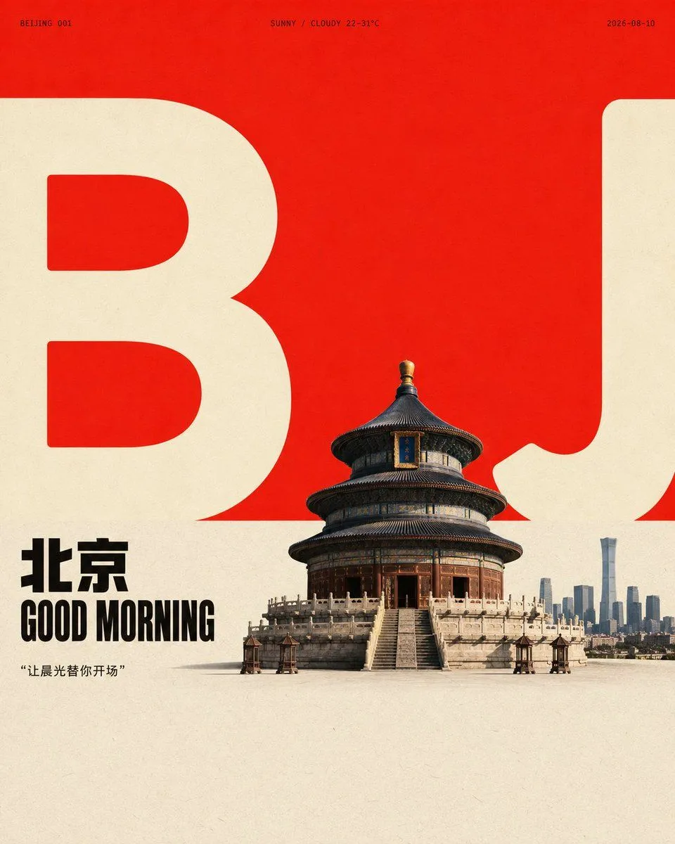
Minimalist Urban Morning Poster
Create a design with graphic poster order and a realistic focal point based on the theme "theme": start with a large, bright, high-brightness color field at the top to establish wide negative space, then add an almost equal, low-saturation light-colored paper area at the bottom to form a clean and clear horizontal color boundary. The core form of the theme is translated into two sets of oversized, low-detail, heavy, and rounded light-colored character graphics that cross the boundary and bleed to the left and right edges, keeping clear internal cavities, thickness contrast, and cuts at the edges; these graphics are visual anchors and skeletons rather than decoration. Compress the core object of the theme into a small-to-medium-scale concrete focal point near the boundary, partially obscuring the giant graphics to create clear overlapping between the foreground, graphic outlines, and negative space. The focal point should use natural photography or highly concrete textures, with real surface details, soft lighting from the top-side, grounded loose shadows, and neutral dark layers that do not overpower. Place two lines of short titles related to the theme near the boundary on the left using heavy, compact, geometric sans-serif uppercase letters, with tight line spacing and neatly left-aligned blocks, using black or the deepest structural color as a small strong anchor. Add tiny, wide-spaced meta-information and numbered short labels on both sides of the upper edge of the giant graphics to create a sparse editorial rhythm, but the text only serves order, scale, and information hints without copying fixed copy. Colors are determined by the theme's semantics for hue and material sources, but maintain the high-brightness and high-purity main color field's relationship to the soft light base in terms of area, brightness, saturation, and emotional tension. Use lighter or more neutral colors for the giant graphics than the light base, with dark text and focal shadows occupying only a small portion. When the color temperature of the theme changes, maintain the large color block contrast, clean boundaries, and limited emphasis colors without spreading color evenly. The overall effect is like clean flat printing on matte paper, with fine uniform fibers and particles, slight density irregularities in the light base and color field, and clear but not overly sharp edges for the photographed object and printed graphics, keeping the color boundaries sharp and avoiding heavy aging, yellowing, dirt, extra decorations, and modern gradients. The background negative space, giant graphics, short titles, micro labels, focal objects, and grounded shadows together form a reading path from the large color field to the text and then to the main subject; if the graphic occlusion, color boundary, or scale contrast were removed, the image would immediately lose this restrained yet tense design identity.