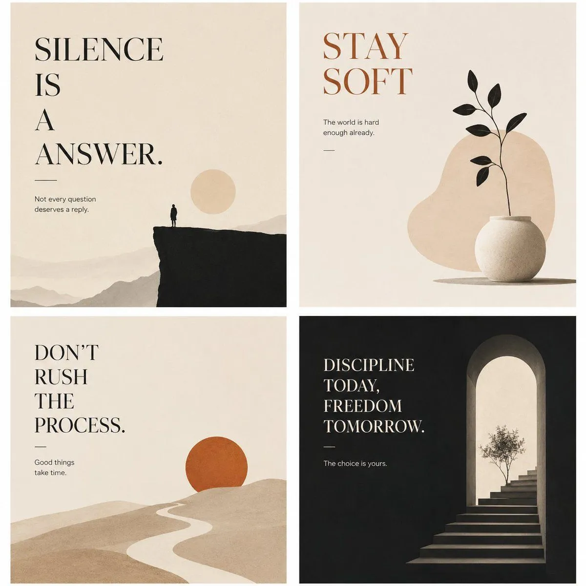
Minimalist Philosophical Poster Grid
Goal: Create a refined 2x2 grid of four minimalist philosophical wall-art posters with restrained illustration, spacious typography, and a quiet editorial mood. Canvas: Square format, four equal poster panels separated by clean white gutters. Use warm off-white paper texture for three panels and deep charcoal black for the bottom-right panel. Overall style is calm, premium, minimalist, suitable for interior prints and poster collections. Layout: Exactly 4 posters in a 2-by-2 arrangement. Each poster uses large high-contrast serif typography, generous negative space, a tiny subtitle line, a short horizontal rule, and one simple symbolic illustration. Poster 1, top-left: Cream background. Large black serif headline in the upper-left reads “top_left_headline” with stacked line breaks. Below it, a thin horizontal rule and small text: “Not every question deserves a reply.” Illustration: distant beige mountain layers across the bottom, a dark black cliff occupying the lower right, a tiny lone human silhouette standing on the cliff edge, and a pale beige sun disk near the right side. Poster 2, top-right: Cream background. Large warm rust-brown serif headline in the upper-left reads “top_right_headline”. Small text beneath: “The world is hard enough already.” Add a short horizontal rule. Illustration: a rounded beige abstract blob in the center-right background, a matte white round ceramic vase at the lower right, and one thin black plant stem with exactly 8 black leaves emerging upward. Poster 3, bottom-left: Cream background. Large black serif headline in the upper-left reads “bottom_left_headline” arranged on multiple lines. Below it, a thin horizontal rule and small text: “Good things take time.” Illustration: soft rolling beige sand-like hills filling the lower half, a winding pale path leading toward the horizon, and one burnt-orange sun circle partly sitting behind a hill on the right. Poster 4, bottom-right: Deep charcoal black background. Large cream serif headline in the upper-left reads “bottom_right_headline” stacked on four lines. Below it, a thin cream rule and small text: “The choice is yours.” Illustration: on the right side, a tall arched doorway glowing with warm cream light, stone steps rising into the arch, and a small delicate tree silhouette near the top of the stairs. Visual style: Elegant serif typography similar to classic editorial poster design, muted earth palette of cream, beige, black, rust orange, and charcoal. Soft grain, subtle paper texture, flat minimal forms, balanced asymmetry, quiet contemplative atmosphere. Keep all four posters consistent as a cohesive collection. Constraints: Use exactly 4 poster panels. Keep typography crisp and legible. Do not add extra quotes, logos, signatures, frames, mockup walls, people beyond the single tiny silhouette in the first poster, or decorative clutter.