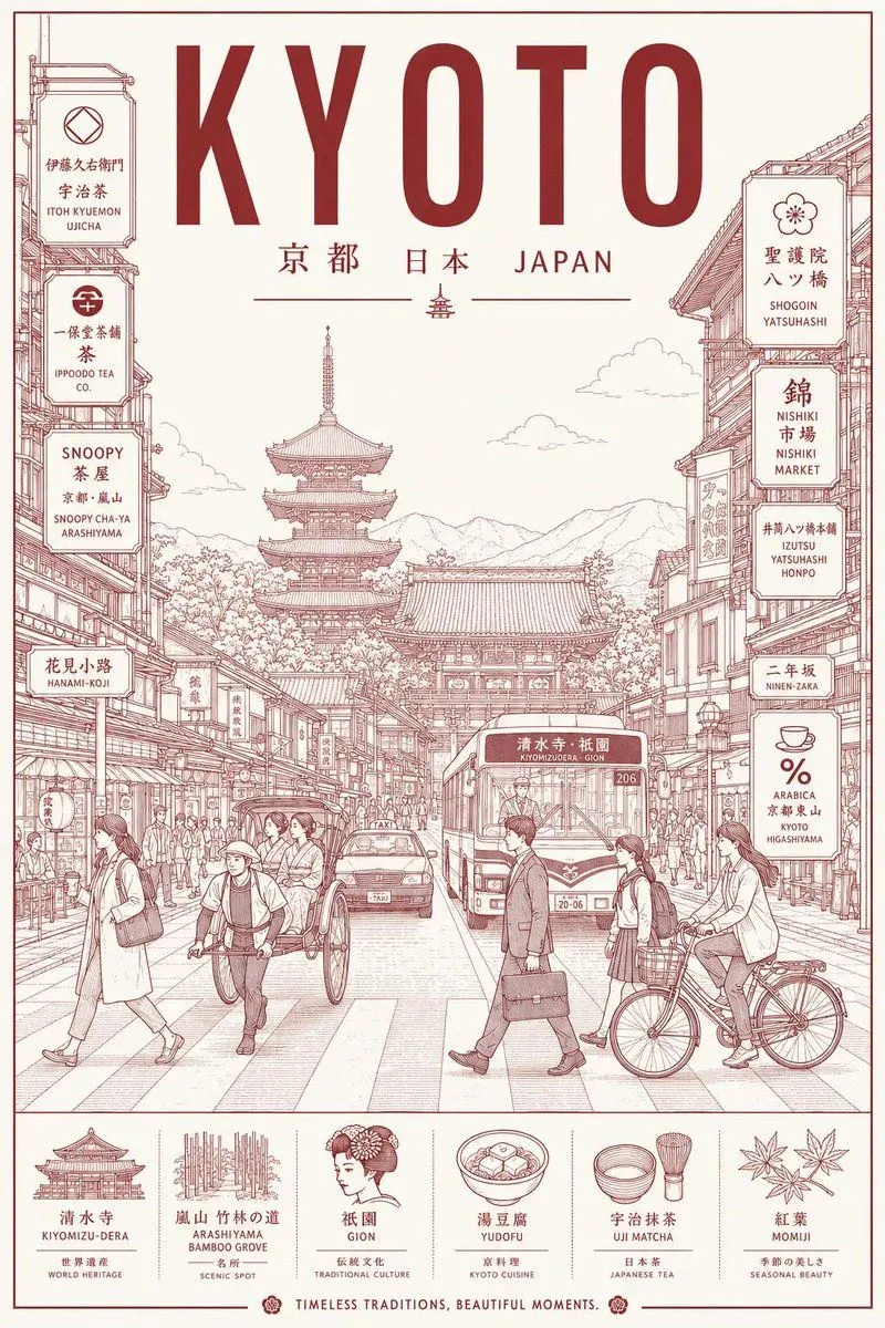
Minimalist Line Art Travel Poster
Generate an ultra-high-resolution minimalist line-art travel poster of destination, treating the city as a stylish slice of everyday urban life instead of a touristy postcard shot. CORE COMPOSITION: - Center the frame on the city's most recognizable street, intersection, alley, tram corridor, or pedestrian avenue - Populate the foreground with locals, commuters, cyclists, travelers, shoppers, students, people sitting at cafés - Let the figures naturally embody the city's local fashion and daily lifestyle - Fill the background with realistic local signage, cafés, restaurants, transit signs, storefronts, and architectural detail - Weave landmarks organically into the everyday scene, never exaggerated or hero-shot - Include authentic local-language type and culturally specific visual cues - Large bold typography centered at the top: "destination_name" - Subtitle directly below: local language + country name STYLE: ultra clean vector illustration, Swiss modernist travel poster, minimal line art, monoline drawing, mid-century editorial feel, architectural illustration, Japanese graphic poster aesthetic, precise geometric perspective, extremely clean negative space, premium travel branding look LINE STYLE: - monochrome line-based illustration only - thin, highly precise linework - minimal fill areas - city-map-like detail density - rhythmic layering of signs, buildings, windows, and street objects - visually dense yet tightly organized composition COLOR SYSTEM — VERY IMPORTANT: - use only ONE main color + ONE background color - pick a color that best captures the city's atmosphere - monochrome silkscreen poster vibe - no rainbow palettes - no excessive neon - color should mirror the city's architecture, climate, nightlife, and cultural identity COMPOSITION: - vertical poster layout - frontal street-level perspective - pedestrians crossing or moving naturally - balanced urban rhythm and visual flow - should feel like a premium city-brand campaign poster MOOD: stylish urban life, calm yet lively, editorial travel magazine cover, timeless city identity, premium tourism campaign visual, minimal yet richly detailed TEXT QUALITY: - all typography must be legible and accurate - no random characters - no broken or distorted letters - local signage should feel authentic and natural - professional editorial typography alignment OUTPUT: - vertical poster composition - 8K ultra detailed - print-ready - ultra sharp vector quality