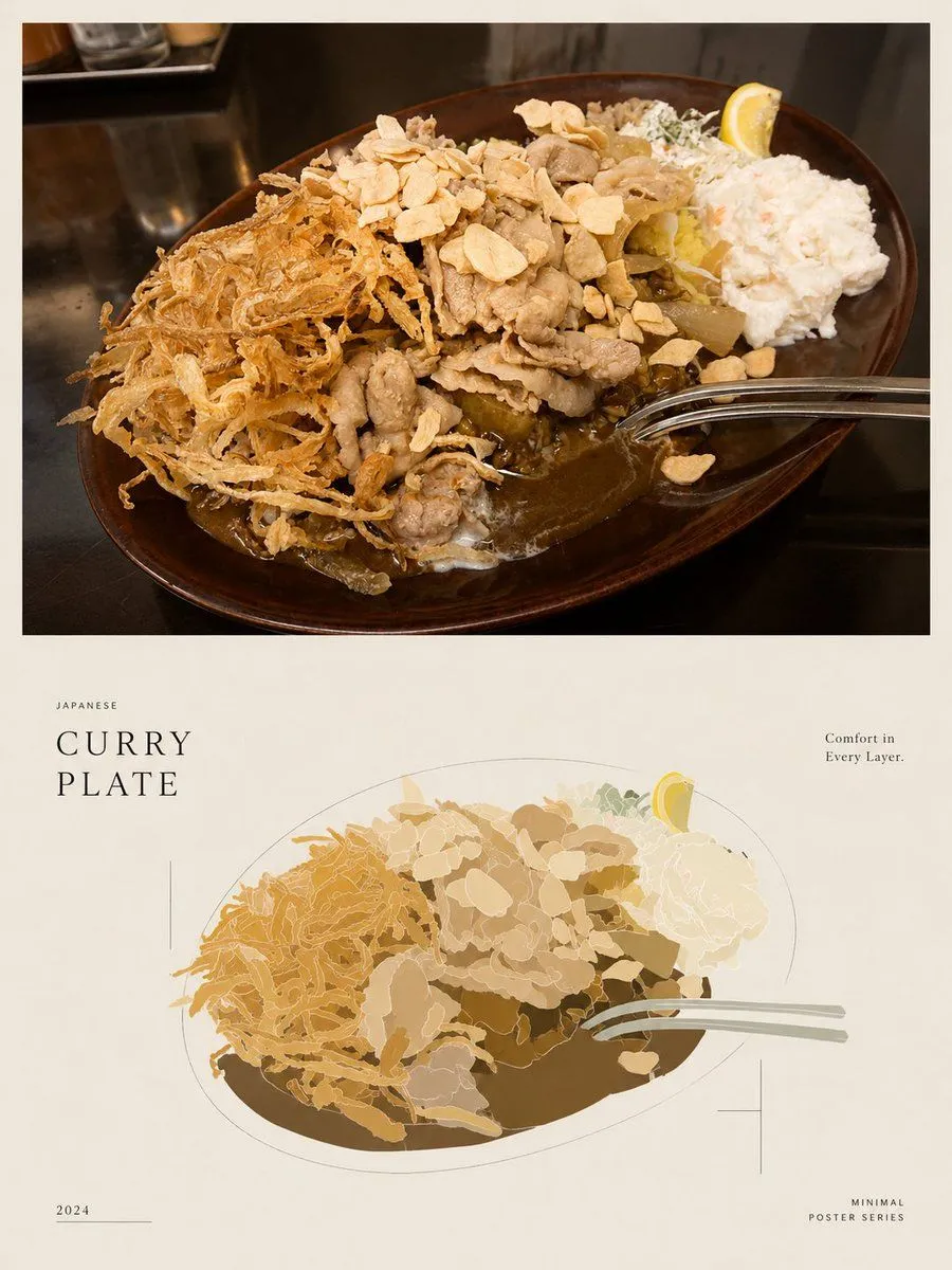
Minimal Japanese Curry Plate Poster
Goal: Create a minimalist editorial food poster that demonstrates reducing a realistic food photo into a clean low-detail illustration while preserving the composition. Canvas: Vertical poster in a 3:4 aspect ratio, warm off-white paper background, generous margins, quiet Japanese magazine/poster design. Layout: Divide the poster into exactly 2 main visual panels. The top half contains a realistic rectangular food photograph with a thin off-white border around it. The bottom half contains a simplified vector-style illustration of the same dish, centered and slightly smaller, surrounded by sparse typography and fine registration-mark lines. Top panel: Show a close-up restaurant photograph of a dish_name on a dark glossy tabletop. The dish sits on an oval dark brown ceramic plate viewed from a high three-quarter angle. Include exactly 8 visible food components: 1 large pool of brown curry sauce, 1 mound of white rice mostly hidden under toppings, 1 pile of thin fried shredded onions on the left, 1 heap of sliced pork or beef in the center, 1 scattering of pale garlic chips across the top, 1 scoop of white potato salad on the right, 1 small garnish of chopped greens near the back, and 1 lemon wedge at the back right. Add exactly 1 shiny metal spoon entering from the right edge into the curry. Use natural warm restaurant lighting, realistic texture, shallow shadows, and no people. Bottom panel illustration: Recreate the same plate as a flattened minimal vector illustration using reduced information and reduced color. Keep the exact same 8 food components and 1 spoon, but simplify them into layered organic shapes with thin light outlines and a limited palette of curry brown, tan, cream, pale yellow, muted green, and soft gray. The oval plate is suggested by a fine gray outline and a dark brown curry shape beneath the toppings. Avoid photorealistic detail; make it look like a tasteful poster illustration. Text content: Add exactly 5 text blocks. Left of the illustration, small spaced uppercase text reads "JAPANESE" above a large elegant serif title reading "CURRY\nPLATE". Upper right, small serif copy reads "Comfort in\nEvery Layer." Bottom left, small text reads "2024" with a thin horizontal line beside it. Bottom right, small spaced uppercase text reads "MINIMAL\nPOSTER SERIES". Use refined black or dark brown typography. Graphic details: Add exactly 3 fine-line decorative marks around the lower illustration: 1 thin vertical line near the left of the title area, 1 small crosshair mark on the lower right of the illustrated plate, and 1 subtle horizontal line near the year. Maintain a restrained, premium editorial look with lots of negative space. Style constraints: Minimal colors, low visual noise, no extra captions, no logos, no watermark, no additional utensils, no extra plates, and no people. The final image should feel like a polished Japanese food poster comparing a realistic curry plate photograph with its simplified illustration.