Minimal Ink Vignette Archive
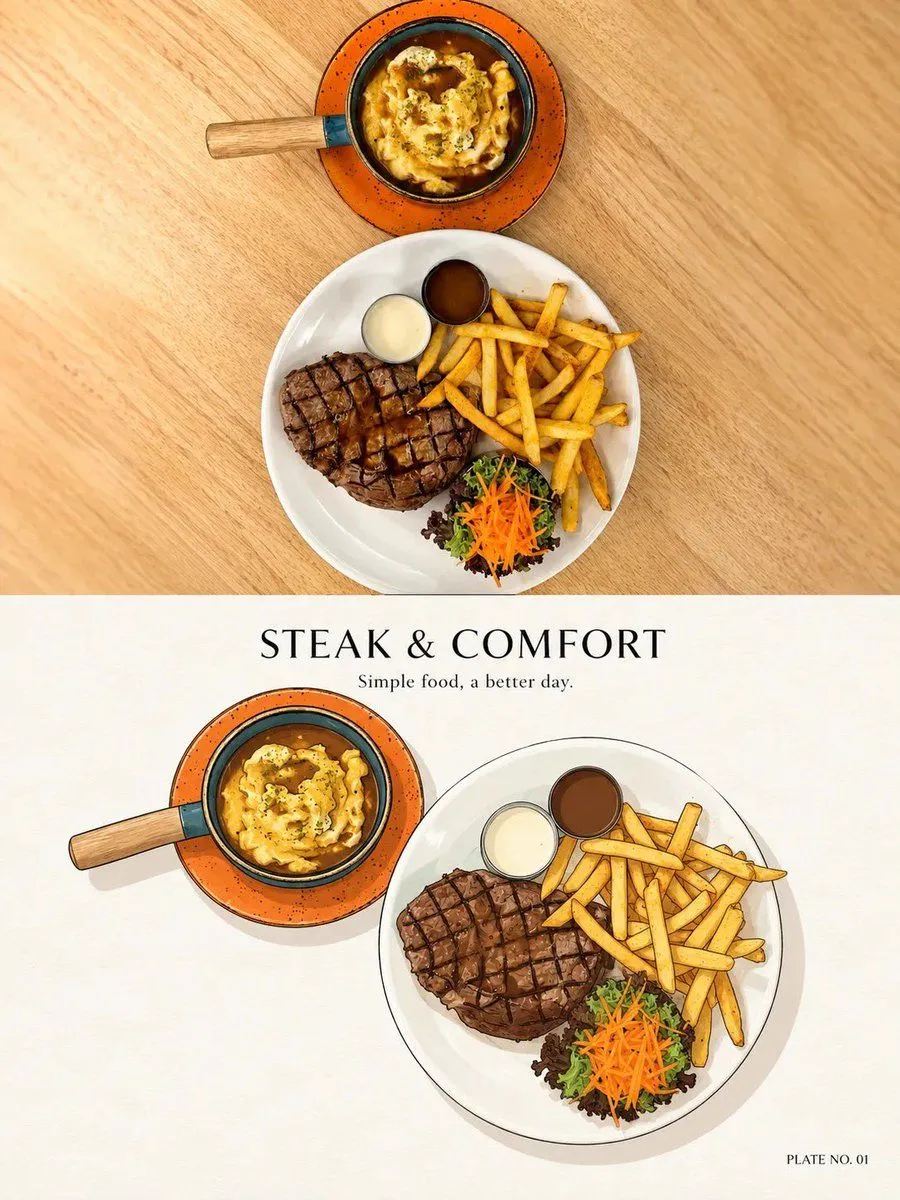
Create ONE refined PHOTO + MINIMAL INK VIGNETTE artwork based ONLY on the uploaded photograph. FORMAT: Vertical 3:4. ### TOP — ORIGINAL PHOTO Use approximately the upper 48–50% for the original photograph. Preserve the photo faithfully and photorealistically. Do not redraw, beautify, replace, remove, duplicate, or invent important elements. Preserve: - people, animals, faces, clothing, poses and gestures - food and objects - buildings and environment - perspective, lighting, colors and atmosphere Only crop or scale proportionally when necessary. ### BOTTOM — MINIMAL INK VIGNETTE Use a warm ivory / natural off-white paper background. Study THIS photograph independently and identify the ONE main visual subject or small group that best represents the moment. Illustrate only what matters. Remove roughly 70–90% of unnecessary background detail. Recognition should come mainly from: silhouette + shape + color + pose + 1–3 distinctive details. Keep the illustration relatively small with generous negative space. ### STYLE Vintage editorial / classic printed vignette. Use: - thin controlled dark-ink outlines - slightly imperfect hand-drawn contours - simple geometric forms - restrained flat colors - subtle tonal variation - minimal texture - soft grounding shadow - clean shape separation Keep it charming, graphic, tidy, nostalgic and understated. Use fewer strokes than a detailed sketch. Avoid: photorealistic illustration, watercolor, painterly brushwork, dense sketching, cross-hatching, excessive outlines, comic-book style, anime/chibi, 3D rendering, vector-perfect geometry, or unnecessary tiny details. ### TITLE + CAPTION Above the illustration, create: ONE short editorial title: approximately 2–4 words, inspired specifically by the photograph. ONE micro-caption: approximately 3–8 words, natural and understated. Never use generic titles such as “Beautiful Moment,” “Sweet Memories,” or “Wonderful Day.” If a recognizable place, landmark, food, brand, event, or subject is clearly visible, its real name may be used. Never guess. ### INDEX Add a tiny bottom-right label based on the main subject: - Food/drink → PLATE NO. 01 - Animal → PORTRAIT NO. 01 - Person/group → MOMENT NO. 01 - Place/architecture/landscape → VIEW NO. 01 - Object/miscellaneous → STUDY NO. 01 For a person + pet, normally use MOMENT NO. 01. ### FINAL FEEL A beautifully curated personal visual archive: REAL PHOTOGRAPH ABOVE + SIMPLIFIED MEMORY BELOW + SHORT EDITORIAL TITLE + TINY HUMAN CAPTION + ADAPTIVE INDEX Quiet, minimal, collectible, elegant, and consistent. IMPORTANT: Analyze every uploaded photograph independently. Never carry over subjects, objects, locations, colors, captions, or details from previous images.