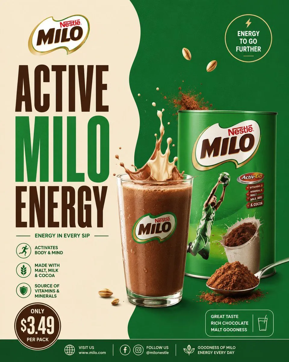
Milo Cocoa Energy Poster
Goal: Create a premium square advertising poster for a cocoa malt drink brand, styled like a polished real-world grocery beverage campaign. Use brand_name as the featured brand and make the poster feel energetic, sporty, nutritious, and chocolatey. Canvas: Square 1:1 poster, high-resolution commercial print look. Split background with a warm cream panel on the left and a deep emerald green panel on the right, divided by a soft organic wavy vertical edge. Use studio lighting, glossy product rendering, crisp shadows, and realistic splashes. Layout: Place the brand logo at the top left. Under it, create a huge stacked headline in bold condensed uppercase typography reading headline_text; make “ACTIVE” dark chocolate brown, “MILO” bright green, and “ENERGY” dark chocolate brown. Center-right should feature a realistic glass of chocolate malt drink in front of a large green product tin. The drink splash erupts upward from the glass with both cream-colored milk and chocolate liquid, plus airborne cocoa powder particles. Put the product tin behind and slightly to the right of the glass. Add a spoonful of cocoa powder and loose cocoa powder at the lower right foreground. Main product details: The product tin is a glossy green cylindrical can with a large MILO logo on the front, a dynamic athlete in a green sports uniform jumping with a ball, a cocoa cup image, and a small red nutrition badge. The glass is clear, filled with cold brown chocolate malt drink, condensation droplets, foam on top, and the MILO logo printed on the front. Text content and badges: Include exactly 8 text areas: 1) top-left brand logo text “Nestlé MILO”; 2) main headline “ACTIVE MILO ENERGY”; 3) tagline below headline “ENERGY IN EVERY SIP”; 4) top-right circular badge “ENERGY TO GO FURTHER” with a small lightning icon; 5) three left-side benefit rows with icons and text: “ACTIVATES BODY & MIND”, “MADE WITH MALT, MILK & COCOA”, and “SOURCE OF VITAMINS & MINERALS”; 6) bottom-left price badge reading price_text; 7) lower-right rounded rectangle reading “GREAT TASTE RICH CHOCOLATE MALT GOODNESS” with a simple glass icon; 8) bottom footer with website/social information: “VISIT US www.milo.com”, “FOLLOW US @milonestle”, and “GOODNESS OF MILO ENERGY EVERY DAY”. Counted visual elements: Include exactly 1 glass of chocolate malt drink, exactly 1 large product tin, exactly 1 spoon filled with cocoa powder, exactly 1 cocoa powder mound, exactly 2 floating malt grains near the upper middle-right, exactly 3 small malt grains near the lower left of the glass, exactly 1 top-right circular energy badge, exactly 3 benefit icons on the left, exactly 1 bottom-left circular price badge, exactly 1 lower-right rounded taste badge, and exactly 3 footer icon groups. Visual style: Bold FMCG advertising design inspired by Milo or Nesquik-style cocoa drink posters, with saturated green, cream, chocolate brown, gold accents, thick condensed type, clean iconography, glossy packaging, and photorealistic food splashes. Make the cocoa and milk splash look frozen in motion with powder burst details. Keep the poster clean, balanced, and highly legible. Constraints: Do not add extra products, characters, text blocks, badges, or icons beyond the counted elements. Avoid clutter. No watermark. No spelling errors. Maintain strong brand hierarchy with the headline dominating the left half and the drink/tin dominating the right half.