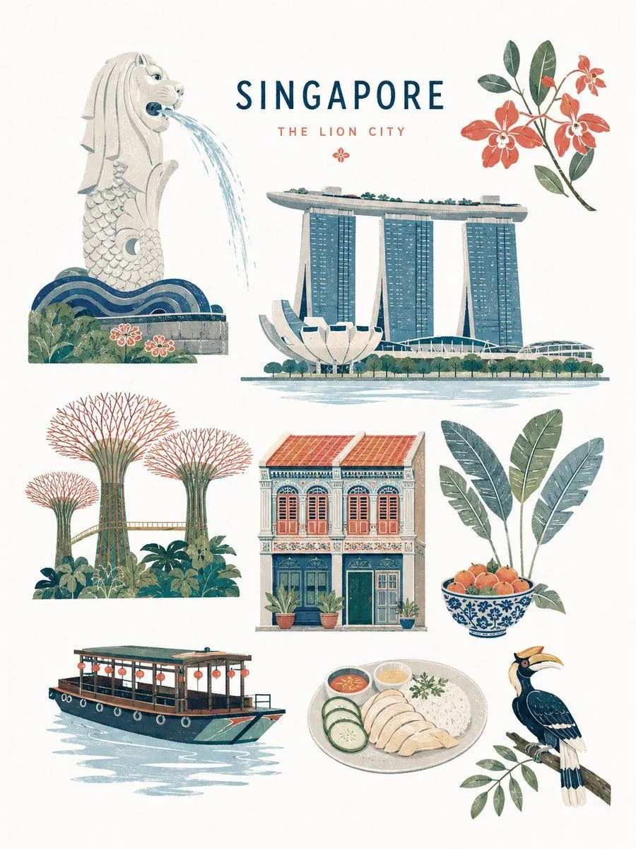
Mid-century Editorial Illustration
Create a premium mid-century-inspired flat editorial illustration of subject, rendered in a refined handcrafted printmaking aesthetic. The artwork should feel like a sophisticated vintage children’s encyclopedia illustration combined with Scandinavian editorial design and retro nature-book graphics. Language: English 8K ultra-high resolution with a 3:4 aspect ratio STYLE: minimalist flat-shape illustration soft geometric simplification handcrafted gouache + risograph + silkscreen print texture subtle paper grain and dry ink imperfections color_palette clean matte colors crisp neutral white balance bright museum-quality paper appearance no yellow tint no beige cast no sepia tone no glossy rendering no photorealism no 3D shading elegant editorial composition premium picture-book atmosphere modern museum-shop illustration vibe COMPOSITION: spacious balanced layout with multiple elements harmoniously arranged simplified organic shapes stylized plants, objects, animals, architecture, landmarks, or symbolic elements depending on subject visual storytelling through clustered illustrated motifs element_count illustrated elements total playful but refined asymmetrical editorial balance large clean negative space on soft neutral white paper background premium Scandinavian editorial layout feeling TEXTURE & PRINT FEEL: subtle premium paper texture refined layered ink overlap delicate risograph misalignment soft dry brush grain light handcrafted print imperfections tactile handcrafted surface feeling clean bright paper surface controlled ink density airy and crisp visual atmosphere ILLUSTRATION RULES: simplified eyes and facial features rounded organic silhouettes minimal line usage flat layered color blocking decorative but restrained detail density avoid excessive realism avoid anime style avoid modern vector corporate style avoid bright neon colors avoid sharp digital gradients avoid yellowish paper tone avoid vintage sepia coloration MOOD: quietly playful, educational, nostalgic, timeless, sophisticated, airy, clean, premium editorial illustration, Scandinavian museum-book elegance OUTPUT: high-resolution editorial illustration, ultra-clean composition, refined handcrafted print aesthetic, bright neutral paper tones, crisp museum-quality editorial finish, suitable for premium magazine spreads, art books, museum posters, or luxury children’s publishing.