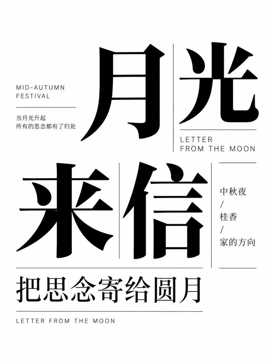
Mid-Autumn Typography Poster
Create a minimalist, high-contrast typography poster for the Mid-Autumn Festival. The design should be monochromatic (black text on a white background) and feature a sophisticated layout of Chinese characters and English labels. Layout & Text Content: 1. Top Section: Feature two massive, bold serif-style Chinese characters '月光' (Moonlight). To their left, include small uppercase sans-serif text 'MID-AUTUMN FESTIVAL' above a thin horizontal line, followed by two lines of smaller Chinese text: '当月光升起' and '所有的思念都有了归处'. 2. Middle Section: Display two large Chinese characters '来信' (Letter/Incoming Mail). To the right of these, place the English text 'LETTER FROM THE MOON' in uppercase sans-serif, separated by a vertical line from a column of three short Chinese phrases: '中秋夜', '桂香', and '家的方向'. 3. Bottom Section: A horizontal line separates the main body from a final row of medium-sized Chinese text '把思念寄给圆月'. Below this, at the very bottom edge, is the text 'LETTER FROM THE MOON' in small uppercase letters. Visual Style: Use a clean, modern editorial aesthetic. The primary Chinese font should be a heavy, elegant serif (Songti style), while secondary text uses a light sans-serif. Ensure ample negative space to maintain a balanced composition.