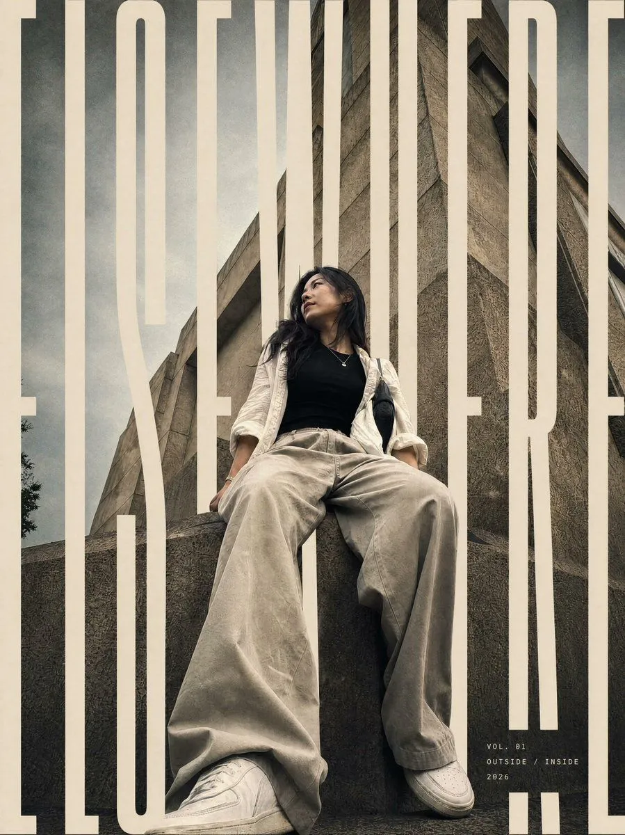
Layered Editorial Typography Poster
Using the provided reference image, transform it into a vertical editorial magazine poster while preserving the subject’s identity, pose, outfit, low-angle perspective, and brutalist concrete architecture. Reframe slightly tighter into a polished cover composition with cinematic contrast, muted beige/gray grading, subtle film grain, and a premium fashion-editorial finish. Typography: Add one oversized condensed uppercase typographic word across the full poster: main_cover_word. Make the letters extremely tall, cream/off-white, and cropped by the poster edges. Integrate the word through the composition with depth masking: some vertical letter strokes pass behind the subject and architecture, while others sit in front, creating a layered magazine-cover effect. Keep the typography bold, minimal, and architectural. Additional text: Add a small minimal cover-detail block near the lower right with exactly 3 lines: issue_line, theme_line, and year. Use small spaced uppercase lettering in off-white. Constraints: Do not change the person’s clothing, expression, or pose. Do not add extra objects, logos, borders, or watermarks. Keep the brutalist building visible and make the final image feel like an editorial-grade poster rather than a simple photo filter.