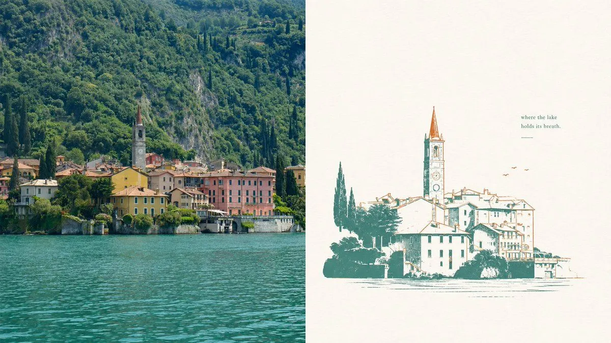
Lake Como Two-Color Print Diptych
Goal: Create a two-panel horizontal composition comparing a real lakeside village photo with a simplified two-color misregistered print illustration of the same scene. Canvas: Wide 16:9 landscape canvas, split exactly into 2 equal vertical panels. Layout: Left panel is a realistic travel photograph; right panel is a minimalist poster-style illustration on warm off-white paper. No border between panels except the clean vertical split. Left panel: Show a picturesque European lakeside village at the base of a steep, densely forested mountain. Include turquoise lake water filling the lower third, a row of pastel waterfront buildings in yellow, pink, cream, and terracotta, and one prominent church bell tower with a pointed reddish spire near the center-left. The mountain behind is lush deep green with rocky patches and tall dark cypress trees. Lighting is natural daylight, crisp but slightly softened, like a travel photo of Lake Como. Right panel: Recreate the same village as a vintage two-color screenprint / risograph-style illustration. Use exactly 2 ink colors: teal-green for shadows, trees, outlines, and water marks; rusty orange for roof accents, tower spire, birds, and selective line details. Background is mostly empty warm ivory paper with subtle grain. The village illustration sits in the lower half, slightly right of center, with a tall church tower rising above the roofs. Lines are intentionally imperfect with slight color misregistration, sparse hatching, and broken ink texture. Add exactly 3 small orange birds to the upper right of the village. Add exactly 1 short quote above the illustration on the upper right reading quote and exactly 1 small horizontal teal line underneath it. Style: Editorial travel-poster aesthetic, quiet negative space, elegant imperfect printmaking, two-color ink, calm lake atmosphere, refined minimalism, nostalgic European village mood. Parameters: The scene is location; the main ink colors are primary_ink_color and accent_ink_color; the paper background is paper_color. Constraints: Use exactly 2 panels, exactly 2 ink colors in the right panel, exactly 3 birds, exactly 1 quote block, and exactly 1 underline. Do not add logos, watermarks, extra captions, people, boats, or modern objects.