Kaiju Roller Coaster Poster
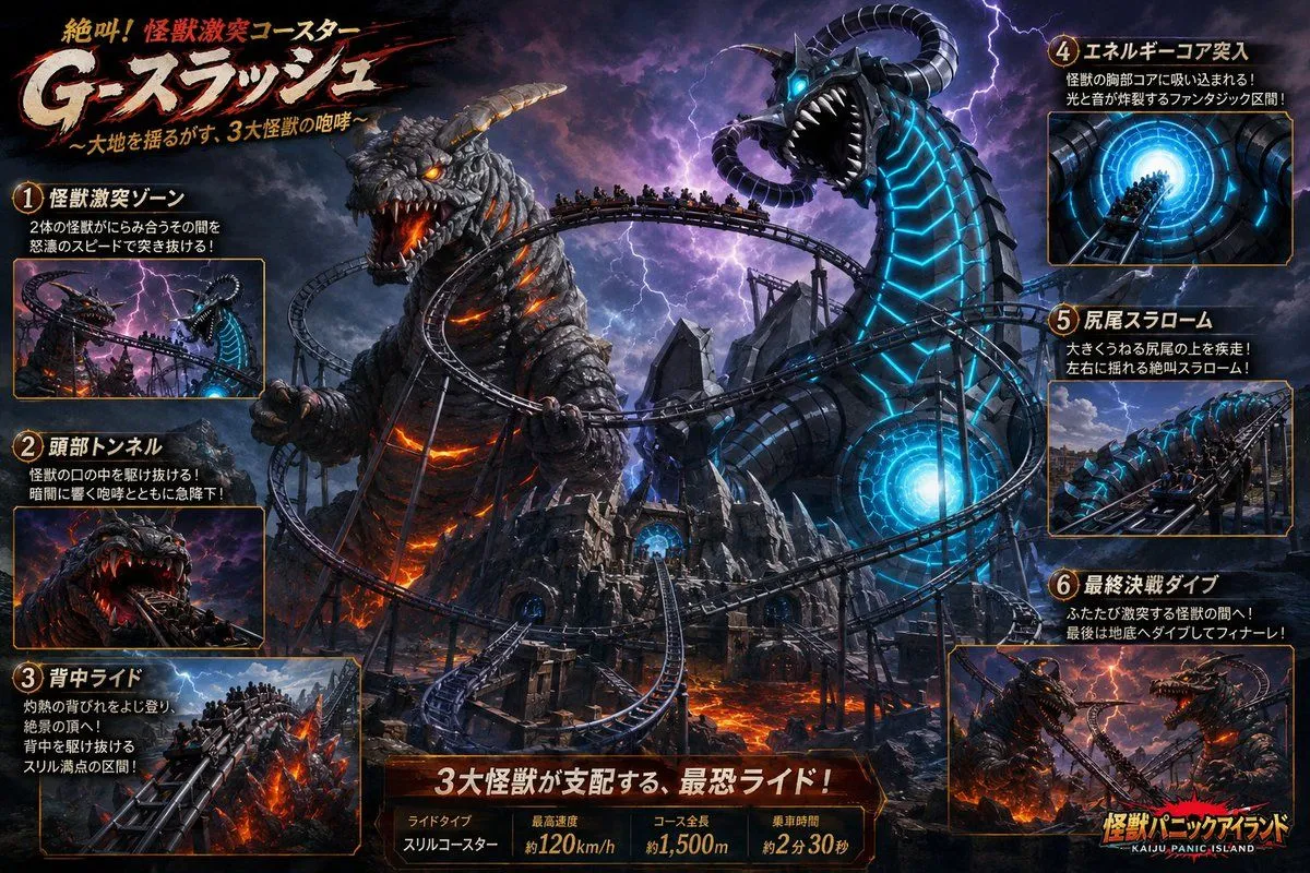
Goal: Create a dramatic Japanese theme-park attraction poster for a kaiju roller coaster named ride_name, showing a high-speed steel coaster weaving through a volcanic monster battlefield dominated by three giant beasts. Canvas: Wide 16:9 promotional key visual, cinematic dark fantasy theme-park advertising style, ultra-detailed digital painting, high contrast, stormy purple-black sky, lightning, lava glow, metallic rails, crowded coaster trains, dramatic perspective, no empty space. Main visual: In the center, a sprawling black roller coaster twists through jagged ruins and lava rivers. Show exactly 3 huge kaiju controlling the scene: 1) a charcoal-gray rocky Godzilla-like beast on the left with glowing orange lava cracks, fiery eyes, horns, open roaring mouth, and claws gripping near the track; 2) a towering biomechanical serpent/dragon on the right with segmented black armor, cyan glowing energy lines, blue eyes, curled horns, and a circular glowing energy core in its body; 3) another horned monster implied in the lower-right finale panel. Multiple coaster trains packed with tiny riders race along the rails, diving into monster mouths, spiraling around bodies, climbing over burning backs, and plunging through tunnels. Typography: Large aggressive Japanese title at top left with brush-stroke texture and red slash accents: 「絶叫!怪獣激突コースター」 above the huge logo 「main_logo_text」. Add subtitle beneath: 「〜大地を揺るがす、3大怪獣の咆哮〜」. Use distressed cream, orange, and red lettering with black shadows, like a Japanese amusement-park thrill ride advertisement. Layout: Build an information-dense attraction poster with a central hero illustration and exactly 6 numbered feature panels around the edges, each with a gold number badge, Japanese heading, two short Japanese description lines, and a small inset action image framed by thin orange-gold borders. Place panels 1–3 stacked vertically on the left and panels 4–6 stacked vertically on the right. Six feature panels, exact count and labels: 1. 「怪獣激突ゾーン」 — inset shows the coaster rushing between the orange lava monster and blue cyber serpent during lightning. 2. 「頭部トンネル」 — inset shows riders diving into a monster’s open mouth tunnel with teeth around the track. 3. 「背中ライド」 — inset shows the coaster climbing along the burning rocky back of the lava kaiju. 4. 「エネルギーコア突入」 — inset shows the train entering a bright cyan circular energy core tunnel. 5. 「尻尾スラローム」 — inset shows the coaster weaving left and right around the serpent’s huge tail. 6. 「最終決戦ダイブ」 — inset shows the final dive between battling monsters over lava. Bottom information bar: Across the bottom center, add a dark metallic plaque with glowing orange edges. Large Japanese headline: 「3大怪獣が支配する、最恐ライド!」. Beneath it include exactly 4 stats columns: 「ライドタイプ」 with 「スリルコースター」, 「最高速度」 with 「約top_speed」, 「コース全長」 with 「約track_length」, and 「乗車時間」 with 「約ride_duration」. Branding: Bottom right corner includes a smaller attraction logo reading 「怪獣パニックアイランド」 with English subtext “KAIJU PANIC ISLAND,” styled in yellow-orange Japanese lettering with a black outline. Visual constraints: Keep the image as a polished fictional amusement-park poster, not a real photograph. Make the Japanese text bold and legible where possible. Use orange lava lighting on the left and cyan energy lighting on the right. Include no watermark, no QR code, no real company logos, and no extra feature panels beyond the exact six listed.