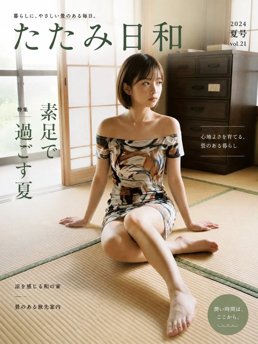
Japanese Tatami Lifestyle Magazine Cover
Goal: Create a realistic Japanese lifestyle magazine cover for magazine_title, with a calm summer tatami-room aesthetic and elegant editorial typography. Canvas: Portrait magazine cover, 3:4 aspect ratio, full-bleed photo background, warm natural daylight, soft beige and deep green color palette. Main image: A young Japanese woman with a short dark bob haircut sits barefoot on a tatami mat floor in a traditional Japanese room. She is seated near the center-right, legs folded casually with one leg extended toward the camera, hands resting on the floor behind her for support, gazing thoughtfully to the right. She wears an off-shoulder fitted summer dress with an abstract brown, cream, black, and gray painterly pattern. Lighting is soft and sunlit from shoji-style windows on the left, creating a serene domestic atmosphere. Background includes sliding shoji panels, tatami seams, and a dark wooden chest of drawers on the right. Layout: Large magazine masthead across the upper left and center in dark muted green Japanese calligraphy-style type. Small tagline above the masthead. Issue information in the upper right. Vertical feature headline on the left side. Small editorial blurb on the right with thin horizontal divider lines. Small article teasers in the lower left. A muted sage-green circular badge in the lower right. Text content: Include exactly these visible text groups, preserving Japanese text: 1. Top tagline: tagline 2. Main masthead: magazine_title 3. Upper-right issue text: "2024", "夏号", "vol.21" 4. Left vertical feature label and headline: "特集", feature_headline 5. Right-side blurb: "心地よさを育てる、", "畳のある暮らし" 6. Lower-left teasers: "涼を感じる和の家", a thin divider line, "畳のある旅先案内" 7. Lower-right circular badge: badge_text plus a small decorative wave mark underneath. Visual style: Polished commercial magazine design, photorealistic editorial photography, clean Japanese lifestyle-magazine layout, generous negative space, refined but slightly familiar mainstream cover design. Use muted forest green typography, thin white divider lines where shown, and restrained minimal ornamentation. Constraints: Keep the cover realistic and uncluttered. Do not add extra people, extra cover lines, barcodes, logos, watermarks, or English translations. Ensure all Japanese text is legible and placed like a real magazine cover.