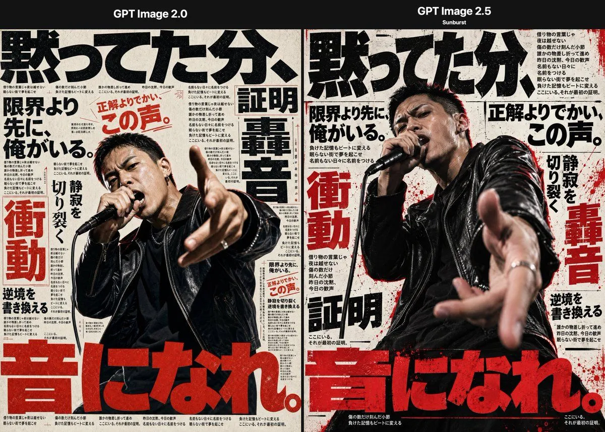
Japanese Punk Poster AI Comparison
Goal: Create a side-by-side comparison graphic showing two AI-generated Japanese punk/hip-hop magazine posters, with the left panel labeled left_model_label and the right panel labeled right_model_label. The image should feel like a dramatic test comparing an older image model with a newer, more realistic one. Canvas: Wide horizontal 3:2 composition, black header bar across the top, two equal vertical poster panels below separated by a thin divider. Use gritty off-white newsprint paper texture, black ink, distressed red accents, and high-contrast editorial poster design. Layout: There are exactly 2 poster panels. Panel 1 on the left shows a Japanese male vocalist photographed from the waist up, slightly lower realism, holding a black microphone near his mouth with one hand and reaching toward the viewer with the other. Panel 2 on the right shows the same concept with stronger realism and more cinematic depth: a Japanese male vocalist in a black leather jacket, intense facial expression, microphone at his mouth, hand thrust toward the camera with strong perspective blur. Add small subtitle text under the right header reading "Sunburst". Main subject: In each panel, depict exactly 1 male singer, for a total of 2 singers. He has short dark hair, a sweaty intense performance expression, a black leather jacket over a dark shirt, silver rings, and a handheld black microphone. The pose is aggressive and immersive, as if shouting lyrics directly at the viewer on stage. Text and typography: Fill both posters with oversized Japanese editorial typography. Use exactly 6 major visible Japanese slogan elements repeated across the layout: 1) huge black headline across the top reading main_japanese_headline, 2) black phrase "限界より先に、俺がいる。", 3) red phrase "正解よりでかい、この声。", 4) large red vertical word "衝動", 5) large black/red vertical word "轟音", 6) enormous red bottom headline bottom_japanese_headline. Surround these with many tiny Japanese body-copy columns, notes, arrows, and thin dividing rules like a dense music magazine layout; the tiny text does not need to be readable but should look typographically authentic. Visual style: Japanese underground music poster, punk zine, brutalist typography, photocopied paper grain, ink bleed, distressed halftone, red paint splatters, torn-print imperfections, cinematic concert photography, shallow depth of field especially on the right panel. Left panel should look flatter and less lifelike; right panel should look more realistic, dimensional, and visceral. Color palette: off-white paper, deep black, crimson red, subtle gray shadows, skin tones, glossy black leather highlights. Constraints: Keep the two-panel comparison structure clear. Do not add extra singers, extra panels, logos, watermarks, or English body text beyond the two model labels and the small "Sunburst" subtitle. Preserve the Japanese slogans as visible poster text.