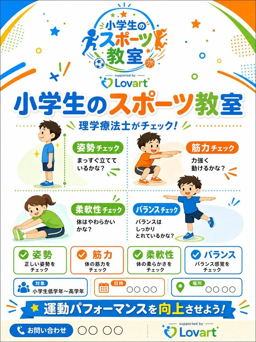
Japanese Kids Sports Class Flyer
Goal: Create a bright, professional Japanese promotional flyer for a sponsor-supported elementary school sports class, using a cheerful children’s sports-clinic theme. Canvas: Vertical A4 flyer, 3:4 aspect ratio, white background with rounded colorful corner swooshes in blue, orange, and green. Add playful confetti, stars, dots, circles, motion lines, and small sports icons throughout. Keep the design clean, print-ready, and family friendly. Main branding: At the top center, place a circular sports-class logo with running and jumping child silhouettes, soccer ball and basketball icons, and the Japanese logo text event_logo_text. Under it, add small text “supported by” and the Lovart logo in blue and green. Use the Lovart logo again near the bottom right with “supported by” above it. Headline area: Large bold Japanese headline across the upper middle: main_headline_text. Use thick rounded lettering with white outline and soft shadow; color the words blue, orange, and green. Beneath it, add the subheadline subheadline_text in blue with small green accent lines. Main layout: Divide the central area into a 2-by-2 dotted grid containing exactly 4 illustrated child activity check sections: 1. Posture check, upper left: a boy in blue sportswear standing in side profile, with a green label posture_label and text “まっすぐ立てているかな?” Add a vertical green dotted measuring line beside him. 2. Strength check, upper right: a smiling boy in orange shirt and shorts doing a squat or reaching pose, orange label “筋力チェック,” and text “力強く動けるかな?” 3. Flexibility check, lower left: a smiling girl in green shirt stretching forward while seated, green label “柔軟性チェック,” and text “体はやわらかいかな?” 4. Balance check, lower right: a smiling boy in blue shirt balancing on one leg with arms out, blue label “バランスチェック,” and text “バランスはしっかりとれているかな?” Use soft pastel oval background shapes behind each child and a colorful flat vector illustration style. Bottom information cards: Below the activity grid, place exactly 4 rounded rectangular summary cards in a row, each with a colored checkmark icon and bold Japanese title: 1. Green card: “姿勢,” smaller text “正しい姿勢をチェック.” 2. Orange card: “筋力,” smaller text “体の筋力をチェック.” 3. Green card: “柔軟性,” smaller text “体の柔らかさをチェック.” 4. Blue card: “バランス,” smaller text “バランス感覚をチェック.” Event info row: Add exactly 3 rounded information boxes beneath the summary cards: 1. Blue people icon, label “対象,” value “小学生低学年〜高学年.” 2. Orange calendar icon, label “日時,” followed by four empty circle placeholders. 3. Green map-pin icon, label “場所,” followed by four empty circle placeholders. Bottom CTA: Add a wide blue ribbon banner with a yellow star on the left and the Japanese slogan bottom_slogan_text; emphasize “向上” in yellow. At the very bottom left, add a blue rounded contact button with a white phone icon and “お問い合わせ,” followed by four empty circle placeholders. Visual style: Modern Japanese children’s event flyer, high-quality vector graphics, vibrant blue/orange/green palette, rounded typography, crisp spacing, light shadows, playful but organized. Avoid photorealism, avoid clutter, no extra people beyond the 4 children in the activity grid, no extra cards beyond the specified counts.