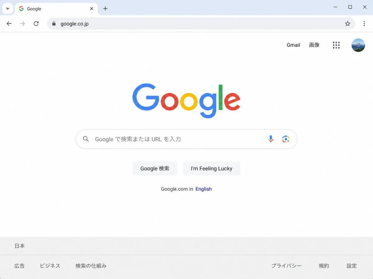
Japanese Google Homepage Screenshot
Create a clean, realistic desktop browser screenshot of the country_version Google homepage in a Chrome-like window, viewed straight on at 4:3 aspect ratio. The browser UI shows one active tab labeled Google with the Google favicon, a plus button for a new tab, back and forward arrows, reload, a lock icon, and the address bar containing website_url; at the far right are a star bookmark icon, three-dot menu, and window controls. The webpage is mostly white with the multicolor Google logo centered high on the page. In the top-right of the page are exactly 4 items: the text link “Gmail”, the text link “画像”, a 3-by-3 Google apps grid icon, and a circular user profile avatar showing a small blue mountain landscape. Centered beneath the logo is one rounded search bar with a magnifying glass icon on the left, placeholder text search_placeholder, and exactly 2 icons on the right: a microphone and Google Lens. Below it are exactly 2 light-gray buttons labeled first_button_text and second_button_text. Under the buttons is a small language line reading “Google.com in English,” with “English” in blue. At the bottom is a pale gray footer with the location “日本” on the first row and exactly 6 footer links on the second row: “広告”, “ビジネス”, “検索の仕組み”, “プライバシー”, “規約”, and “設定”. Use accurate Google colors, crisp sans-serif typography, subtle shadows, soft gray browser chrome, lots of empty white space, and photorealistic UI rendering.