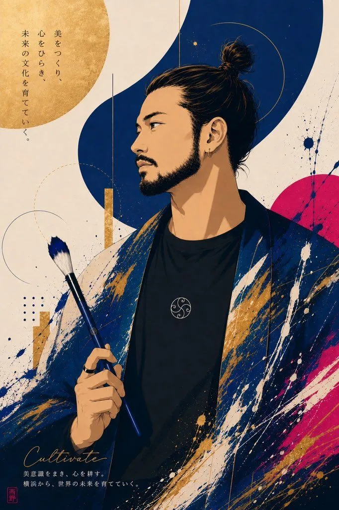
Japanese Artist Poster Portrait
Create a vertical Japanese art-poster illustration featuring a stylish East Asian male artist as the central subject. Canvas: portrait orientation, roughly 2:3 ratio, cream washi-paper background with subtle grain and ink speckles. Subject: a three-quarter bust portrait of a young adult man with hair_style, sharp eyebrows, almond eyes looking left, defined nose, mustache and short beard, small gold hoop earring, calm serious expression. He wears a black crew-neck shirt with a small circular white emblem on the chest and a loose dark indigo kimono-like jacket covered in expressive white, navy, gold, and magenta paint splashes. His right hand holds exactly 1 long blue-handled paintbrush with white bristles near the lower-left center of the image. Composition: place the figure slightly right of center, cropped from mid-torso upward. Behind him use bold modern Japanese graphic design: exactly 1 large textured gold circle in the upper left, exactly 1 thick deep-navy flowing S-shaped vertical ribbon behind the head, exactly 1 magenta semicircle on the right edge, exactly 3 thin circular line motifs, exactly 2 vertical gold rectangular bars, exactly 1 small navy dotted grid, and scattered ink splatters in navy, white, gold, and magenta. Text content: include exactly 3 text areas. At upper left, vertical Japanese copy reading vertical_japanese_slogan. At bottom left, elegant cursive English word signature_word. Under it, two small Japanese lines reading bottom_japanese_caption. Add exactly 1 small red square seal stamp at the bottom-left corner. Visual style: premium editorial poster, contemporary ukiyo-e meets fashion illustration, clean vector-like linework with painterly texture, high detail in face and hair, rich indigo and gold palette, dynamic brush-stroke energy, refined negative space, no photorealism. Constraints: keep all text legible and positioned as described, do not add extra people, extra brushes, frames, logos, or watermarks.