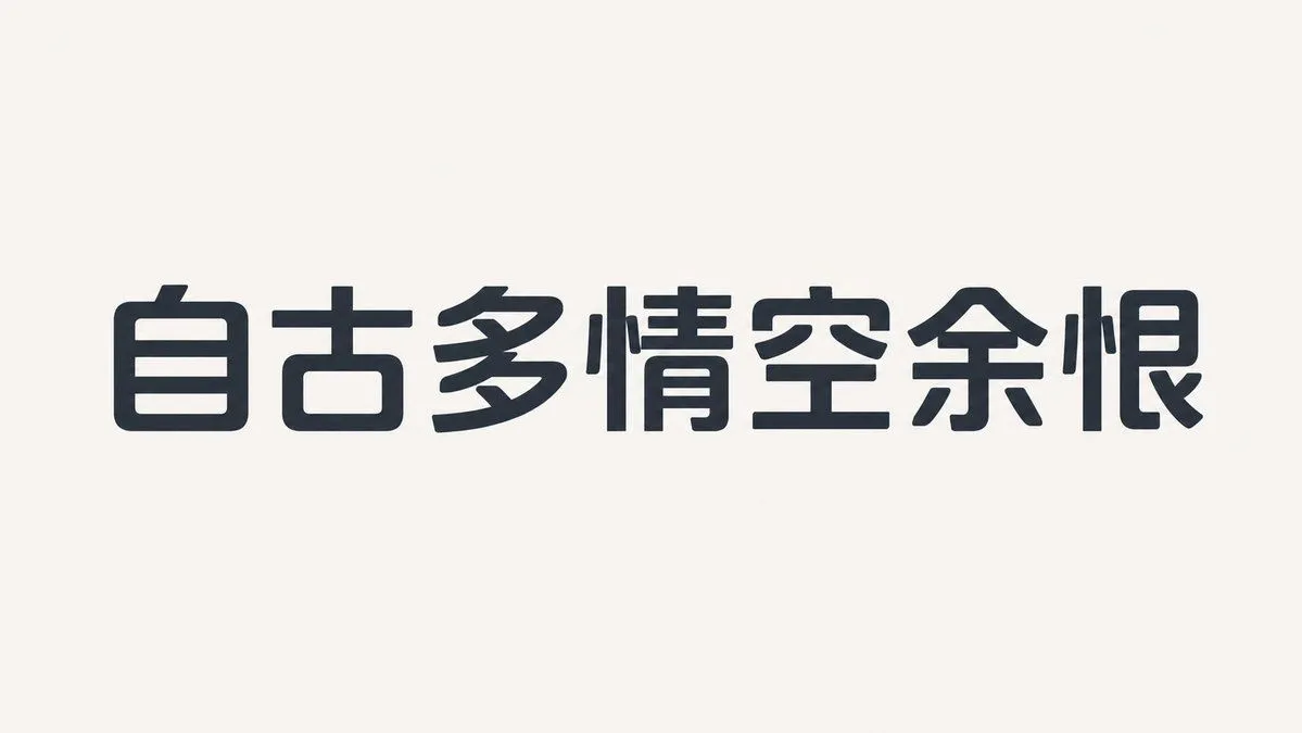
Humanist Sans-Serif Typography Design
This is a font_type typeface with a slightly wide face, low center of gravity, and open counters. The skeleton is based on a humanist structure, overall compact but not crowded. The strokes have low contrast, with horizontal strokes slightly thinner than vertical ones. The outer curves are full while the inner sides are tightened. The corners use small-radius rounded corners, and the ends are mostly slightly beveled. The letter spacing is tight but with sufficient internal white space. Repeated components maintain the same curvature. Lowercase a, e, the number 2, and uppercase R are the core identifying characters. The bold version increases weight by expanding the inner side of the strokes rather than compressing the counter. —— Text Content: text_content Aspect Ratio: aspect_ratio