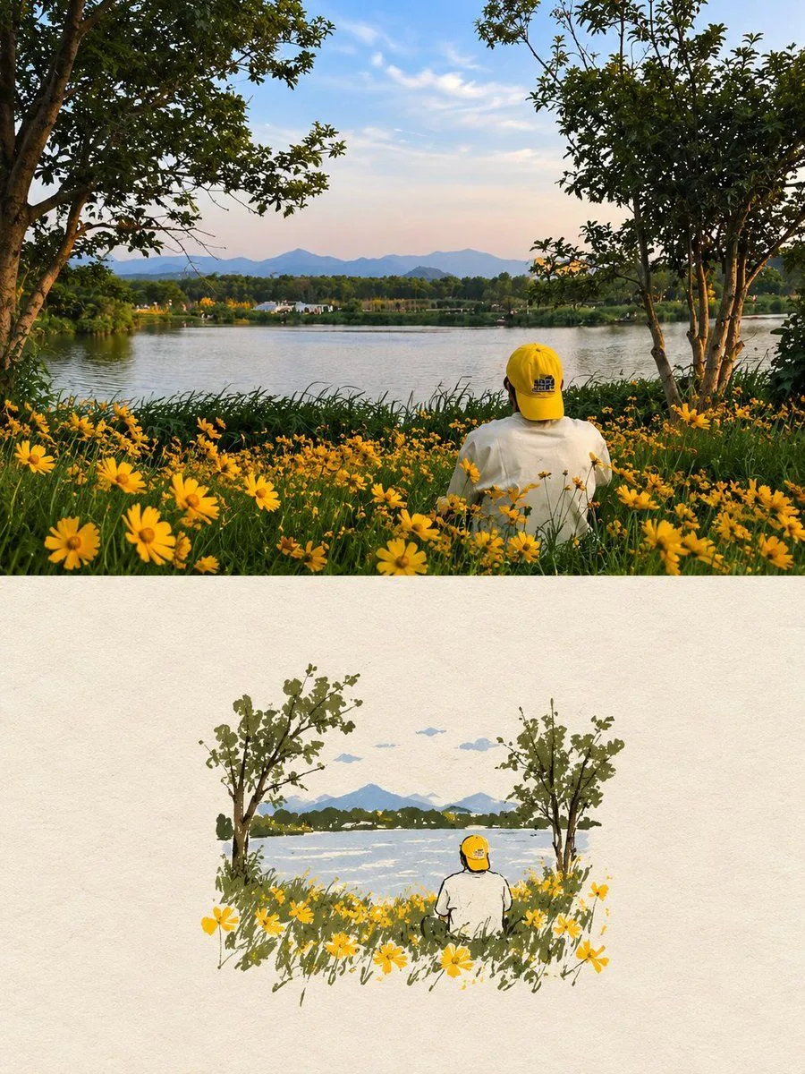
High-End Editorial Poster with Illustration
Create one independent high-end editorial poster for each uploaded photo. Never combine photos. FORMAT Strict 3:4 vertical composition with an exact 50/50 horizontal split. The top and bottom halves must be equal in height and visually connected as one refined editorial cover. TOP HALF: ORIGINAL PHOTO Use the original photo faithfully. Preserve the subject, identity, facial features, proportions, pose, clothing, objects, composition, lighting, shadows, atmosphere, and color mood. Keep it fully photorealistic with only subtle premium editorial color grading. Never stylize, distort, replace, or alter the main subject. Extend only surrounding background when necessary, seamlessly and naturally. BOTTOM HALF: HAND-DRAWN ILLUSTRATION Reinterpret the same scene as a minimalist handmade paper illustration. Preserve the recognizable subject, silhouette, pose, key objects, and main visual story. Use delicate imperfect lines, simple acrylic-style flat color shapes, visible brush marks, rough paper texture, organic edges, and subtle handmade imperfections. Keep the illustration small and centered, occupying about 10–20% of the bottom half, with generous negative space. Use a rough white, warm off-white, or pale natural paper background with only minimal environmental details. COLOR Extract colors from the original photo and reduce them to a maximum of 4 restrained, harmonious colors. Use controlled flat color blocks while maintaining subtle paper grain and brush texture. TYPOGRAPHY Optional minimal editorial text only when appropriate, such as a short title, keyword, location, or number. Keep it understated and never force text into the design. STYLE Quiet, poetic, refined, minimal, relaxed, artistic, thoughtful, premium, high-recognition. FINAL Maintain the exact 50/50 split. The top must remain a faithful photograph, while the bottom is a simplified handmade illustration of the same scene. Avoid clutter, excessive colors, heavy typography, artificial effects, or unnecessary details. The result should feel like a premium contemporary independent art publication cover.