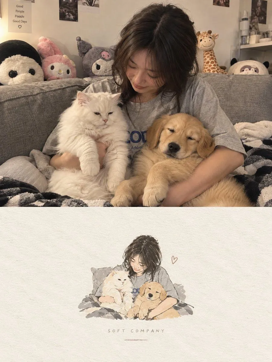
High-end Editorial Poster from Photo
Create one independent high-end editorial poster for each uploaded photo. Do not combine multiple photos into a collage. Each photo must be processed and output as a separate poster. OVERALL FORMAT Strict 3:4 vertical composition. Divide the canvas horizontally into two exactly equal sections, with a precise 1:1 height ratio. The top half occupies exactly 50% of the canvas. The bottom half occupies exactly 50% of the canvas. The two sections should feel visually connected as one refined art publication cover. TOP HALF — ORIGINAL PHOTOGRAPH Preserve the original photograph as faithfully as possible. Keep the main composition, subjects, identity, facial features, body proportions, poses, expressions, clothing, objects, and spatial relationships unchanged. Preserve the realistic photographic texture, natural lighting, shadows, atmosphere, and original color mood. Apply only subtle, sophisticated editorial color grading, creating the feeling of a premium magazine photograph, contemporary art book, or high-end independent publication. The image should remain photorealistic and authentic, never overly retouched or artificially stylized. If necessary to fit the 3:4 composition naturally, extend the sky, ground, walls, or surrounding environmental background. Background extension must feel seamless and photographic. Never stretch, distort, reshape, replace, or alter the main subject. BOTTOM HALF — MINIMAL HAND-DRAWN PAPER ILLUSTRATION Extract the most recognizable visual elements from the original photograph and reinterpret them as a minimalist hand-drawn paper-cover illustration. Preserve: The most recognizable subject Essential silhouette and proportions Key pose or gesture Important objects The core narrative relationship between people and objects Highly simplify the image. Remove unnecessary details and retain only the visual information needed for immediate recognition. Use: Delicate, slightly imperfect hand-drawn lines A small number of bold, clearly defined acrylic-style flat color shapes Rough paper texture Visible handmade brush marks Slightly irregular, organic edges Subtle imperfections that make it feel genuinely handmade The main illustrated subject should be small, centered, and carefully composed, occupying approximately 10–20% of the bottom half. Leave a large amount of negative space around the illustration. The background should primarily resemble: Rough white paper Warm off-white paper Pale natural paper Minimal editorial book-cover stock Use only a few lines or small color shapes to suggest the surrounding environment. COLOR PALETTE Extract the dominant colors directly from the original photograph. Compress the palette into no more than 4 main colors. Keep the colors restrained, sophisticated, and harmonious. Use bold but controlled flat color blocks. Avoid excessive color variation. Preserve subtle paper grain and handmade brush texture. The illustration should visually feel like a simplified