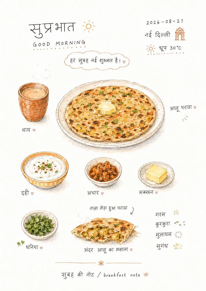
Hand-drawn Breakfast Journal Aesthetic Poster
Create a relaxed, hand-drawn observation map around any subject: a large area of clean white paper serves as the main space, with the theme content broken down into several small object-like graphics, cross-sections, small connected pieces, short repetitive items, and close-ups, scattered across the upper and middle sections of the paper. Instead of a formal table, they are connected by loose line spacing, staggered white space, and handwritten phrases that simulate horizontal reading, forming an intimate rhythm as if taste, touch, sound, or movement were recorded casually. Small graphics use theme-derived materials and colors, maintaining small scales, rounded outlines, slight perspective, and hand-painted traces, with local preservation of grain, burnt edges, crumbs, textures, or section details; do not let them become unified icons, they should look like physical notes between picture book food illustrations and journal stickers. Text is the skeleton of the picture: use thin black lines with a sense of handwritten kana or childish handwriting, loose spacing, slightly jumping baselines, short words interspersed around the graphics, some strings close to the edges of the graphics, and some floating independently in the blank space, with a line of small signature-style explanation at the bottom. The color is derived from the theme itself, with white paper occupying the largest area and fine black characters carrying information; the main color remains warm, clean, and slightly high-brightness; a small amount of high-saturation warm colors or dark colors are only used for the focal points, shadows, and textures of the graphics, with dots of green, brown, or other thematic auxiliary colors as minimal rhythm. The overall image maintains a slight softening and natural compression feel of scanned paper, with hand-drawn unevenness and pigment absorption at the edges, without heavy shadows, decorative borders, or modern typography; the focus is to let the graphics and onomatopoeic handwriting together create a refreshing and childlike information page. Theme: theme