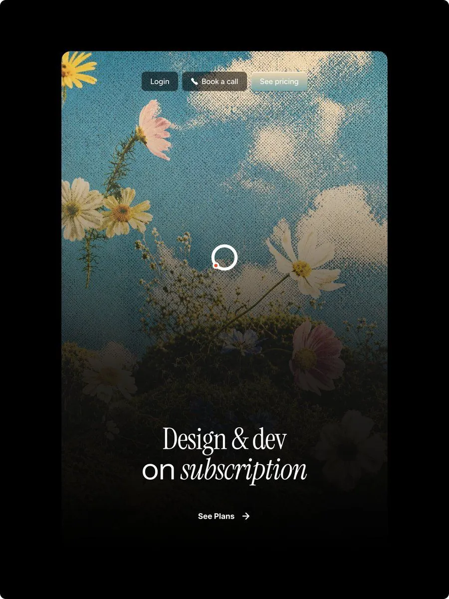
Halftone Floral Landing Page Hero
Goal: Create a polished vertical landing-page hero mockup for a design subscription service, with a nostalgic halftone editorial look and Figma-style web design precision. Canvas: Portrait 3:4 image on a pure black outer background. Center a tall rounded-rectangle website card with large corner radius, occupying most of the frame and leaving thick black margins around it. Main visual: Inside the card, use a dreamy upward-looking photograph-style scene of wildflowers against a blue sky with soft white clouds. Apply a strong vintage halftone dot texture across the entire card image. Add a dark black gradient overlay rising from the bottom so the lower half becomes moody and readable while the top remains bright sky blue. Visible floral elements should include exactly 9 main blossoms: 1 partial yellow flower in the top-left corner, 1 pink flower near the upper-left, 2 white daisies clustered left-middle, 1 large white cosmos on the right-middle, 1 white daisy near the bottom-left, 1 small bluish flower near lower center, 1 pink flower at lower-right, and 1 dark partially hidden white flower at the bottom-right edge, plus thin stems and tiny baby's-breath buds. Top navigation: Place exactly 3 small pill buttons centered near the top of the card with subtle glass/blur styling and soft shadows. Button 1 text: "login_button_text" on a dark charcoal pill. Button 2 text: "booking_button_text" with a small white phone icon before the text on a warm dark translucent pill. Button 3 text: "pricing_button_text" on a pale frosted gray-blue pill. Use small clean sans-serif white text. Center detail: Add one loading spinner in the middle of the card, made from a white circular ring with a small orange-red dot on the lower-left part of the ring. Keep it simple and crisp. Hero typography: Near the lower third, center a large elegant white serif headline reading "headline_text". The first line says “Design & dev”; the second line says “on subscription,” with the word “subscription” in italic serif. Use refined high-contrast type, generous letter spacing, and a luxurious editorial feel. Call to action: Below the headline, center a small white CTA reading "call_to_action_text" followed by a thin right arrow. Keep it minimal and aligned with the headline. Style constraints: High-end web hero design, realistic floral sky background, halftone print texture, dark cinematic bottom fade, rounded card corners, no browser chrome, no extra logos, no watermark, no additional text beyond the 3 nav buttons, the headline, and the CTA.