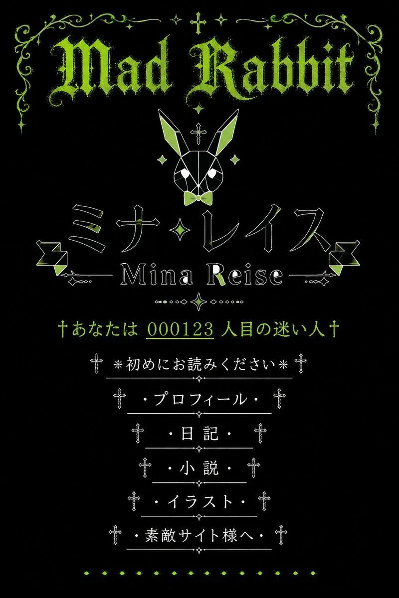
Gothic Japanese Mobile Homepage
Goal: Create a vertical screenshot-style graphic of a nostalgic early-2000s Japanese mobile personal homepage with a gothic lolita / dark fantasy aesthetic, centered on the fictional site owner site_owner_name and the site title main_gothic_title. Canvas: Portrait 2:3 aspect ratio, black background, designed like an old mobile homepage landing page. Use a limited palette of acid lime green, white, and black. Everything is vertically centered with generous black space and symmetrical ornamentation. Visual style: Ancient Japanese cellphone homepage, faux gothic web shrine, pixel-era elegance, distressed lime-green blackletter typography, thin white line art, small crosses, sparkles, filigree, diamonds, dotted separators, and decorative horizontal rules. The mood is occult, cute, rabbit-themed, and nostalgic. Layout: At the top, place an ornate lime-green filigree border spanning the width, with symmetrical curling vines, small sparkle stars, and a tiny cross at the center. Beneath it, display the large distressed blackletter headline “main_gothic_title” in lime green. Below the title, center a geometric white line-art rabbit head icon with long ears, lime-green ear fills, a small lime bow tie, diamond accents, and a small cross above it. Main name area: Under the rabbit, place a large Japanese katakana name in thin outlined white lettering with lime highlights: “japanese_display_name”. Directly below, show the romanized name “site_owner_name” in a serif font, flanked by thin horizontal decorative lines and small geometric ornaments. Add one central diamond/sparkle motif between the Japanese name and the romanized name. Visitor line: Below the name area, add a lime-green old-homepage counter message with crosses on both ends: “†あなたは visitor_counter 人目の迷い人†”. Underline or emphasize the number as if it is a classic homepage hit counter. Navigation menu: Create exactly 6 vertically stacked menu links, centered, each in white Japanese text with a leading and trailing cross ornament and a thin horizontal divider line. The 6 visible menu items must be: 1) “※初めにお読みください※”, 2) “・プロフィール・”, 3) “・日記・”, 4) “・小説・”, 5) “・イラスト・”, 6) “・素敵サイト様へ・”. Place tiny diamond ornaments between divider lines. Decorative elements count: Include exactly 1 large top headline, 1 geometric rabbit icon, 1 large Japanese display name, 1 romanized name line, 1 visitor counter line, 6 navigation menu links, 2 side geometric ribbon-like ornaments near the name area, and 1 bottom row of small lime diamond dots. Constraints: Keep the composition symmetrical and centered, no modern UI chrome, no photographic elements, no extra menu items, no watermark, no realistic phone frame. Make the text legible while preserving an aged bitmap/webpage feel.