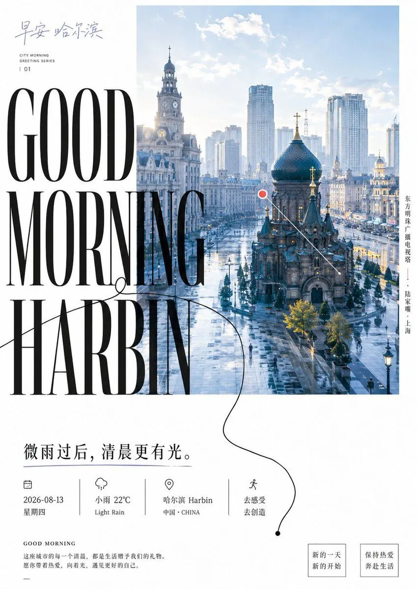
Good Morning Harbin Magazine Poster
Goal: Create a refined vertical city-morning magazine poster for city_name, blending editorial typography with a bright urban travel photograph. Canvas: Portrait poster, approximately 3:4 ratio, white background, minimalist luxury magazine aesthetic, generous margins, cool blue morning color palette with black typography. Layout: Place a large rectangular city photograph in the upper-right and center area, occupying about two-thirds of the poster width and starting near the top edge. The photo shows a sunlit post-rain urban square in Harbin: wet reflective pavement, historic European-style buildings, a church with a dark onion dome in the foreground, clock-tower architecture on the left, modern high-rise buildings in the misty background, soft clouds and pale blue sky. Overlay the left side of the image and white margin with enormous condensed high-fashion serif text reading “GOOD MORNING HARBIN” stacked across three lines, black, very tall Didot/Bodoni-like letters, partially overlapping the city photo. Top-left text: Add handwritten-style Chinese calligraphy reading “早安 哈尔滨” in muted blue-gray. Beneath it, add small uppercase English text in two lines: “CITY MORNING” and “GREETING SERIES”, then a spaced issue number “| 01”. Right-side vertical text: Add one vertical Chinese location caption along the right side of the photo: “东方明珠广播电视塔 —— 陆家嘴 · 上海”, set in small black type, even though the main poster title says Harbin. Graphic annotation: Add one small red circular dot with a thin white outline near the center-right of the city photo, connected to one thin white diagonal line pointing down toward the church. Add one elegant thin black looping line flourish starting around the large word “MORNING”, curving across the word “HARBIN”, continuing down into the lower white area, ending in a small black dot near the bottom-right. Main lower quote: Below the photo and headline, place a large Chinese sentence in black: main_quote Information row: Under the quote, create exactly 4 evenly spaced info blocks separated by 3 thin vertical divider lines. Block 1 has a small calendar icon and text “2026-08-13” and “星期四”. Block 2 has a small rain-cloud icon and text “小雨 22°C” and “Light Rain”. Block 3 has a small map-pin icon and text “哈尔滨 Harbin” and “中国 · CHINA”. Block 4 has a small walking-person icon and text “去感受” and “去创造”. Bottom-left paragraph: Add a small heading “GOOD MORNING”, then a short Chinese paragraph: “这座城市的每一个清晨,都是生活赠予我们的礼物。愿你带着热爱,向着光,遇见更好的自己。” Add a short horizontal dash beneath. Bottom-right buttons: Add exactly 2 outlined square callout boxes with thin black borders. First box text: “新的一天 / 新的开始”. Second box text: “保持热爱 / 奔赴生活”. Visual style: Editorial magazine cover, clean Swiss spacing mixed with luxury serif typography, crisp photographic realism, soft morning haze, cool blue-white tones, high contrast black text, delicate line art icons, no clutter. Constraints: Use exactly one main city photograph, one giant English headline, one red map marker, one looping black flourish line, four info blocks, three divider lines, and two bottom callout boxes. Keep all text sharp and readable, avoid extra logos, watermarks, people close-ups, or additional decorative elements.