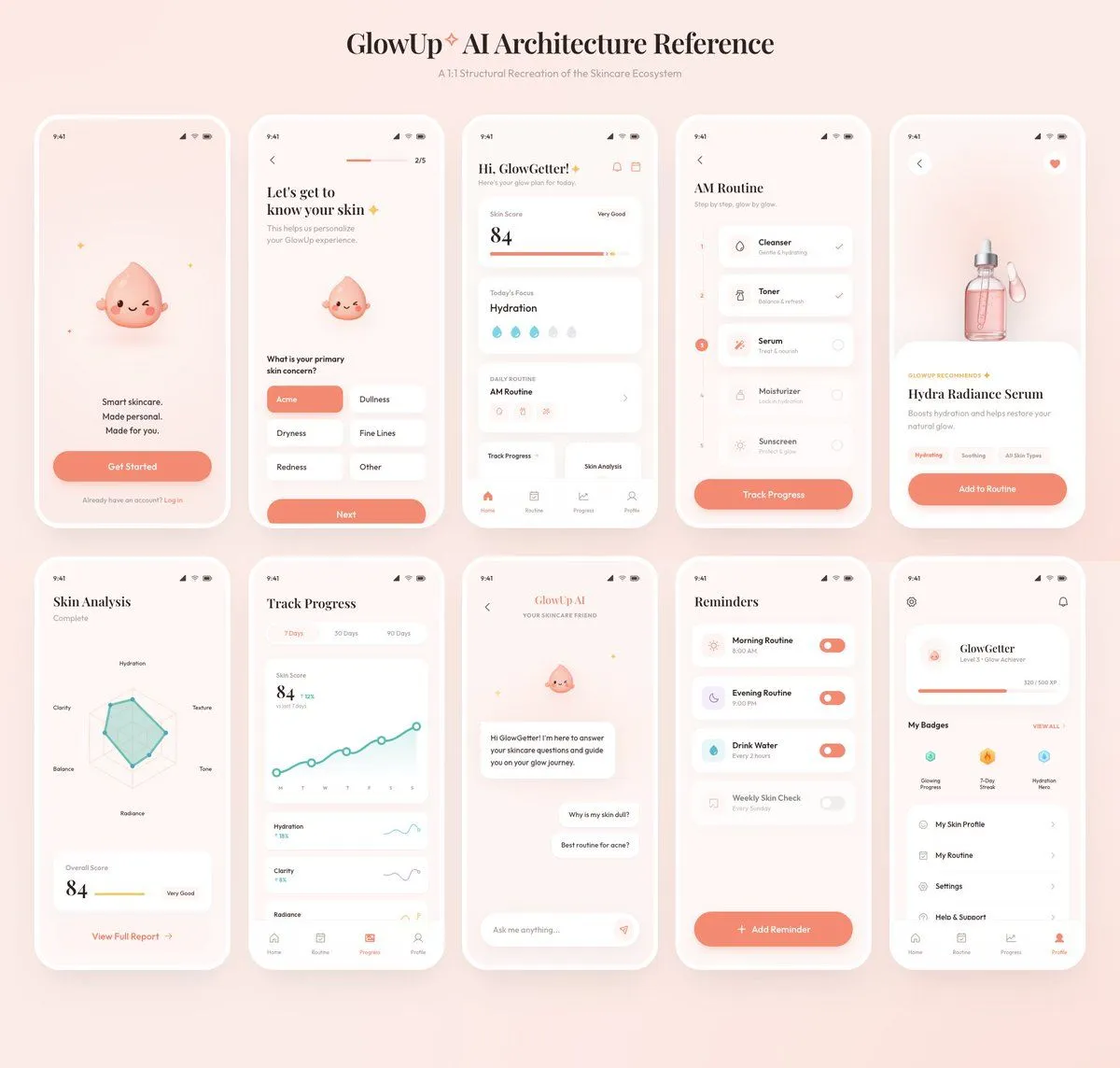
GlowUp App UI Board
Using the provided reference image as the source, recreate the GlowUp skincare mobile app architecture board as a clean, high-resolution UI presentation. Focus on the app screens from the right side of the reference, remove the surrounding canvas clutter and loose asset thumbnails, and redraw the interfaces crisply in the same soft peach/pink brand style with rounded white phone frames, subtle shadows, minimal icons, and the cute droplet mascot where it appears. Arrange exactly 10 mobile screens in a neat 2-row grid of 5 screens each, under the centered heading “board_title” and subtitle “board_subtitle”. Include these 10 screens: 1) welcome / get started screen, 2) onboarding skin concern selection screen, 3) GlowGetter dashboard with skin score and routine cards, 4) AM routine checklist, 5) Hydra Radiance Serum product detail, 6) skin analysis radar chart, 7) track progress line chart, 8) GlowUp AI chat screen, 9) reminders list, and 10) profile / badges screen. Keep the same visual identity from the reference: pastel peach background, coral CTA buttons, white cards, delicate typography, skincare-focused labels, tiny status bars, and airy spacing. Make the output look like a polished product-design showcase rather than a screenshot of the original board.