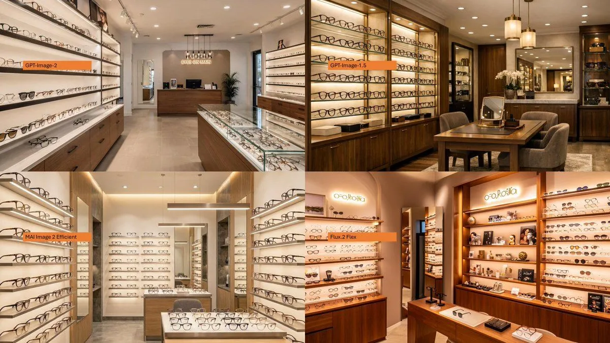
Four-Panel Eyewear Store Model Comparison
Library Explainers
Yesterday
Using the provided reference image as a layout/comparison inspiration, replace the dense Japanese policy infographic with a photorealistic 2×2 comparison collage. Each of the 4 panels should show a different realistic interior view of store_type, with warm retail lighting, shelves full of glasses, wooden cabinetry, display cases, mirrors, and a polished upscale showroom feel. Add one small horizontal orange label near the left side of each panel, using exactly these 4 labels: top_left_label, top_right_label, bottom_left_label, and bottom_right_label. Keep the image as a clean four-quadrant comparison, with no Japanese report text, no diagrams, no government-style boxes, and no extra captions beyond the four orange labels.