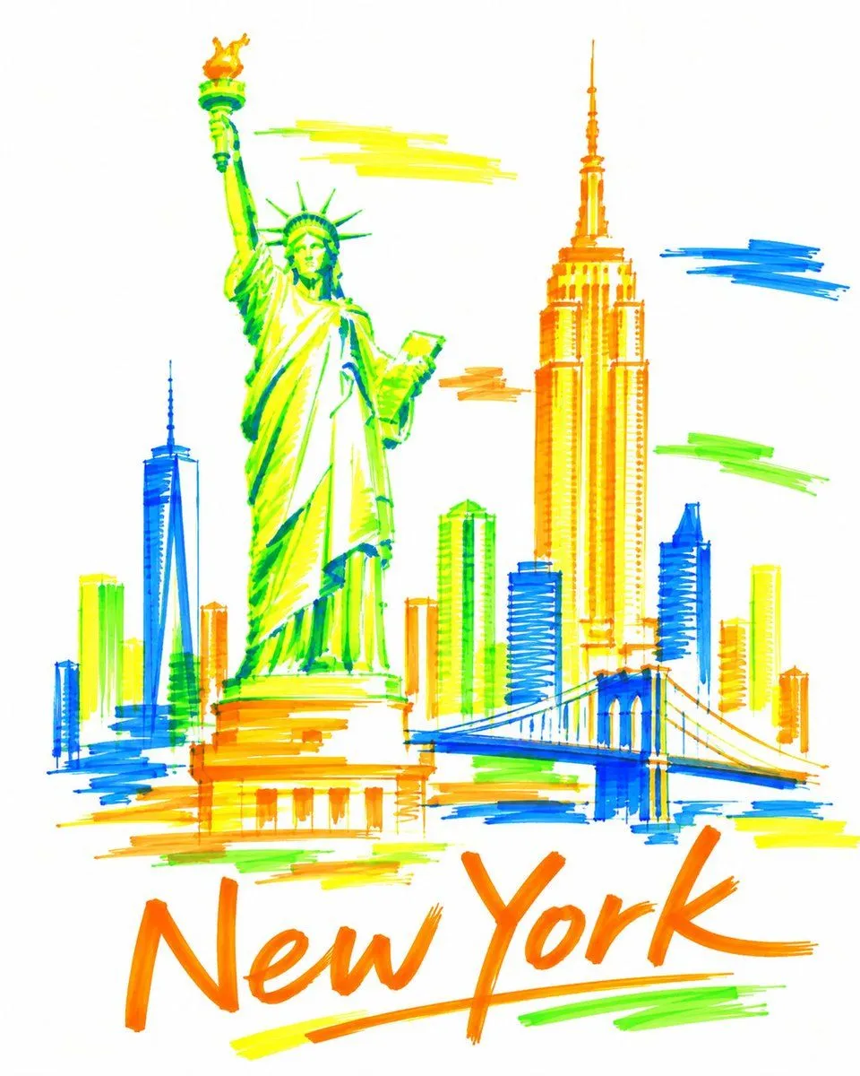
Fluorescent Highlighter Travel Poster
Create a bold, sophisticated vertical 4:5 travel art poster for destination, drawn entirely with only four fluorescent highlighter markers on pure bright white paper: 🟧 Fluorescent Orange 🟨 Fluorescent Yellow 🟩 Fluorescent Green 🟦 Fluorescent Blue COMPOSITION Select 2–3 real, instantly recognizable landmarks or architectural symbols that genuinely represent destination. Use one dominant landmark as the visual anchor, supported by one or two smaller landmarks. Integrate everything into one continuous, asymmetrical composition using overlap, cropping, scale contrast, and generous negative space. Do not arrange landmarks side-by-side like a tourist brochure. Keep the architecture highly simplified but immediately recognizable. HIGHLIGHTER STYLE Construct the artwork only with visible broad-tip highlighter strokes — no black ink, pencil, fine outlines, or digital fills. Use quick sweeping marks, transparent overlaps, uneven saturation, streaks, gaps, imperfect edges, visible stroke beginnings and endings, and occasional strokes extending beyond the architecture. Do not carefully color inside buildings. Use a limited number of confident strokes to suggest rather than fully render the landmarks. Leave significant areas unpainted so the viewer mentally completes the forms. Up close, the artwork should feel almost abstract; from a distance, destination should become unmistakable. COLOR & WHITE SPACE Use only fluorescent orange, yellow, green, and blue. Use all four throughout the composition and allow them to overlap naturally. Keep approximately 50–60% of the pure white paper untouched. No gradients, shadows, black, gray, beige, pastel colors, or additional shades. TYPOGRAPHY Integrate the exact text “destination” naturally into the composition using the same fluorescent highlighters. Make it spontaneous, expressive, handwritten, and visually integrated rather than a conventional poster heading. STYLE Contemporary editorial illustration, experimental architectural sketching, Swiss graphic-design restraint, expressive marker art, museum-shop travel artwork, sophisticated handmade imperfection, bold negative space. Avoid: photorealism, detailed architectural rendering, conventional skyline compositions, rigid grids, decorative borders, watercolor, vintage textures, cream/beige paper, and generic tourism-poster aesthetics. FINAL FEEL: A destination remembered through only four fluorescent highlighters — energetic marks, enormous white space, imperfect strokes, and just enough architectural information for destination to suddenly emerge from abstraction. High resolution, vertical 4:5, pristine pure-white background.