Farnsworth House LESS Poster
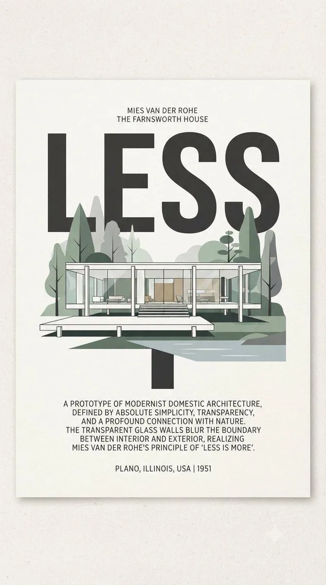
Goal: Create a minimalist modernist architecture poster for architect_and_building, centered on a clean white paper sheet with subtle shadow on a warm off-white wall. Canvas: Vertical poster, approximately 2:3 aspect ratio, with generous margins and a refined gallery-print look. Use muted sage green, gray, black, and off-white tones, crisp vector-like illustration, slight paper grain, and Bauhaus/Swiss typography. Layout: At the top center, place two small uppercase lines reading "MIES VAN DER ROHE" and "THE FARNSWORTH HOUSE". Below them, dominate the poster with one enormous bold black word, main_headline, in condensed sans-serif capitals, spanning most of the width. The architectural illustration overlaps the lower half of this word. Subject details: Show the Farnsworth House as a long, low, transparent glass pavilion in front elevation: a white flat roof slab, a white floor slab raised on thin white columns, transparent glass walls with visible interior furniture, and a central stair leading down to a floating terrace platform. Count exactly 6 prominent vertical white structural columns across the front facade, plus thin window mullions. Include a shallow reflective water or ground plane to the right, angular green shadows below, and a flat modern landscape behind it. Count exactly 9 stylized trees/shrubs around the house: 2 tall dark green pointed trees, 2 pale gray vertical trees, 2 rounded pale green shrub masses, 2 slender leafy trees, and 1 small stacked oval tree near the right side. Text content: Below the illustration, center a compact uppercase paragraph in narrow sans-serif: "A PROTOTYPE OF MODERNIST DOMESTIC ARCHITECTURE, DEFINED BY ABSOLUTE SIMPLICITY, TRANSPARENCY, AND A PROFOUND CONNECTION WITH NATURE. THE TRANSPARENT GLASS WALLS BLUR THE BOUNDARY BETWEEN INTERIOR AND EXTERIOR, REALIZING MIES VAN DER ROHE'S PRINCIPLE OF 'LESS IS MORE'." At the bottom center, add the location/date line location_and_year. Visual style: Minimal flat vector poster, architectural elevation drawing, subtle transparency in glass, clean geometric composition, muted mid-century modern palette, strong typographic hierarchy, precise alignment, no people, no logos, no watermark.