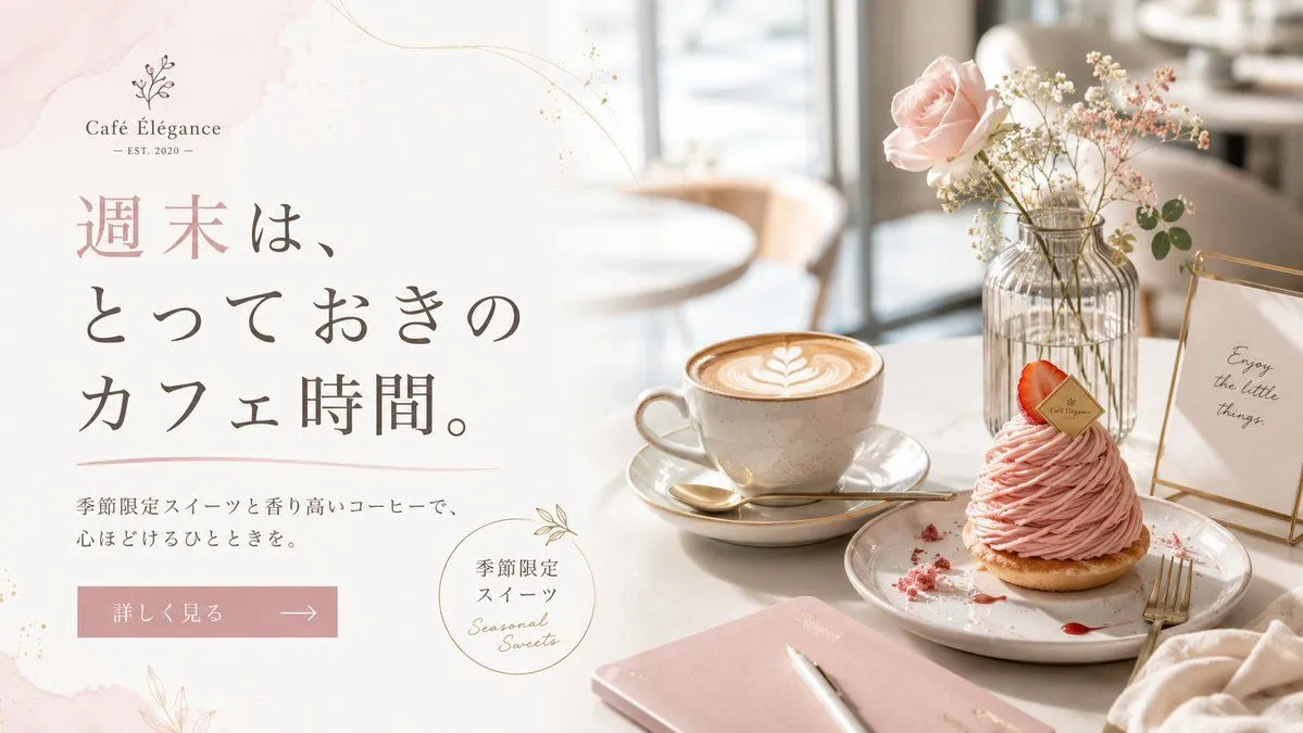
Elegant Café Weekend Banner
Goal: Create an elegant horizontal café promotional banner for cafe_name, blending a soft Japanese lifestyle advertisement with a realistic café tabletop photo. Canvas: Wide 16:9 web banner, about 1200×675 px. Split composition with the left half as a clean text area on an off-white background and the right half as a bright, shallow-depth-of-field café scene. Layout: Left side contains the café logo at the top, a large Japanese headline in the center-left, a short subheading below, a pink rectangular call-to-action button, and a small circular seasonal sweets badge near the lower center. Right side contains the product still life: one latte cup, one plated pink dessert, one flower vase, one small framed quote sign, and one notebook with pen. Use generous negative space and refined alignment. Text content: At top left, include a delicate botanical line icon above the logo text “cafe_name” and small text “— EST. 2020 —”. Main headline in large vertical-feeling Japanese serif typography: “headline_text”. Subheading beneath in smaller Japanese text: “subheading_text”. Button text: “button_text” with a thin right arrow. Circular badge text: Japanese “季節限定 スイーツ” plus handwritten English “Seasonal Sweets”. Framed sign on the table reads “Enjoy the little things.” Subject details: Show exactly 5 main tabletop objects on the right: 1 beige ceramic latte cup on a saucer with leaf latte art and a gold spoon, 1 plated pink Mont Blanc-style strawberry dessert with a small branded tag and crumbs, 1 ribbed glass vase holding a pale pink rose and tiny white flowers, 1 gold-edged tabletop frame with the quote, and 1 blush-pink notebook with a white pen in the foreground. Add soft café chairs and window light blurred in the background. Visual style: Airy luxury café aesthetic, pastel blush pink and cream palette, warm natural daylight, high-key photography, soft bokeh, marble or pale tabletop, fine gold accent lines, light watercolor blush washes and subtle botanical line art around the text area. Typography should feel premium: elegant Japanese Mincho-style serif for the headline, refined small serif for the logo, and handwritten script only for the seasonal badge. Constraints: Keep the design uncluttered and upscale. Preserve the exact count of 5 main tabletop objects. Do not add extra logos, watermarks, people, or excessive text. Maintain sharp readable text on the left and realistic photographic detail on the right.